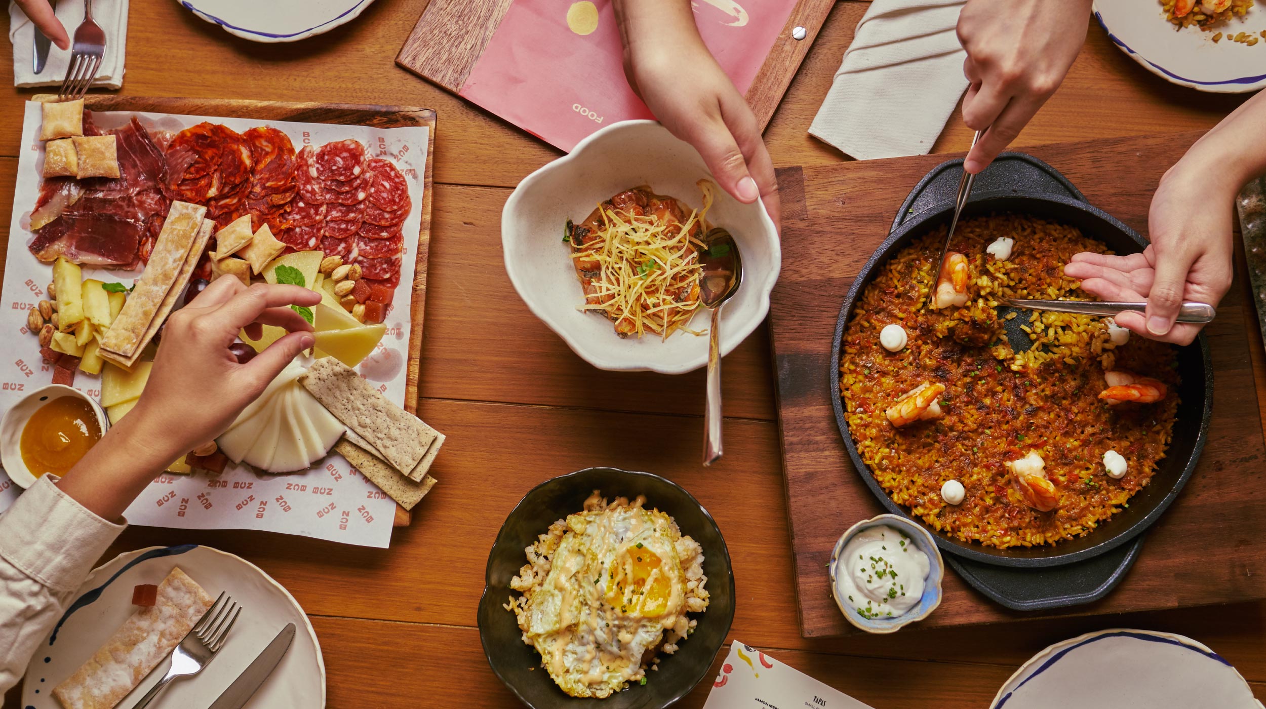
- Environmental
- Illustration
- Visual Identity
Design Challenge —
How might we showcase the spirit of Barcelona without using the usual, touristy motifs?
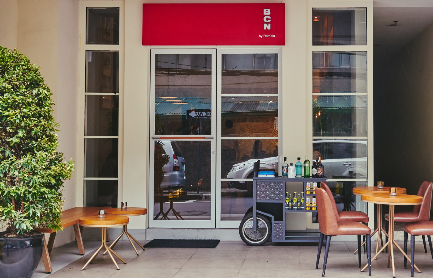
In order to capture the feeling of being Barcelona, we recounted personal experiences and our own memories of the place. We recalled the small things, like street signs, chance encounters, and the little side streets. The brand had to highlight the things unseen during your first visit to Barcelona.
As the R&D restaurant for Bistronomia, the visual identity needed to be just as dynamic. It had to accommodate changes in the menu and changes in theme. The brand had to give people a taste of Barcelona in order to entice them to stay longer this second time around.
We visualized our own interpretation of Barcelona, where Barcelona is a mix of things old and things new.
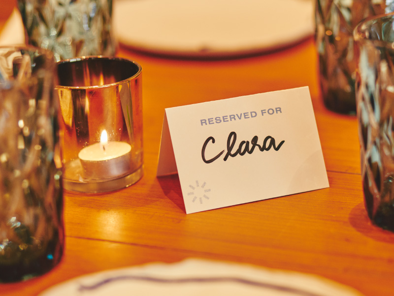
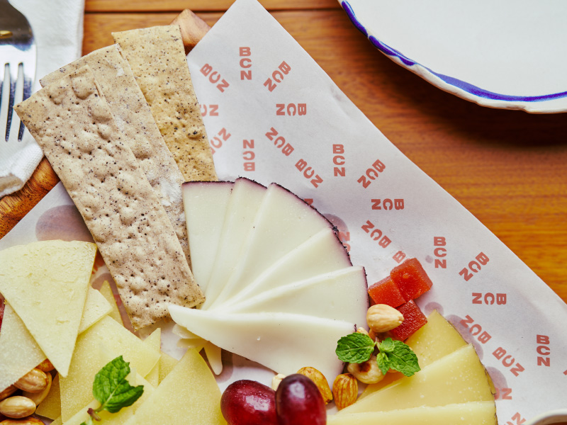
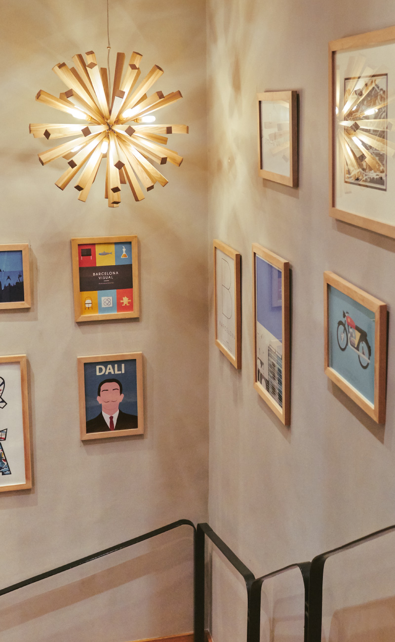
Through abstract illustrations, we wanted to leave room for interpretation and discovery.
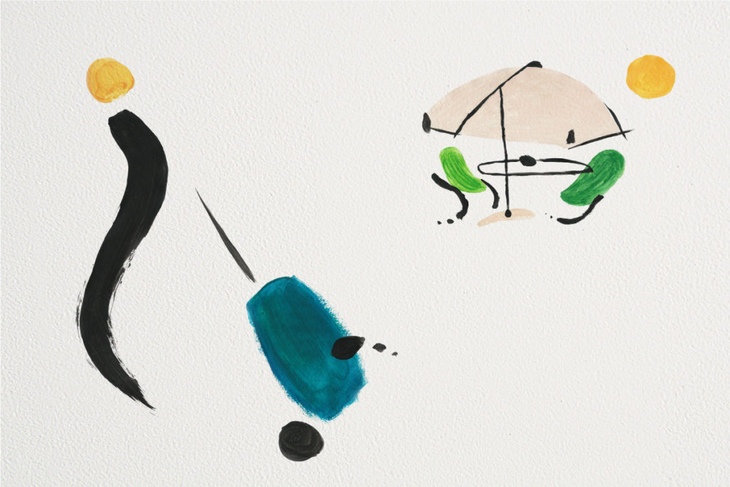
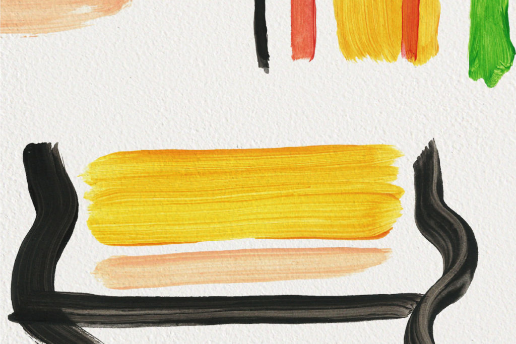
We used brush strokes inspired by Miro and mixed in the use of typography to show a balance of fun and formal. We illustrated the everyday life of people in Barcelona to give guests a more authentic sense of place.
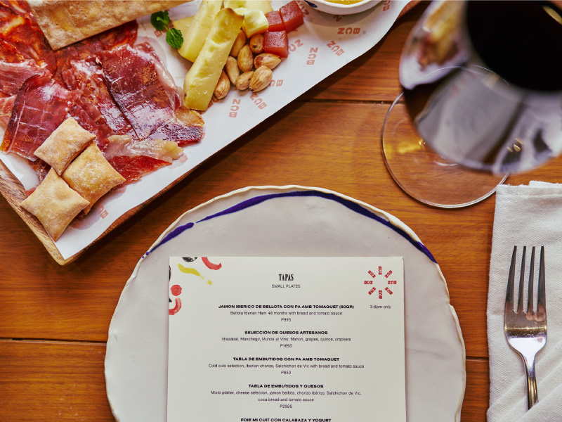
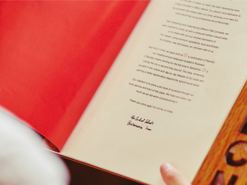
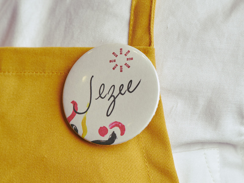
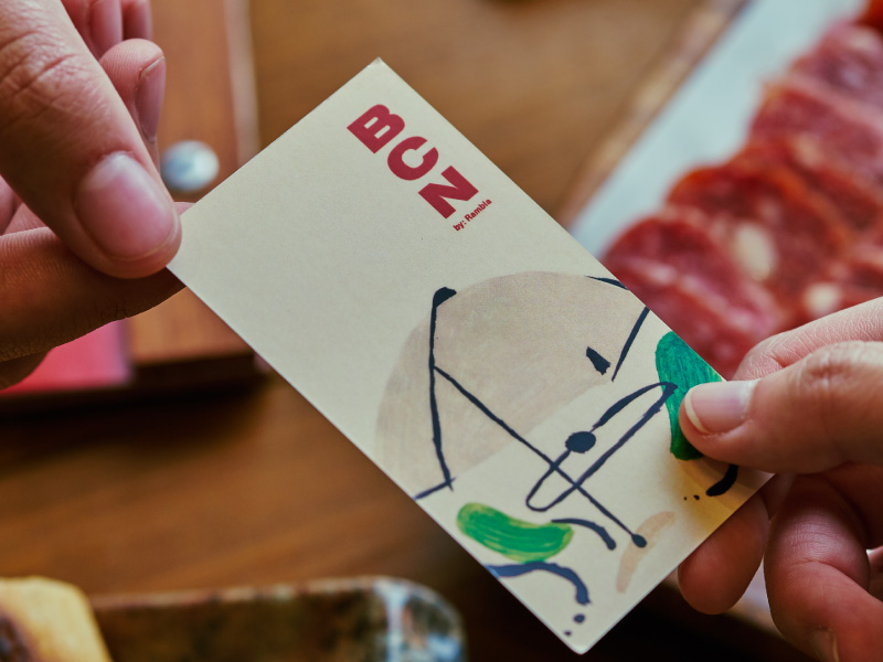
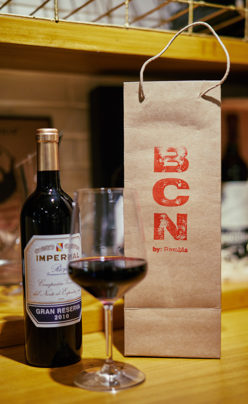
Rooted in the flexibility of the icon, the identity represents the spirit of Barcelona—unpretentious, whimsical, and full of life.
— PREV
Las Flores
NEXT —
Rambla