- Naming
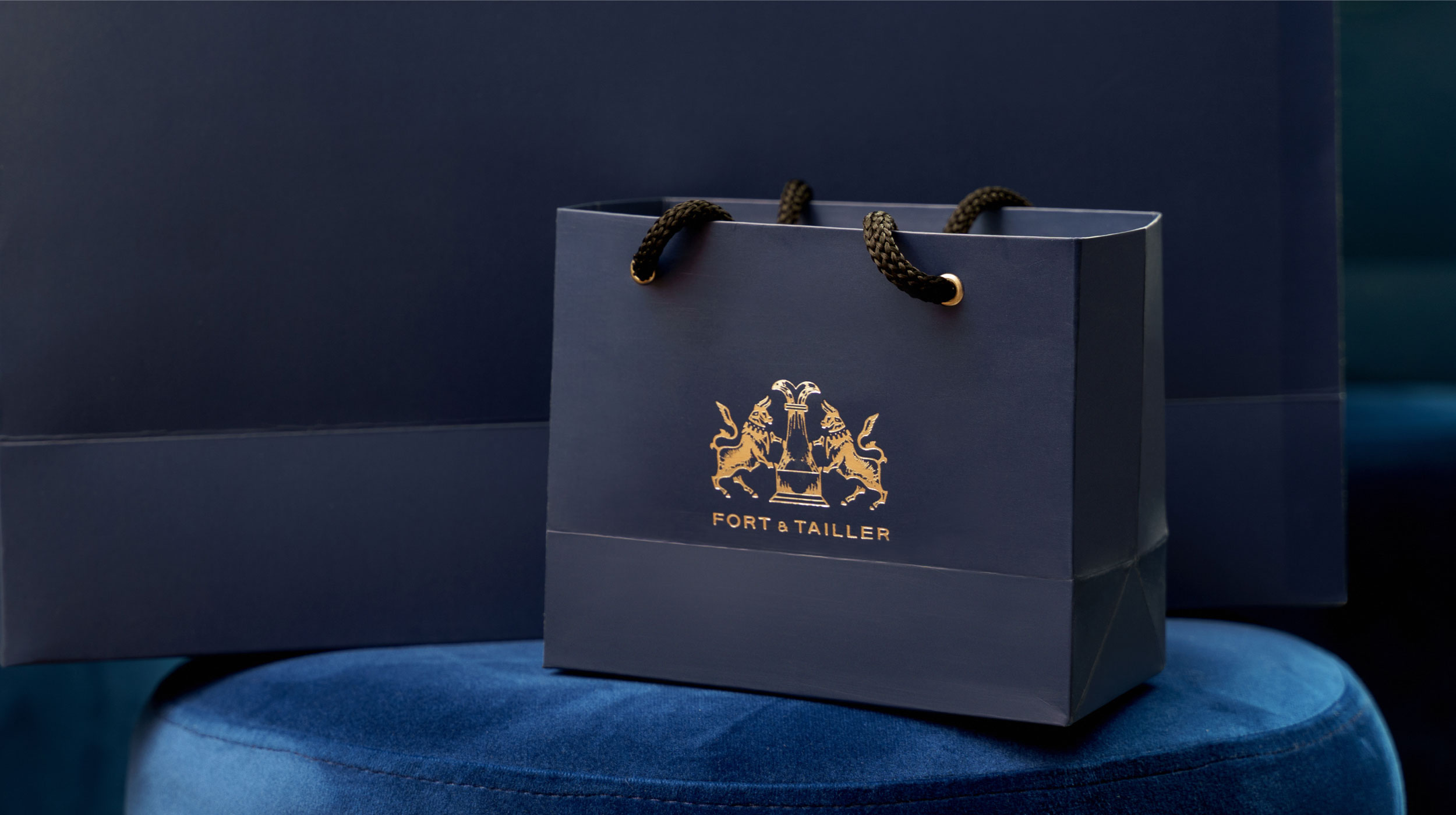
- Packaging
- Verbal Identity
- Visual Identity
Design Challenge —
How might we show the balance between strength and detail?
Process —
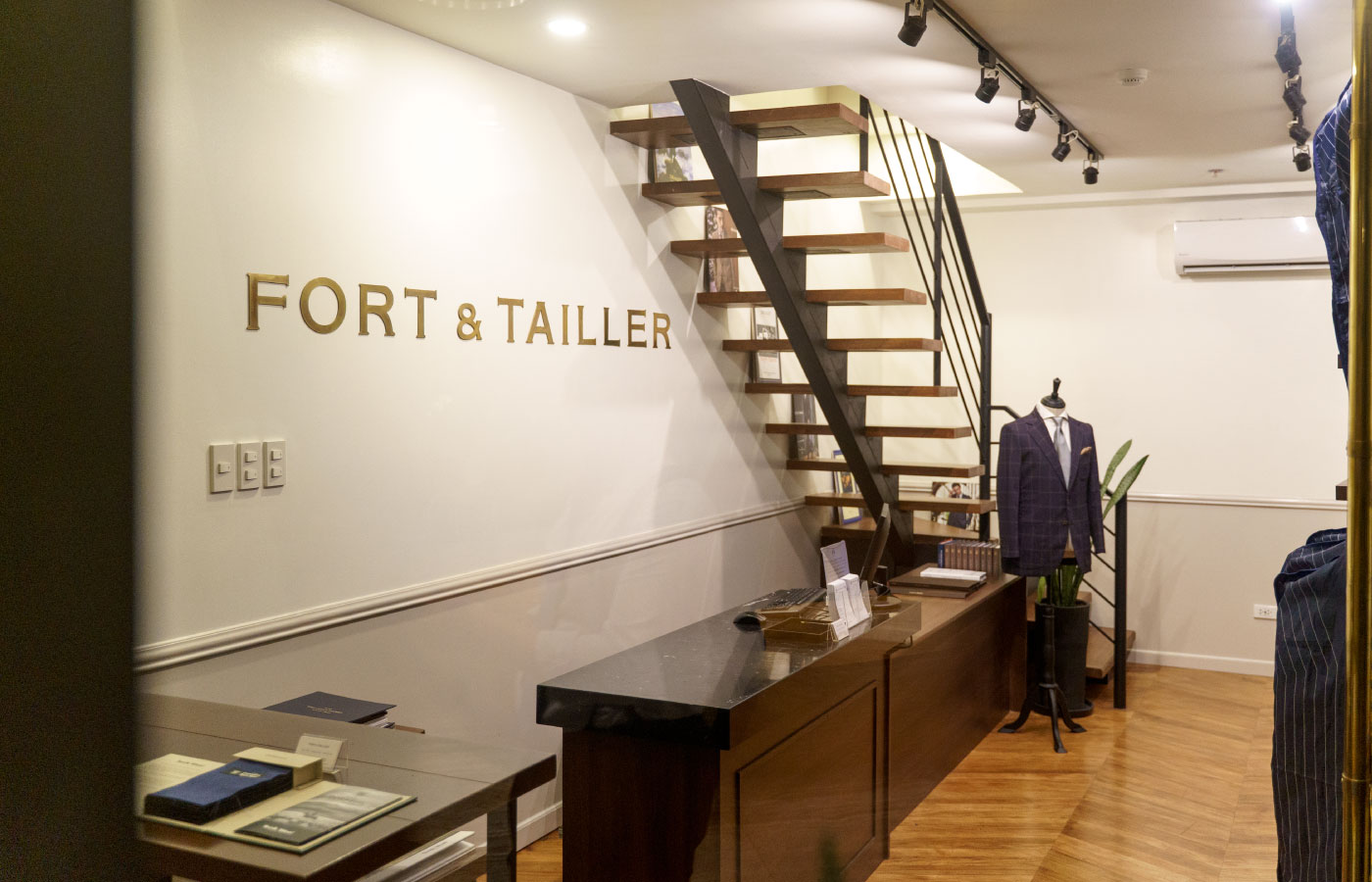
Fort & Tailler is a bespoke suit tailoring service who challenged us to capture the attitude of a smart businessman. From this brief sprung the idea behind the name – and the rest of the brand. Fort alludes to strength, while Tailler alludes to precision and detail. Together, strength and detail form the ethos of the whole brand, cascading from the logo down to suit order forms.


Design Solution —
The Fort & Tailler brand identity is anchored on a balance between bullish strength and precise detail.
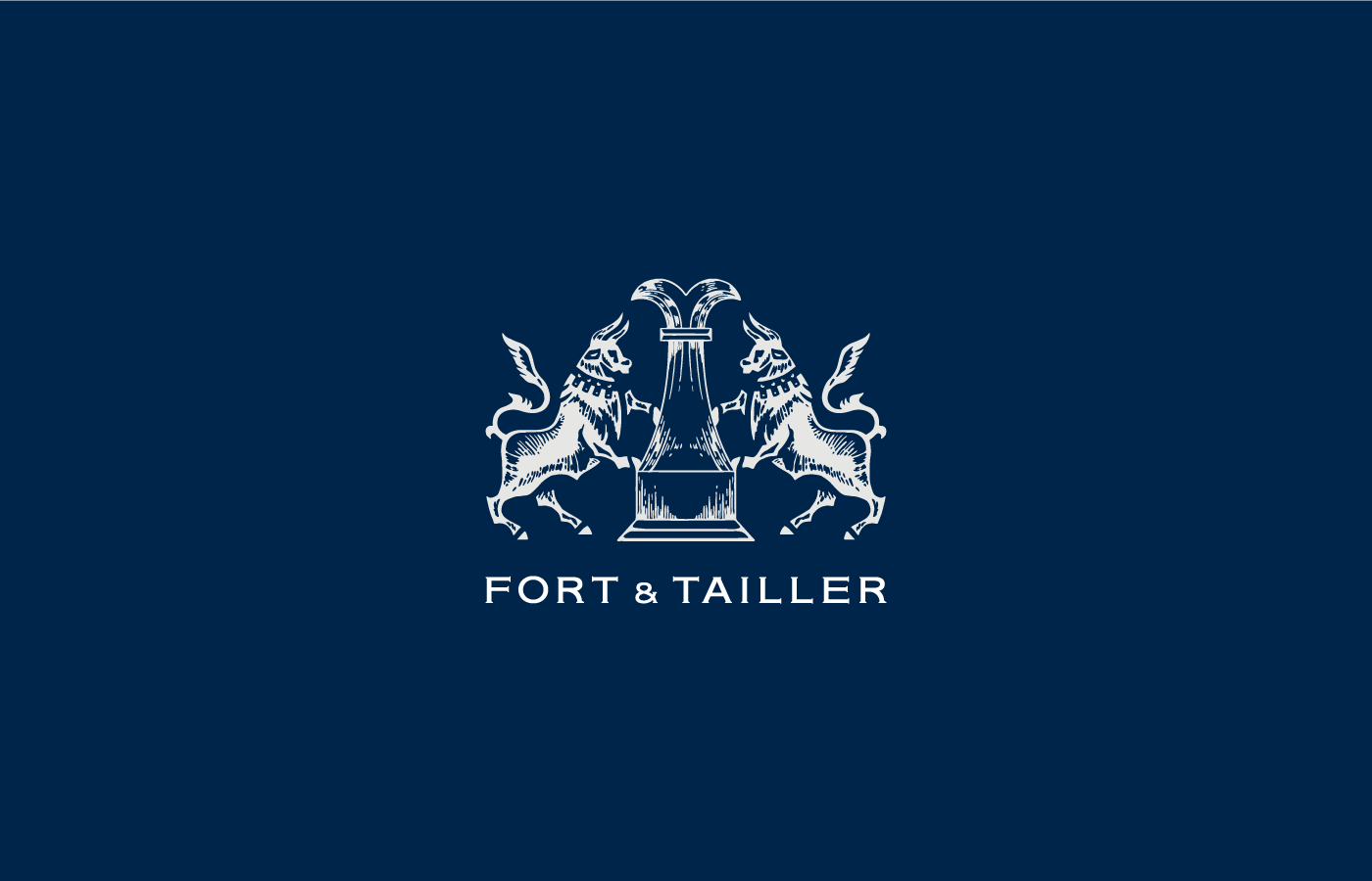
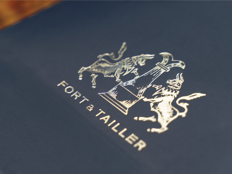
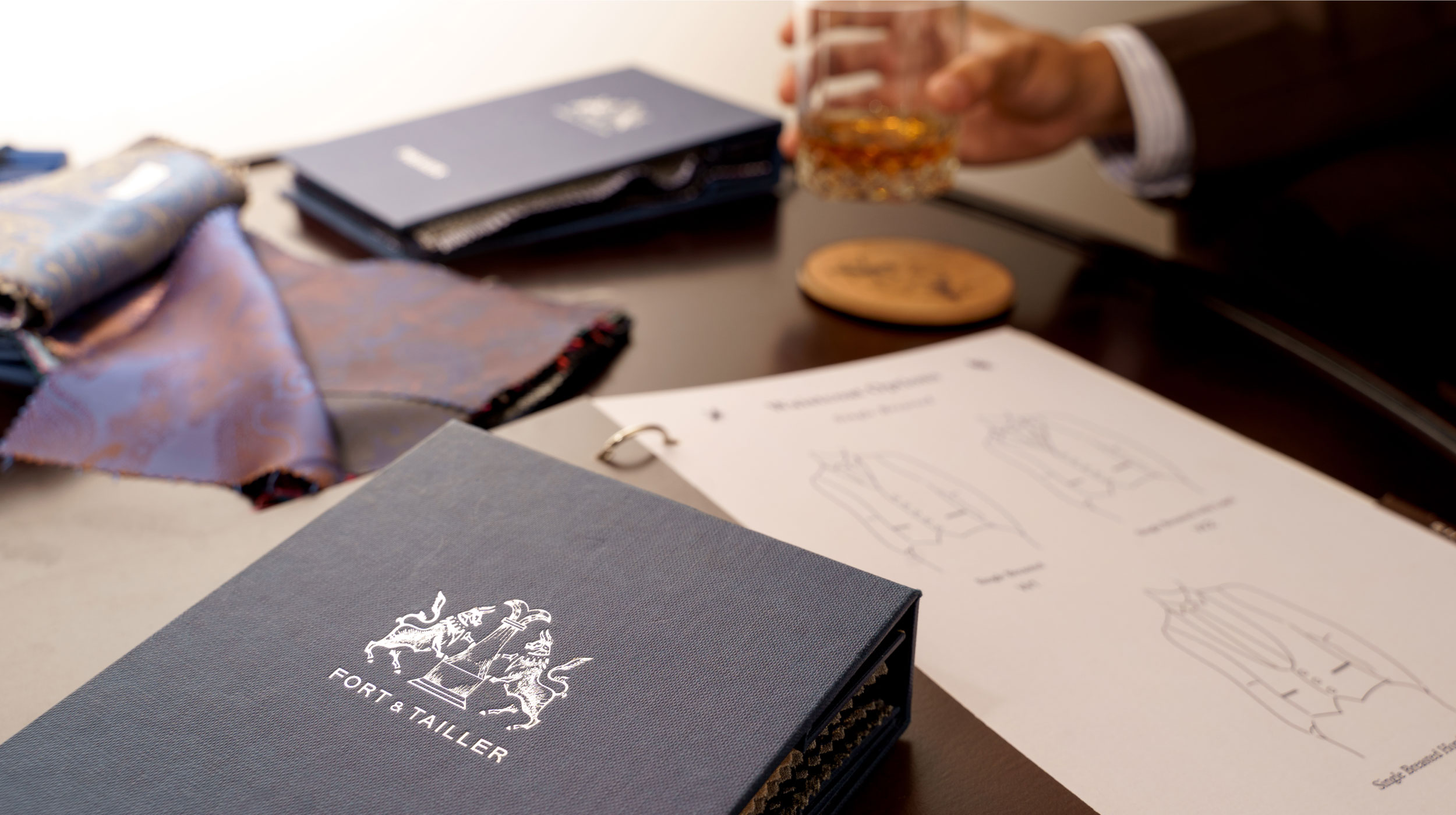
Visually, the concept of strength and detail is best captured by the logo – an illustration of 2 bulls propping up a chess rook. The bulls allude to the idea of a “bull market” – i.e. a climate conducive for strong and good business, while the rook harkens back to the precision and decisiveness used in a game of chess. Together, these elements convey a grounded balance for the Fort & Tailler brand.
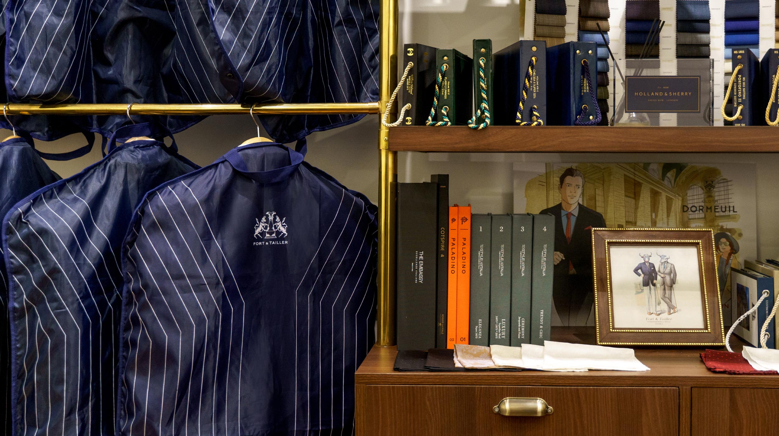
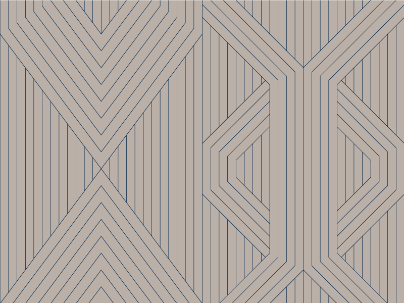
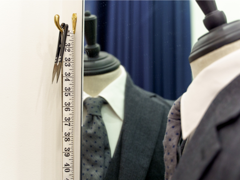
To communicate precision, we developed geometric line patterns reminiscent of pinstripes found in suits. Applied in suit bags and inside linings of packaging, the pattern adds grounded detail to the brand.
We also made branded collateral look precise, and light, even, to offset the strength of the other brand elements. This achieves a balance between strength and detail.
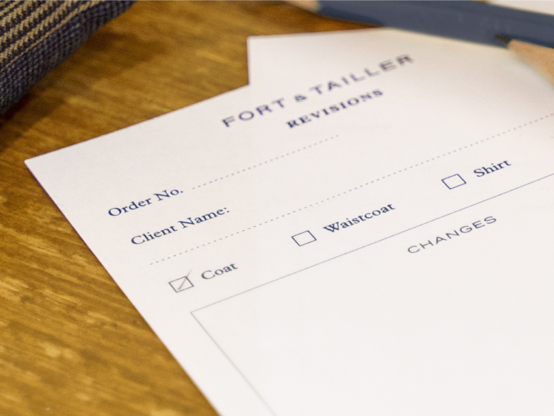
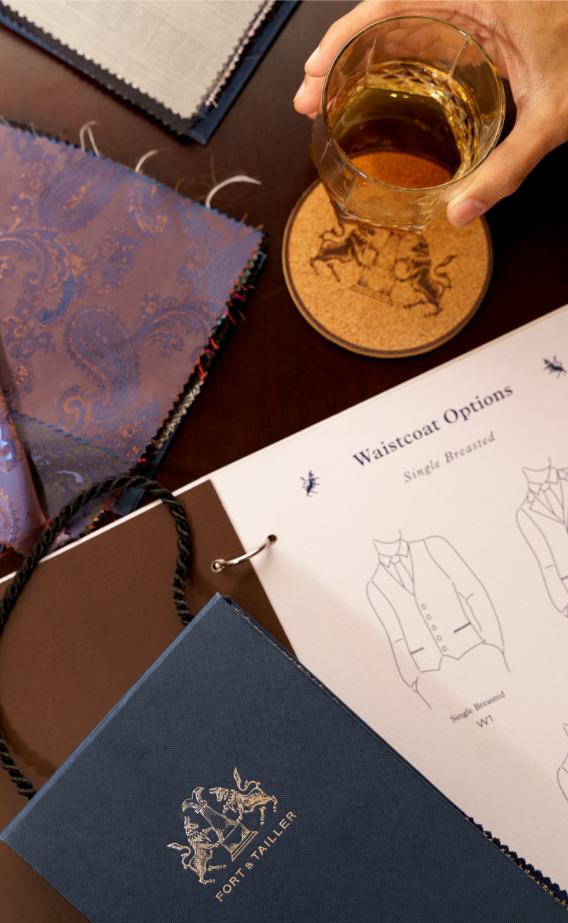
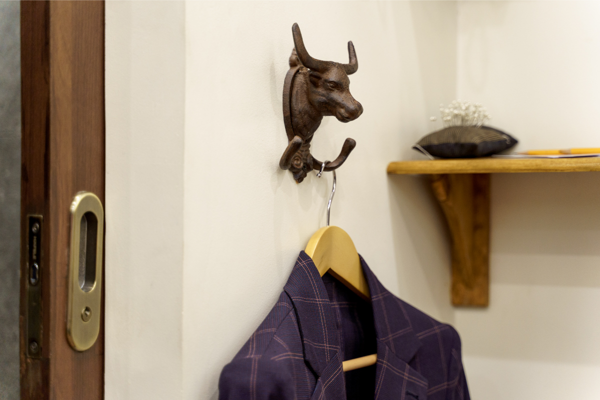
The brand depicts style made to ones measure – in both strength and detail.
— PREV
Uniqlo Feel the SEA
NEXT —
First Pacific Leadership Academy