- Illustration
- Packaging
- Verbal Identity
- Visual Identity
- & La Lola Graphic Design Team — Expanded Collaterals
Design Challenge —
How might we have Churros to-go?
How it started —
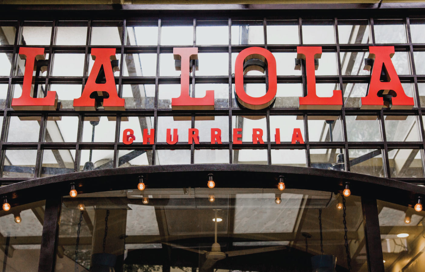
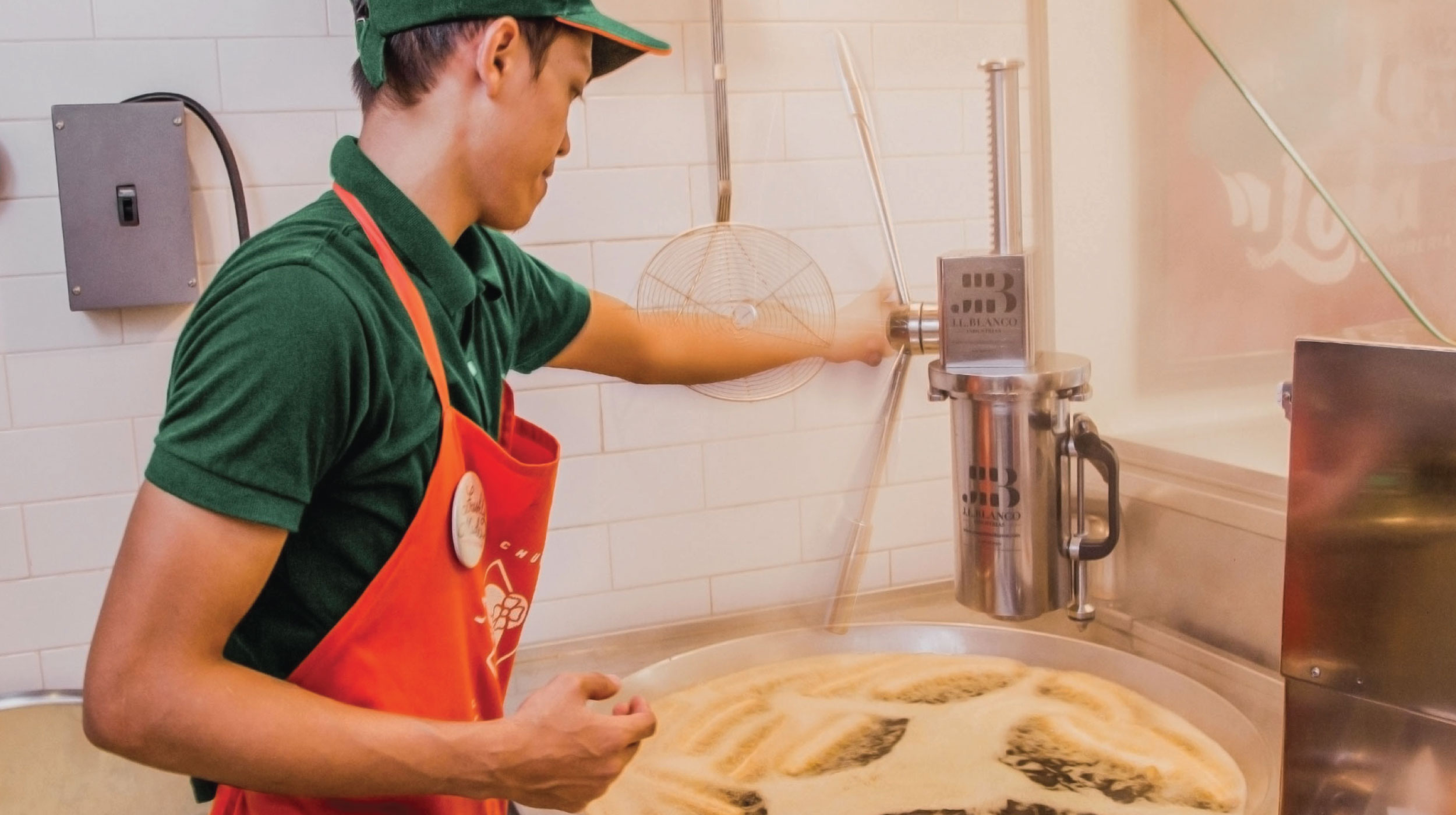
In late 2014, we sat down with an old client, the Bistronomia Group, to brainstorm their newest food concept. They had a small space in Powerplant Mall where they thought of selling hot and fresh churros. They weren’t sure about what the brand was going to look like, but they knew that they wanted to call it La Lola Churreria.
Design process —
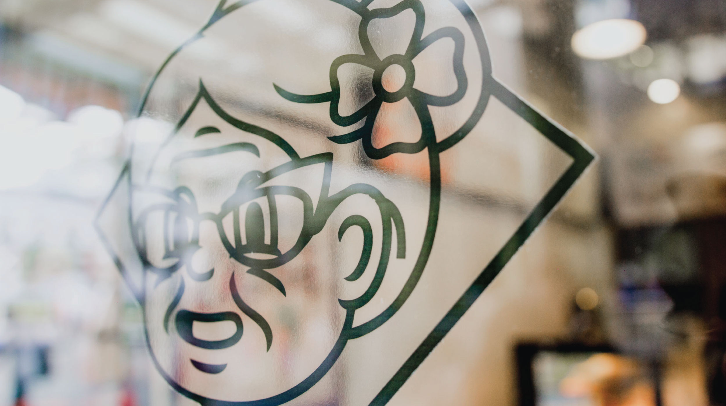
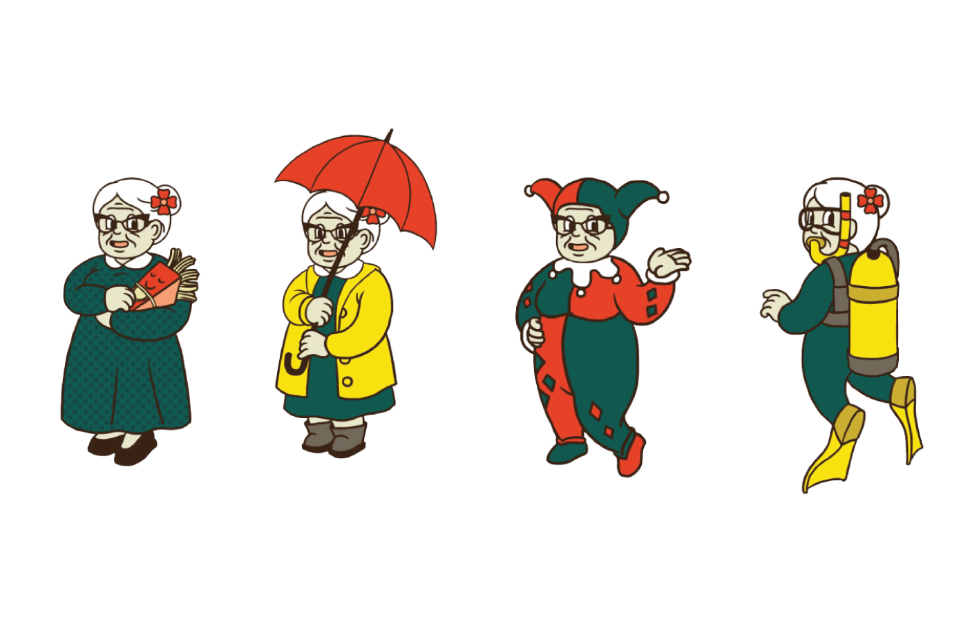
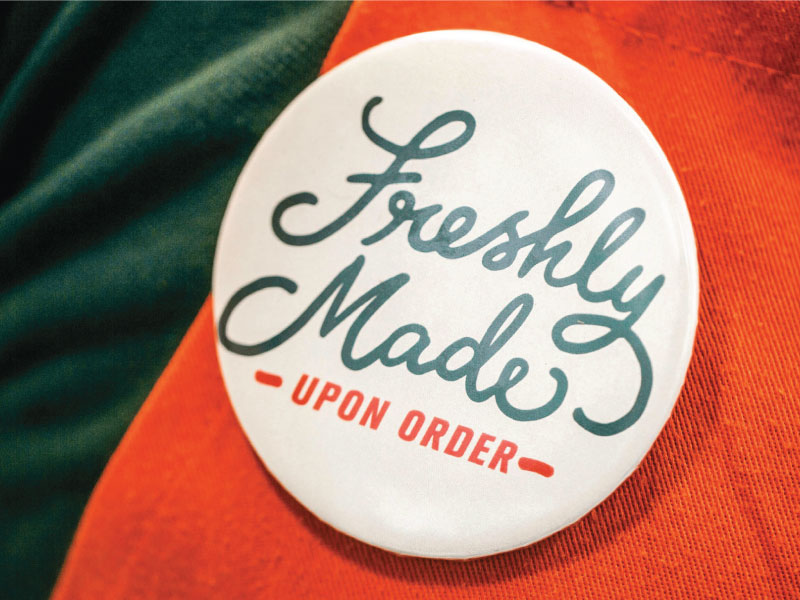
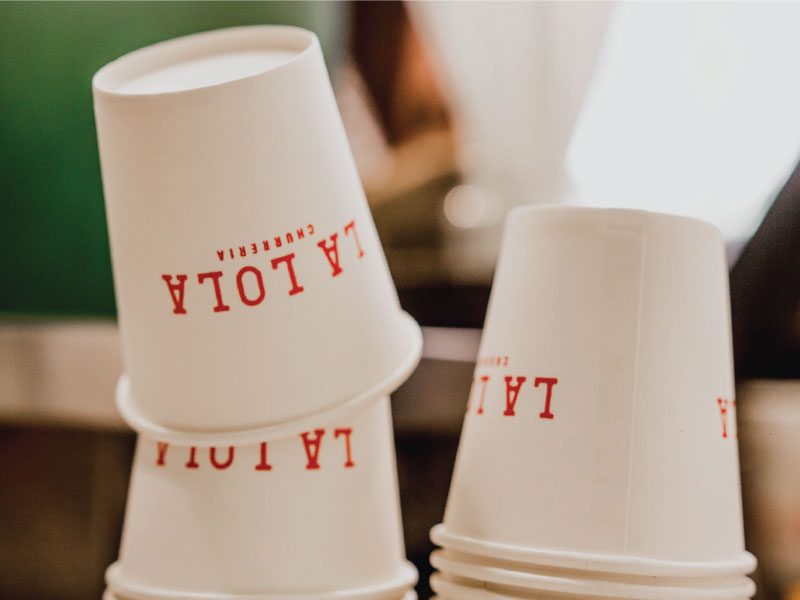
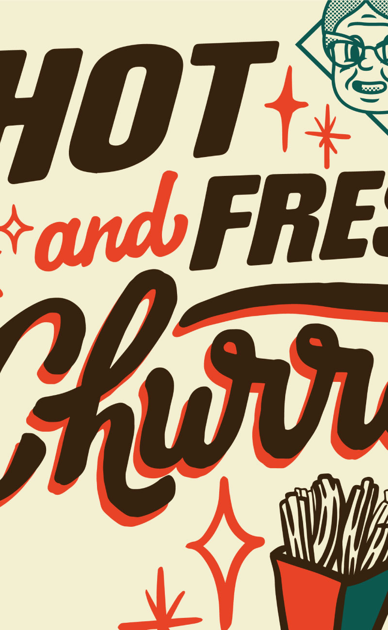
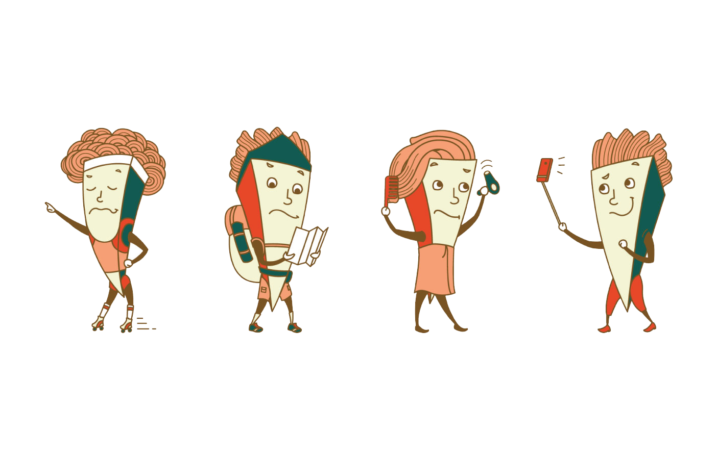
With this project, we began with the color: A deep green and a bright red orange set against a dark chocolate brown. Once we had set this, the team began working on who we now know as the famous Lola and her brood of churros. We developed a custom logotype as well as a typable font called “Churreria Bold.”
Packaging design —
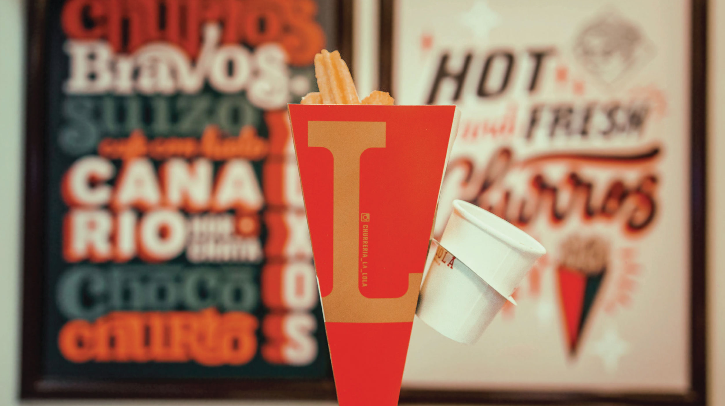
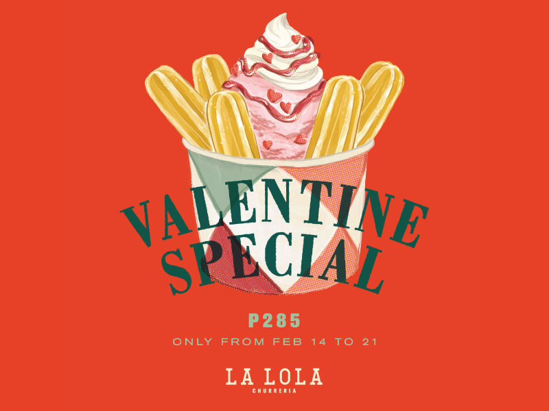
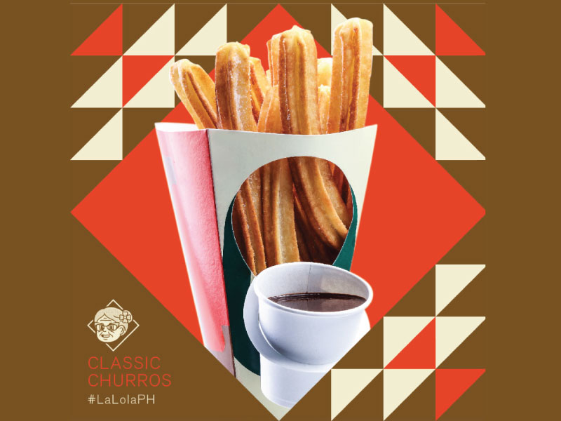
If you were having it in-store or having it to-go, you would be handed a La Lola churro cone. Each cone came with a slot to attach a cup of warm chocolate dip for easy dunking. The packaging designs would change every few seasons or on special holidays.
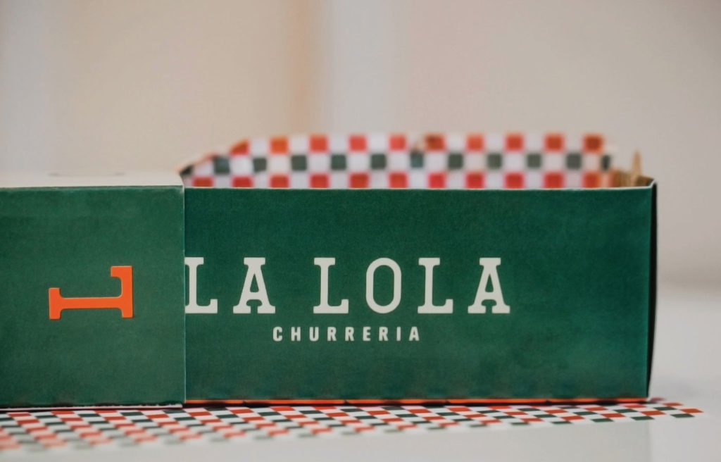
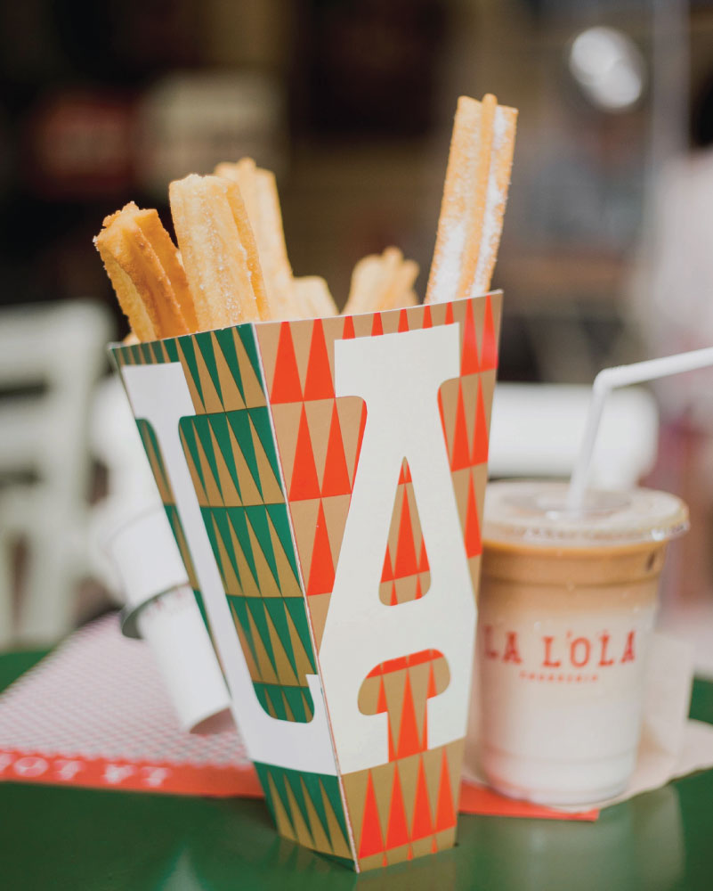
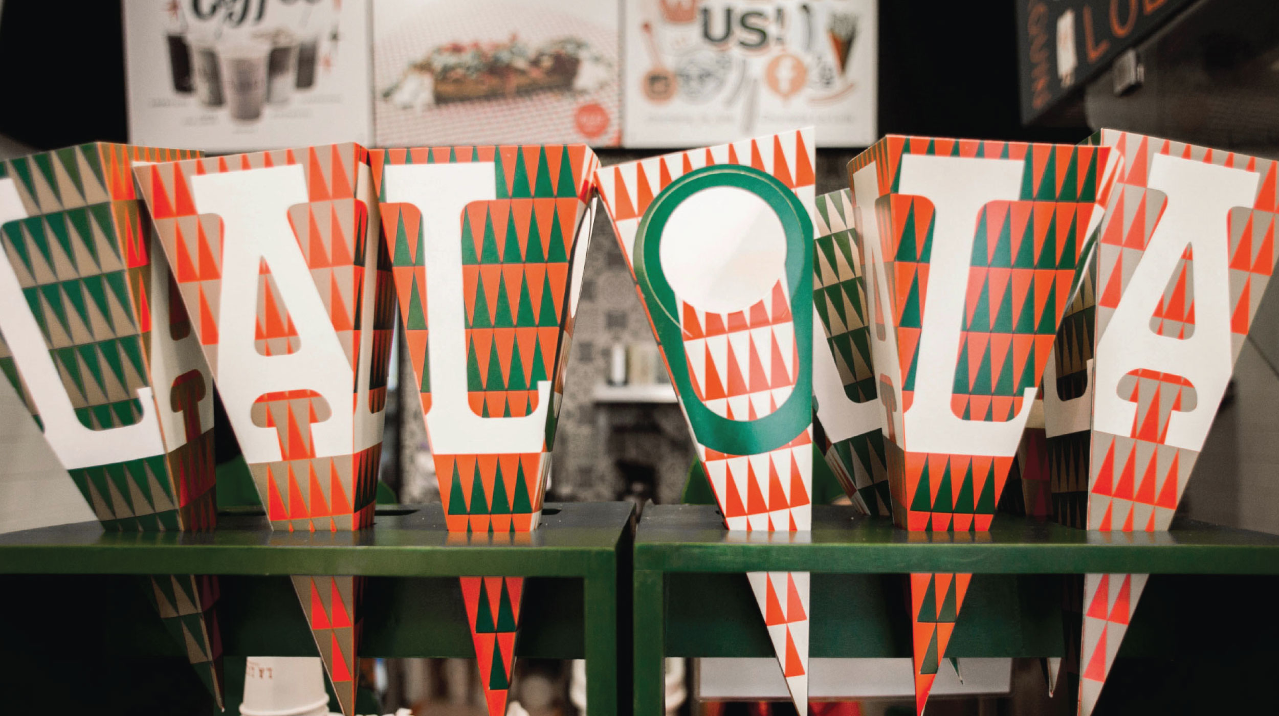
La Lola Churreria currently has 16 stores across the Philippines.
— PREV
Metro Pacific Water
NEXT —
Scout's Honor