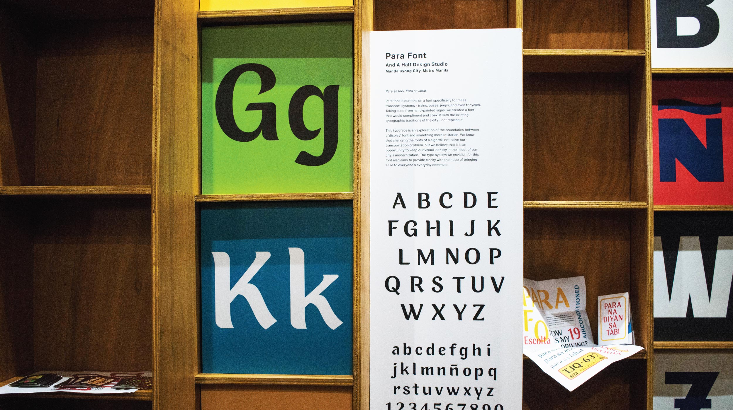
Para sa tabi.
Para sa lahat.
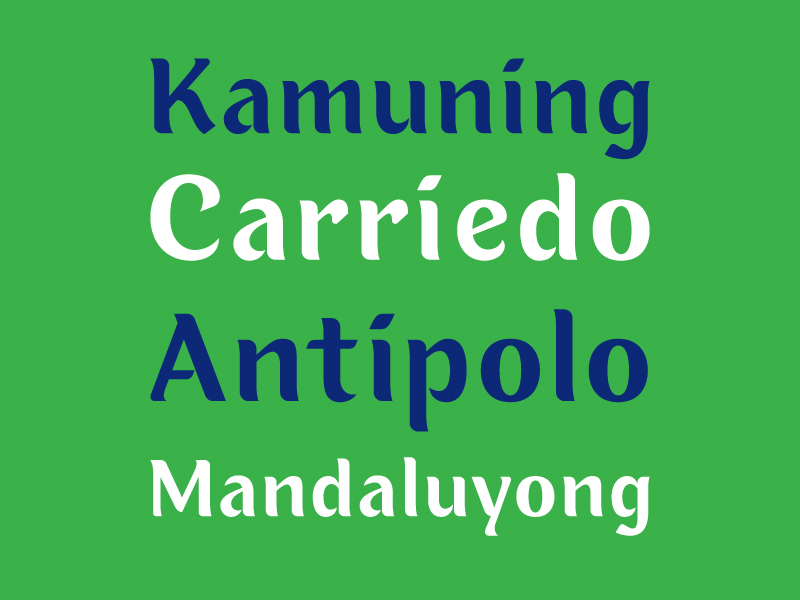
Para Font is our take on a font specifically for mass transport systems – trains, buses, jeeps, and even tricycles. Oftentimes, signs oriented to commuters in these modes of transport are designed haphazardly, concealing Metro Manila’s rich typographic character. Taking cues from hand-painted signs, we created a font that would complement and coexist with the existing typographic traditions of the city – not replace it.
This typeface is an exploration of the boundaries between a display font and something more utilitarian. As Filipinos, we’ve grown accustomed to ornate and condensed typography in our everyday environment, which is something we want to celebrate without letting go of function.
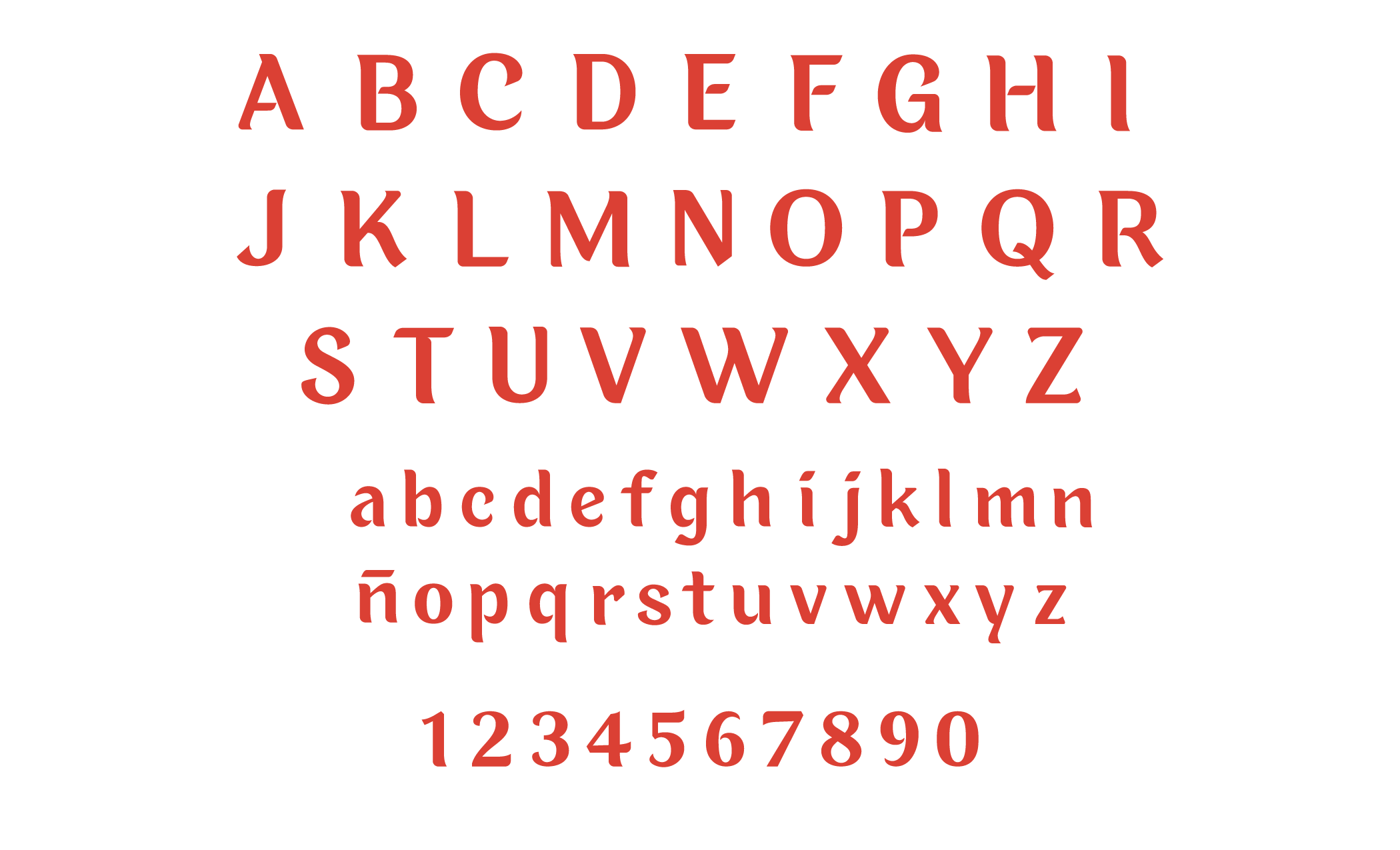
The gestures of Para take inspiration from the swashes of handpainted signages. We constructed the type as a broken script, having clear breaks between elements. This characteristic is evident in the capitals A E F H P R. The crossbars of these letters are not necessarily connected to the stem.
The thin and thick parts of the letterforms are abrupt, similar to the various weights of brush strokes.
The type also features a large x-height to give a sense of warmth to the font.
Other letterforms have special features for a more organic approach to the strokes, including the lowercase e with an oblique crossbar. We also included special terminals for the letters f, g, and j, while letters K and R have a curved leg.
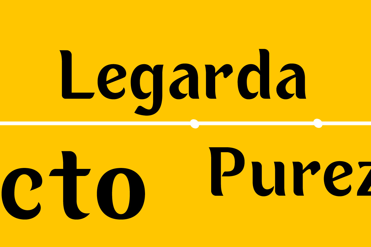
We know that changing the fonts of a sign will not solve our transportation problem, but we believe that it is an opportunity to keep our visual identity in the midst of our city’s modernization.
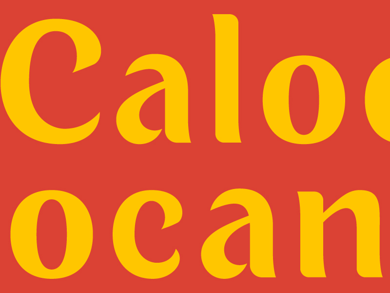
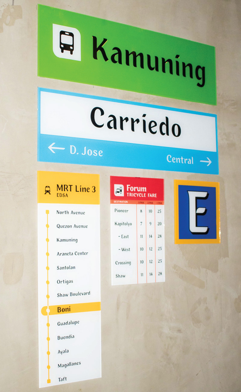
The type system we envision for this font also aims to provide clarity with the hope of bringing ease to everyone’s everyday commute.
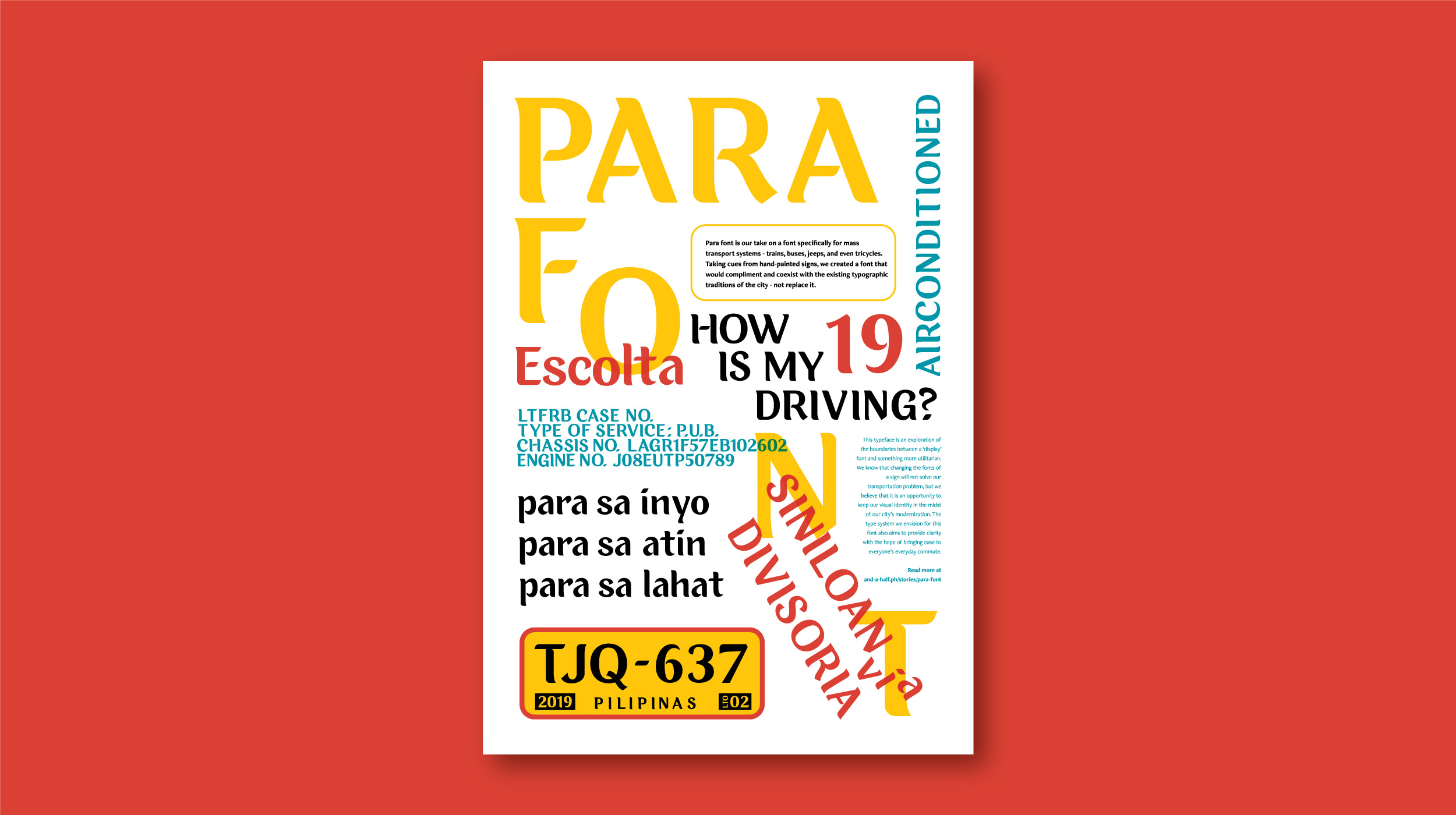
View our type application in Tipong Pilipino – a Typography Exhibit, featuring 9 other design studios and designers in Escolta Exchange. The exhibit runs until November 30.
— PREV
Ateneo de Davao And A Half