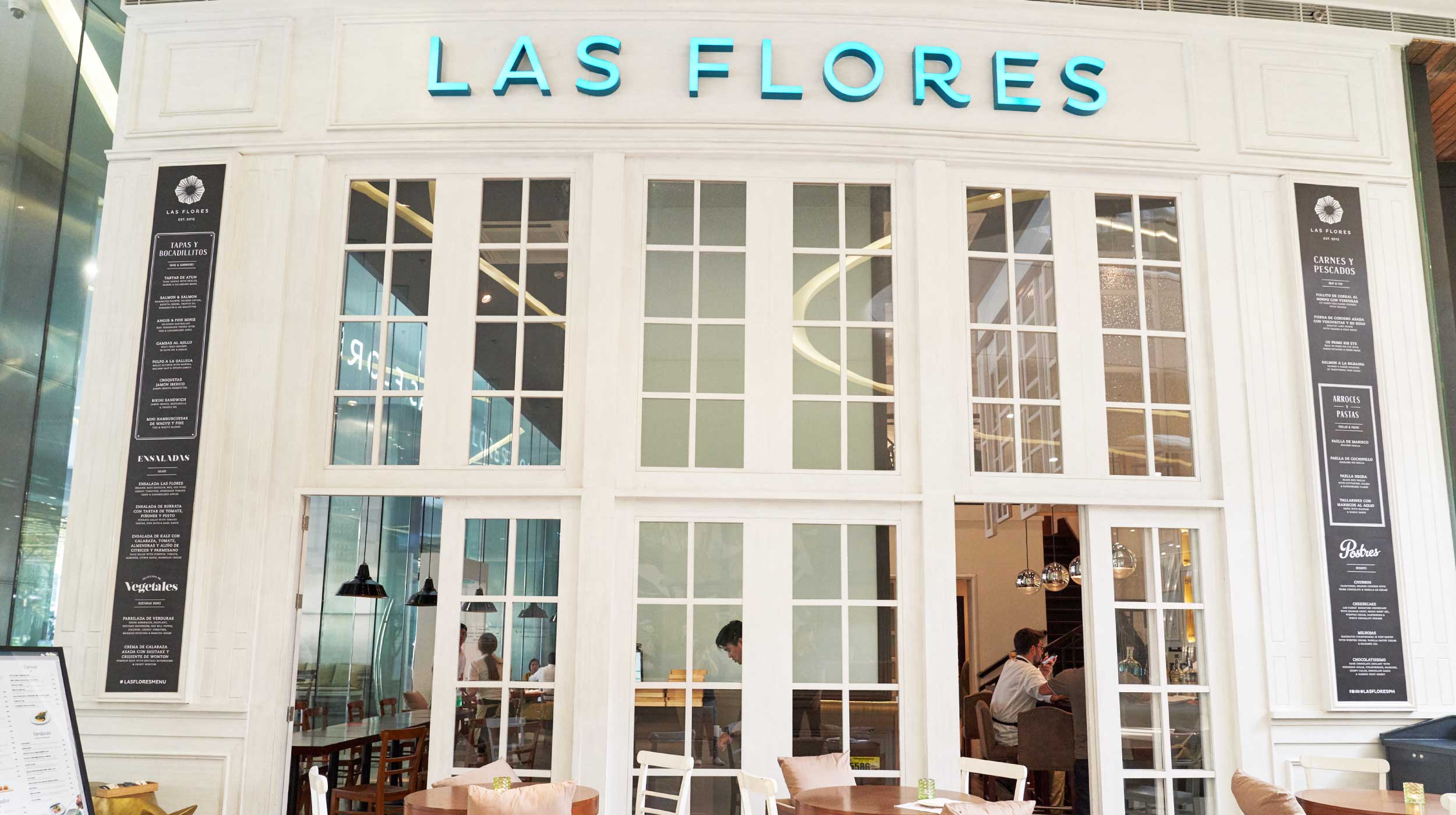
- Visual Identity
- & Bistronomia Design Team — Graphic Design
There is particular intent in naming a Spanish tapas bar “The Flowers”.
The brand —
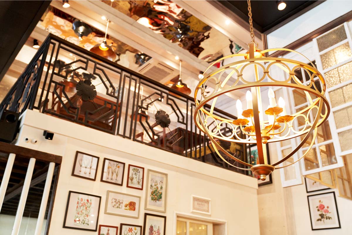
The direction is both romantic and straightforward as it focuses on the harmony of food, service, interiors, and music. From the beginning, this entire experience was meant to convey modern Spanish dining in a bold and seamless manner.
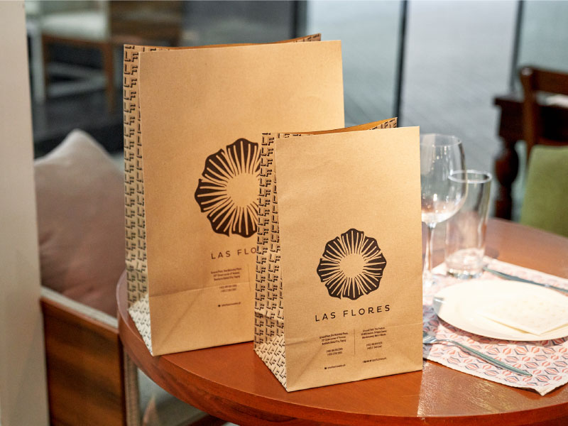
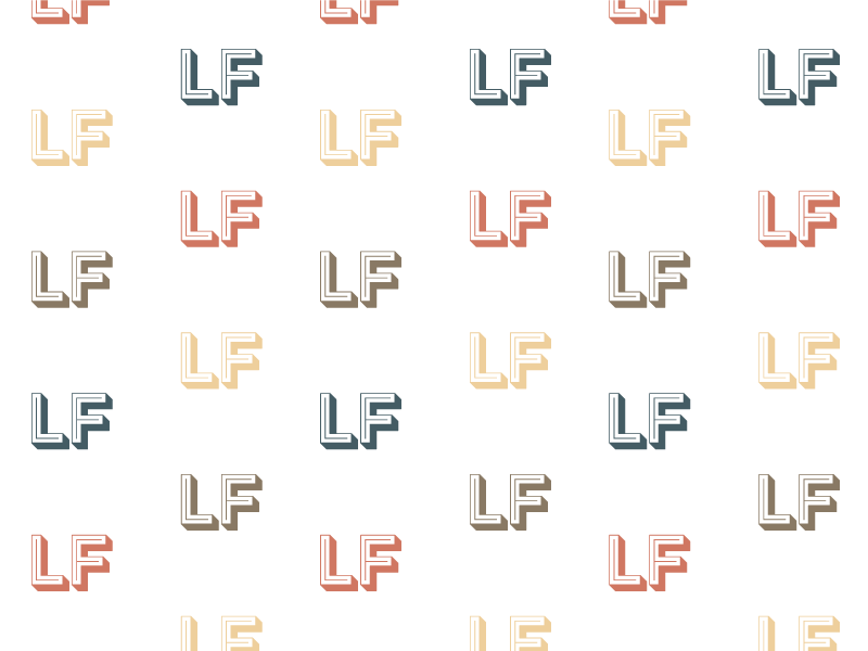

Part of our thought process was blurring the act of designing a flower shop and a restaurant. As long as the ethos and vibe were on point, we knew we were crafting the right brand identity.
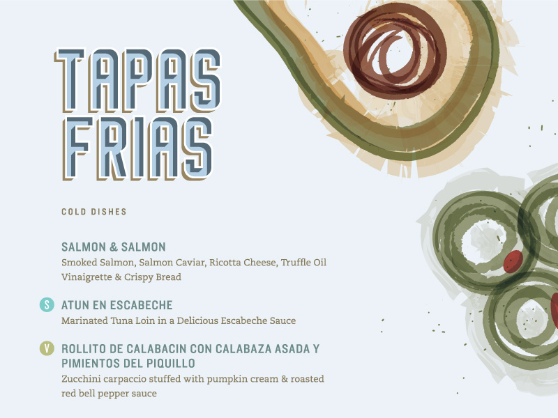
The process —
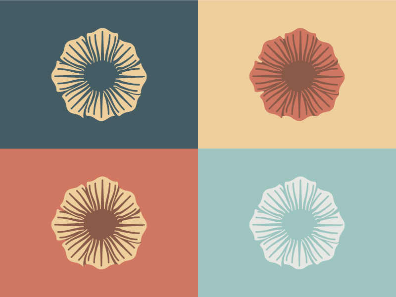
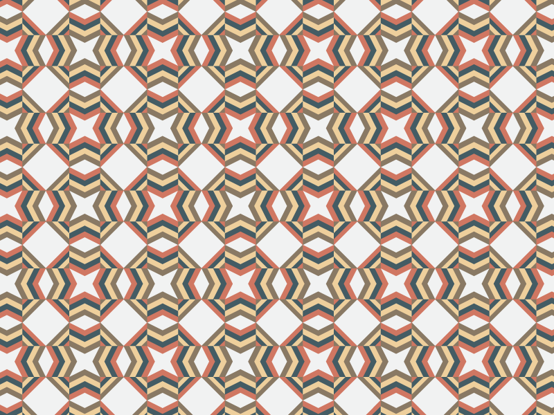
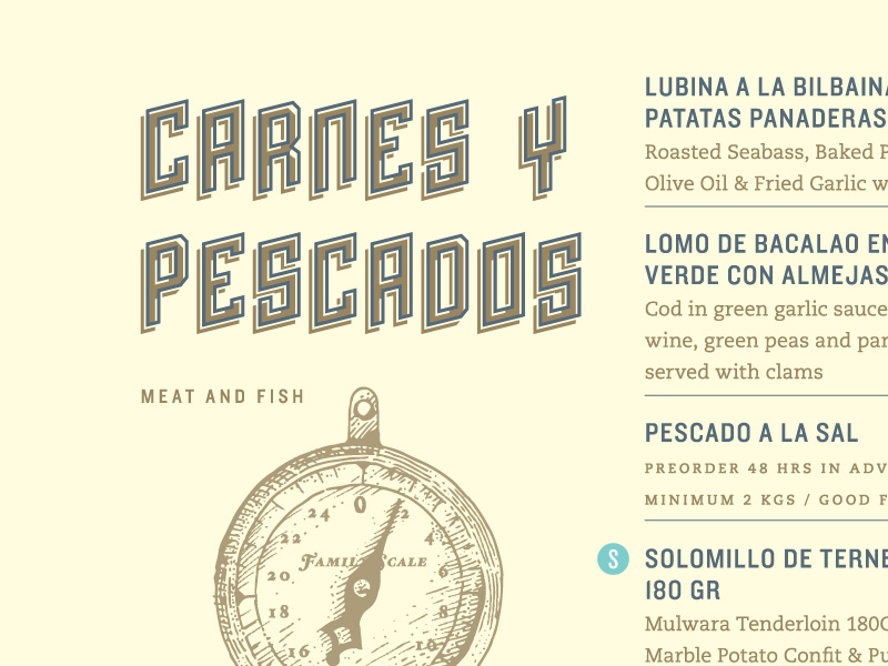
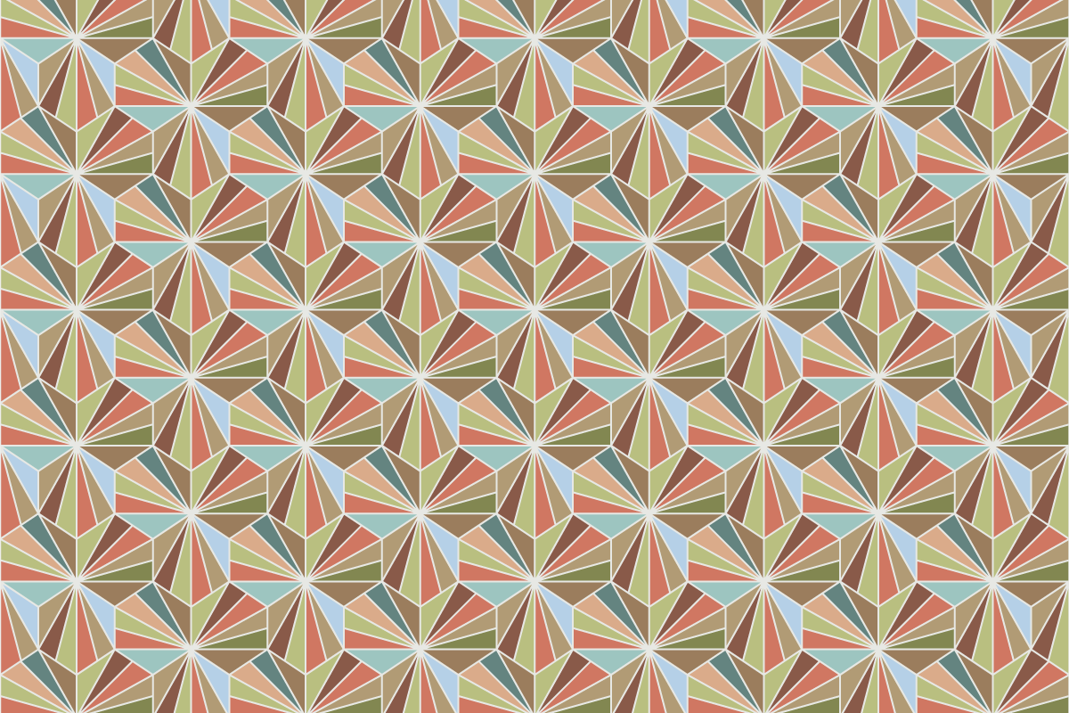
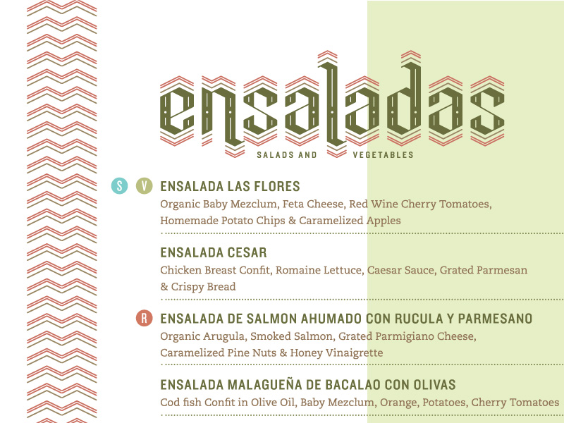
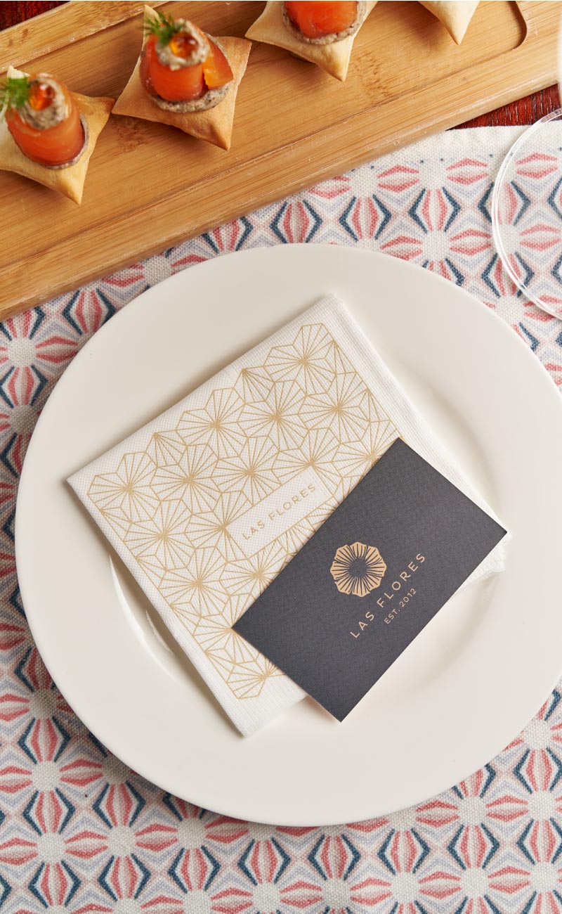
Las Flores’ visual identity is vibrant and playful, while being mellow and pastel. We created geometric patterns, organic textures, and a wide array of soft colors. The illustration and typography styles are varied, yet housed in a singular direction. The clean layout and negative space then balances all the playful elements.
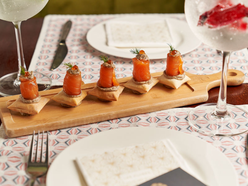

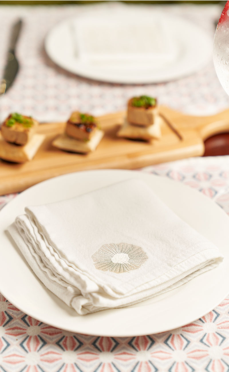
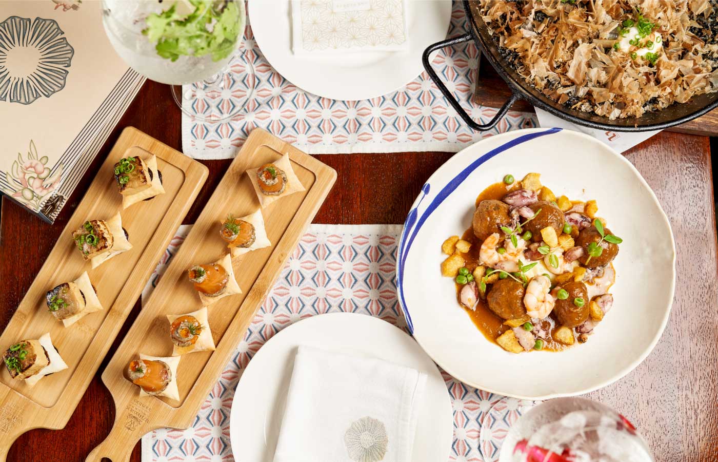
After almost 7 years and 2 strong branches, Las Flores did not have to explain why a tapas bar would literally be named flowers. Their customers just ate, had a great time, and kept coming back.
— PREV
Kyoto Chaya
NEXT —
BCN by Rambla