- Verbal Identity
- Visual Identity
Design Challenge —
How might we stay true to the creative spirit of Barcelona?
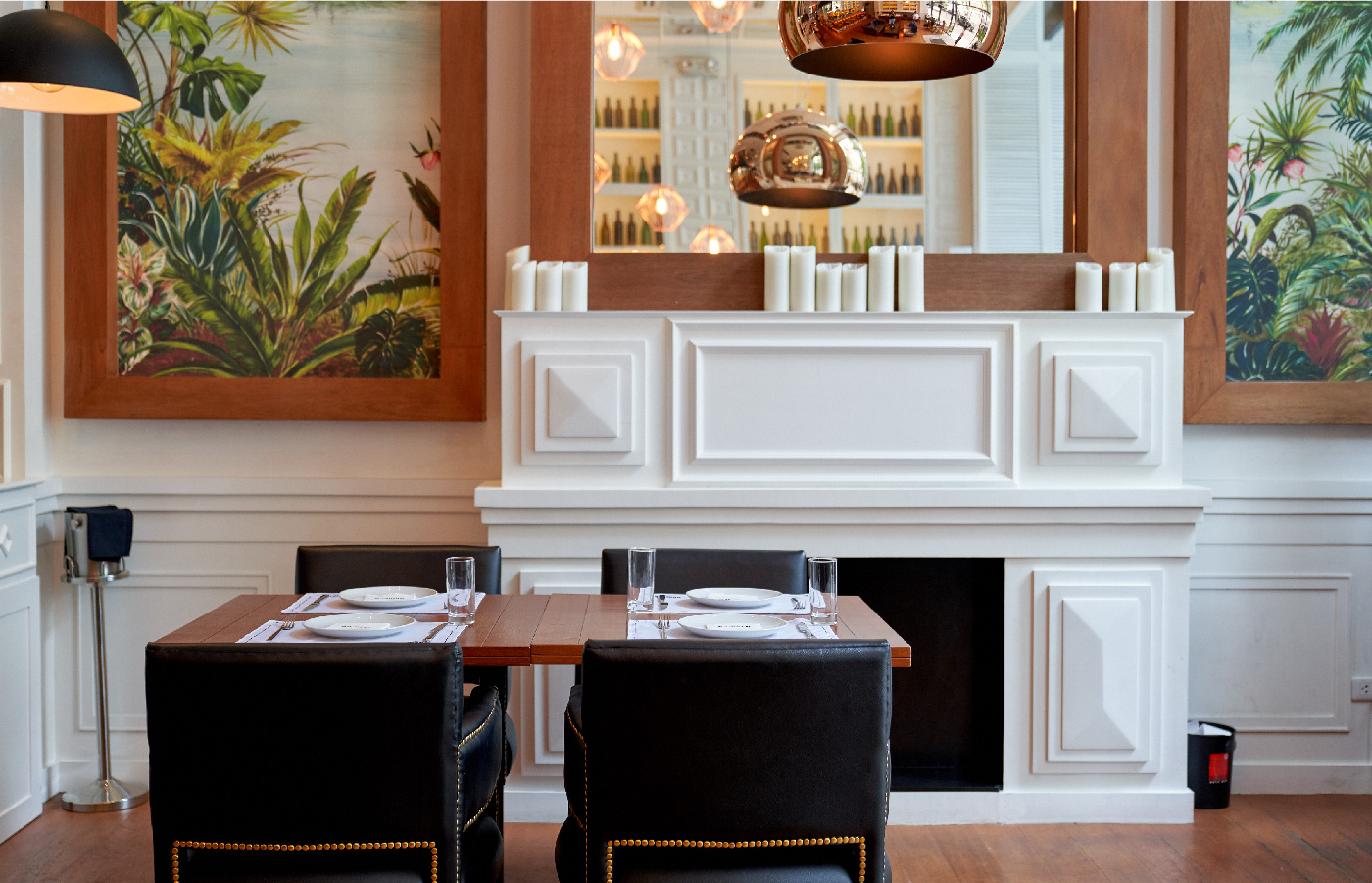
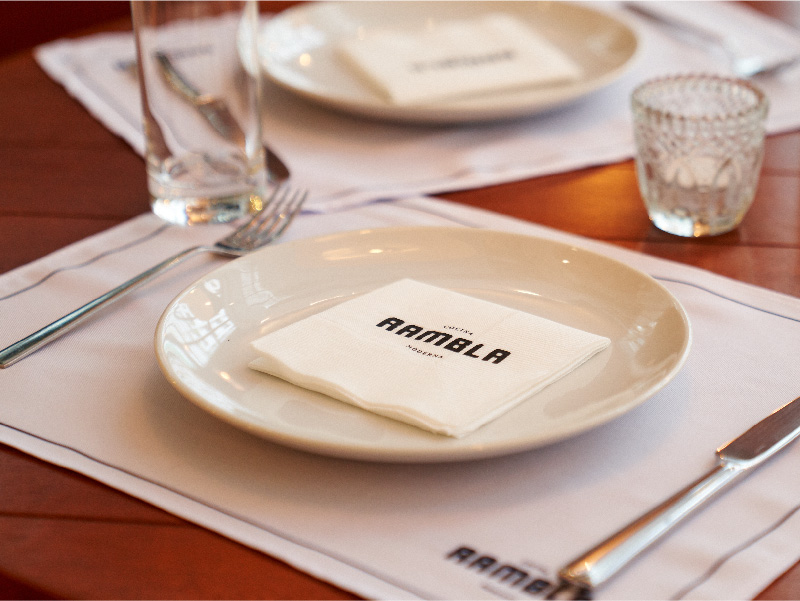
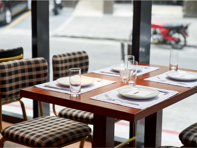
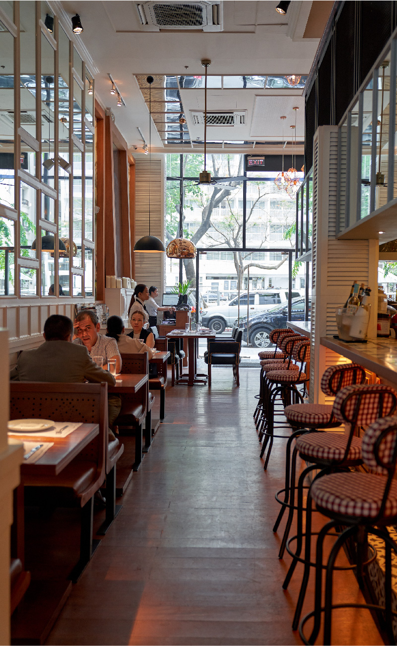
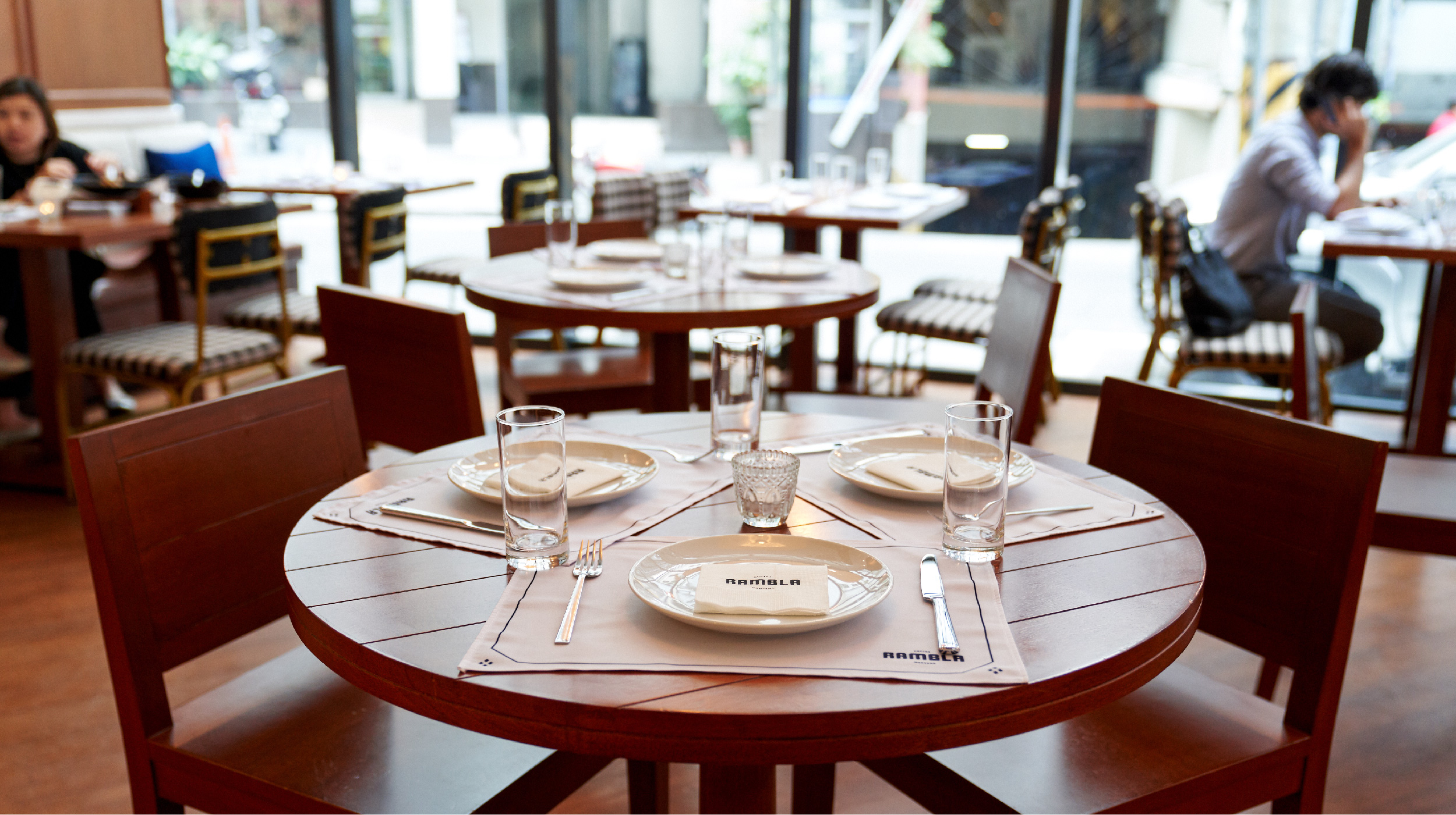
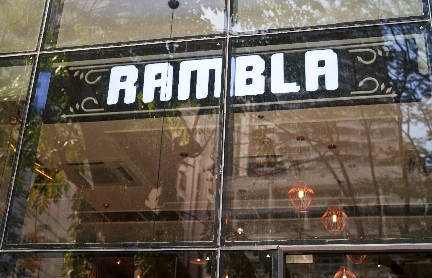
A longtime Rockwell favorite, Rambla is a modern Spanish restaurant that specializes in inventive tapas. For their second branch, our good friends from Bistronomia asked us to update their branding. They wanted to better visualize the inventive and open-minded spirit of Barcelona to complement their contemporary menu. From that direction, we looked to Barcelona herself— the city’s architecture and neighborhood restaurants to form an identity that was modern, flexible, and playful.
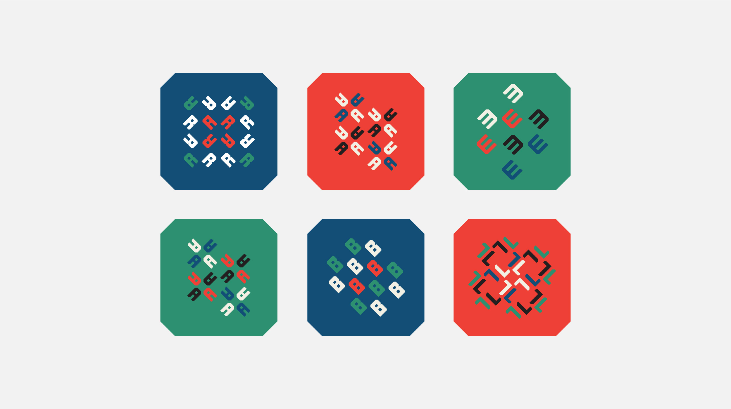
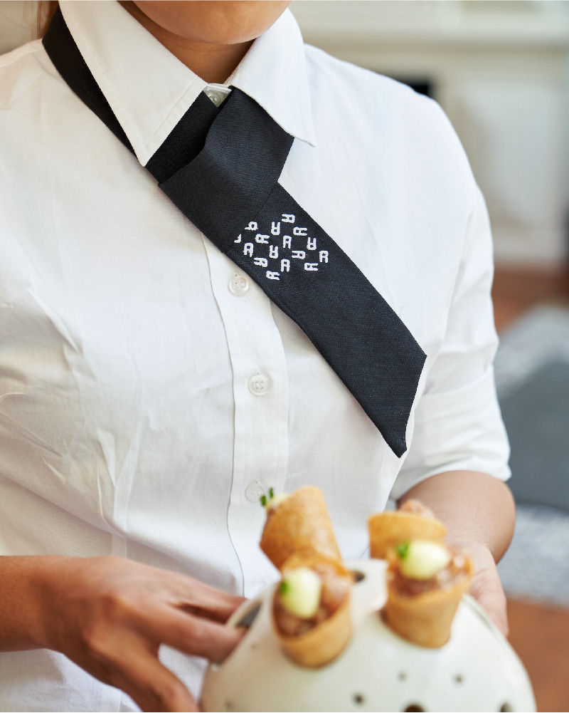
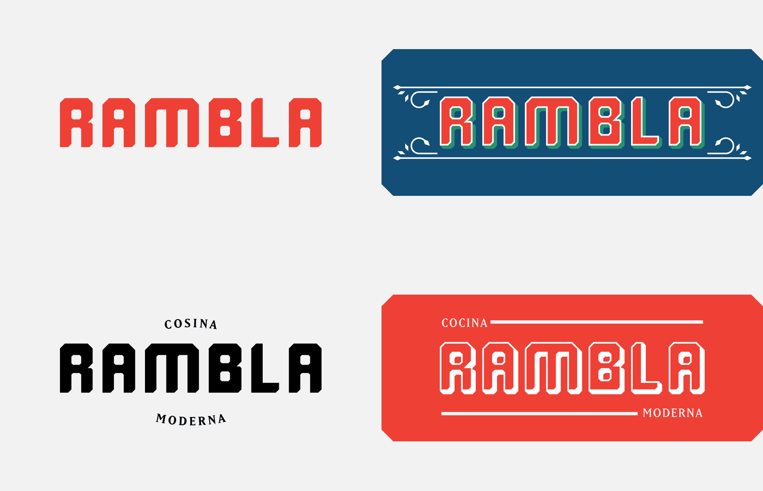
We started with Barcelona’s city grid. The corners of the logotype and graphic containers mimic the chamfered corners of city’s oldest buildings. The layout follows this idea, keeping things compact and evenly spaced out on a grid. And as an ode to the city’s famous tiles, we designed flexible patterns from the wordmark that can be mixed and matched for either accent elements or seamless backgrounds.
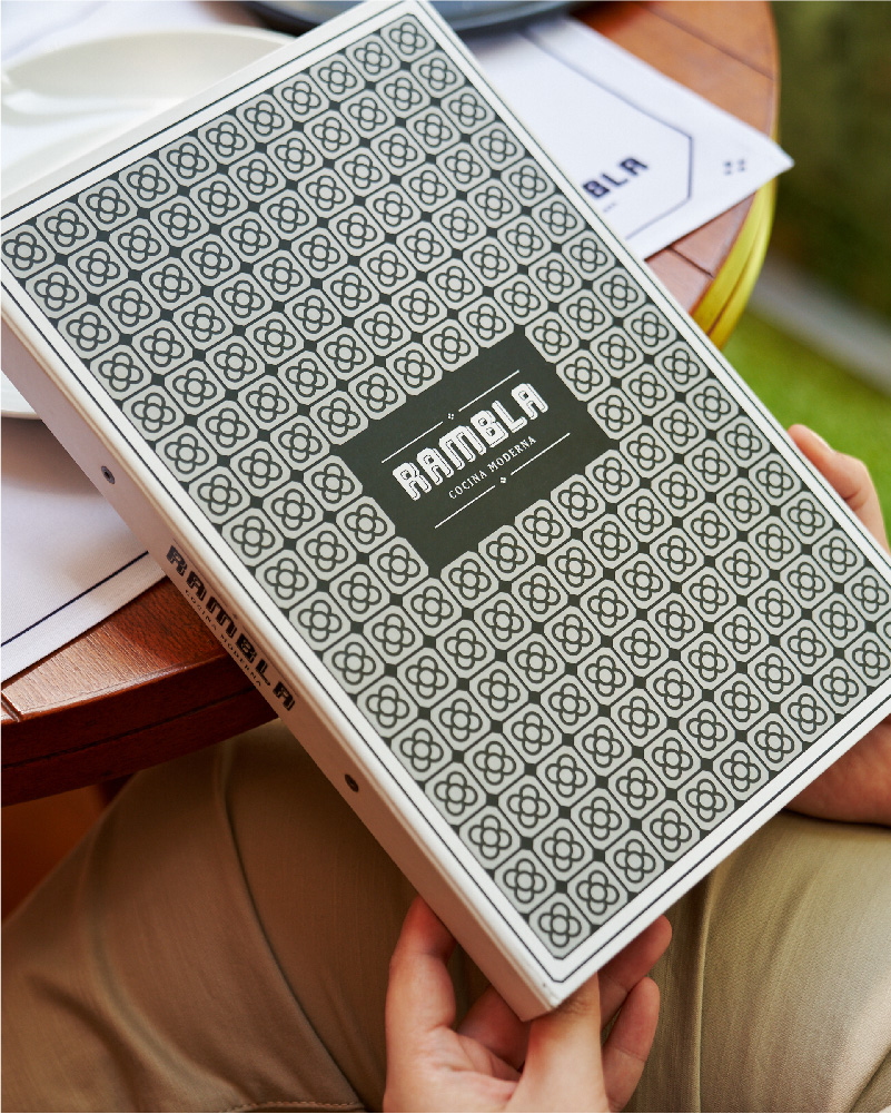
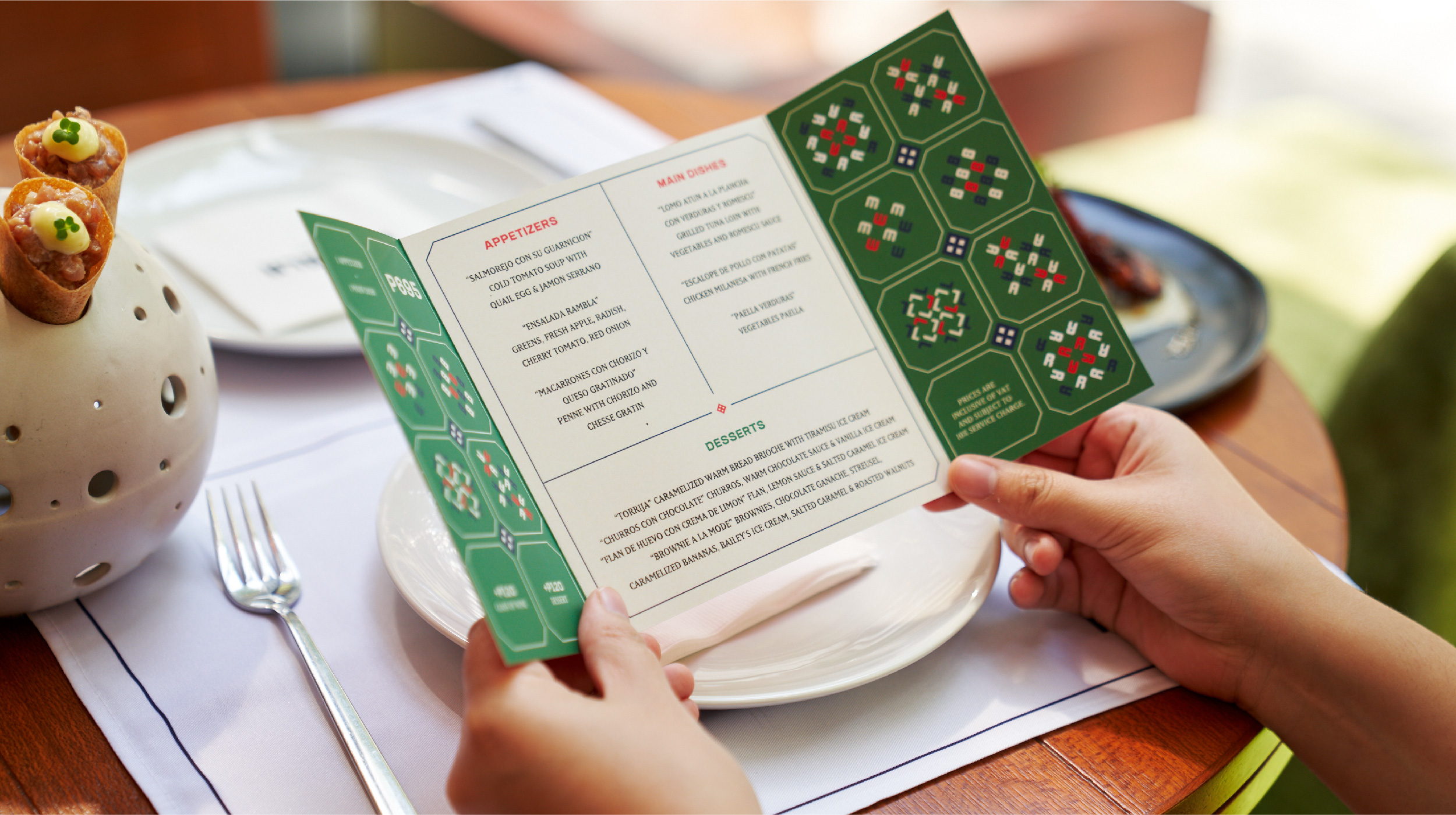
Rambla is meant to be a place to enjoy life through the delight and discovery of food. Our design complements the playfulness of the menu and the passion of our partners to cook in the free spirit of Barcelona.
— PREV
BCN by Rambla
NEXT —
Digital Walker