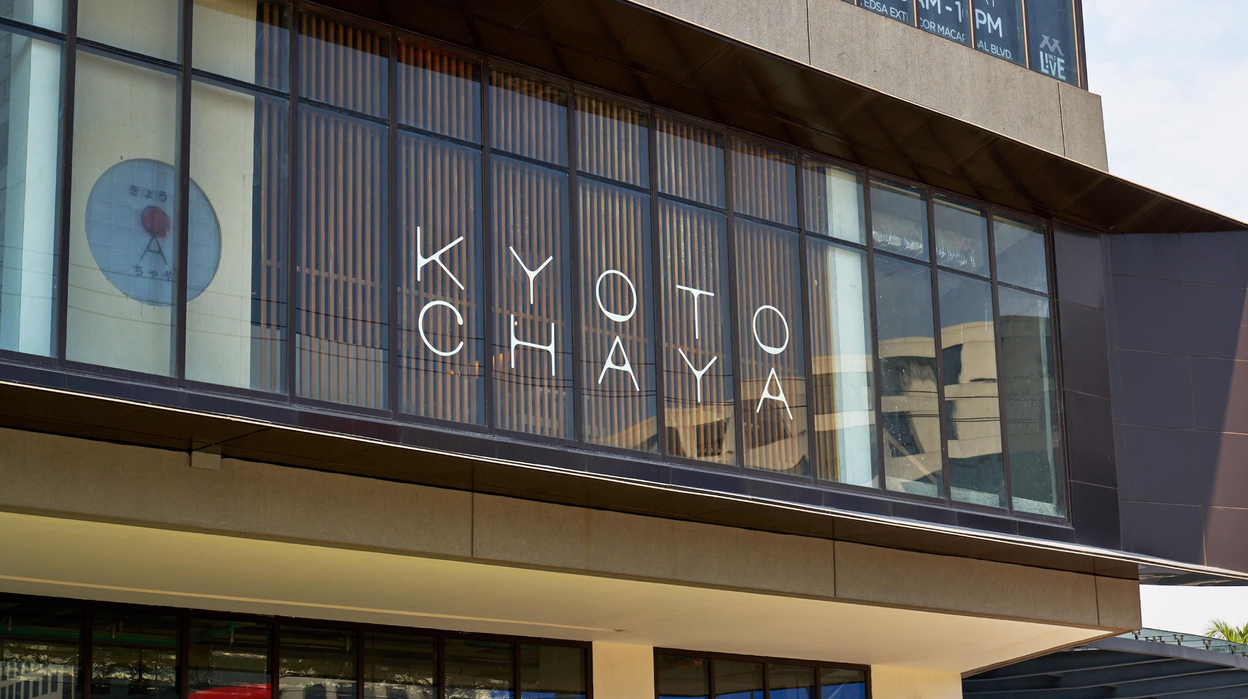
- Illustration
- Visual Identity
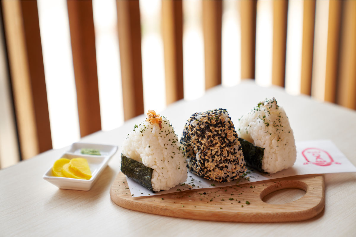
Kyoto Chaya is a Japanese café that serves quality tea, coffee, and light traditional meals. 茶屋 or chaya is the traditional Japanese tea house.
The brand —
Combining the cultural richness of Japan’s oldest capital and the subtle quality of a traditional chaya, we wanted the brand to convey that same kind of relaxation, gentleness, and clarity.
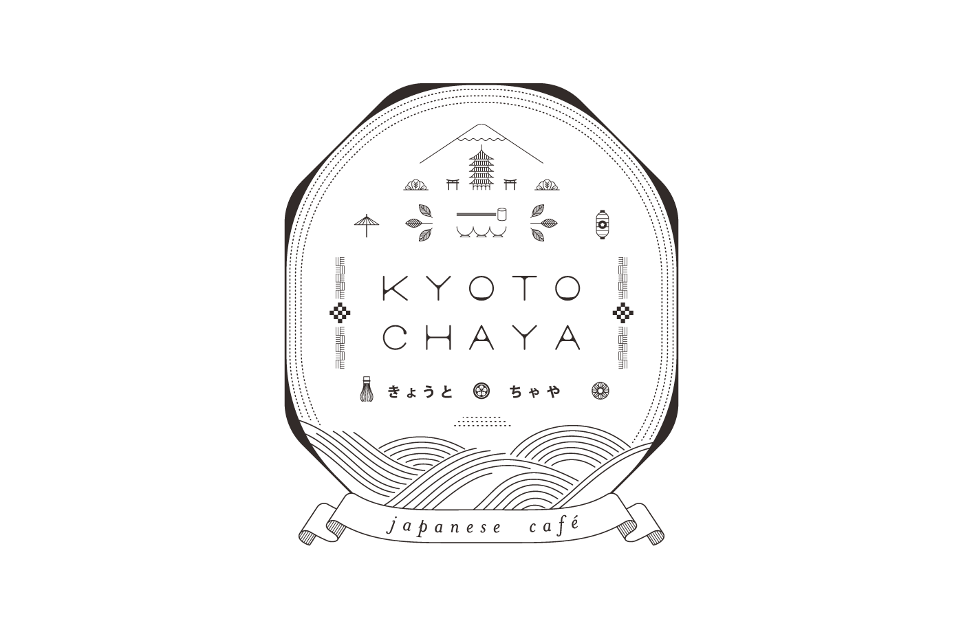
The logo —
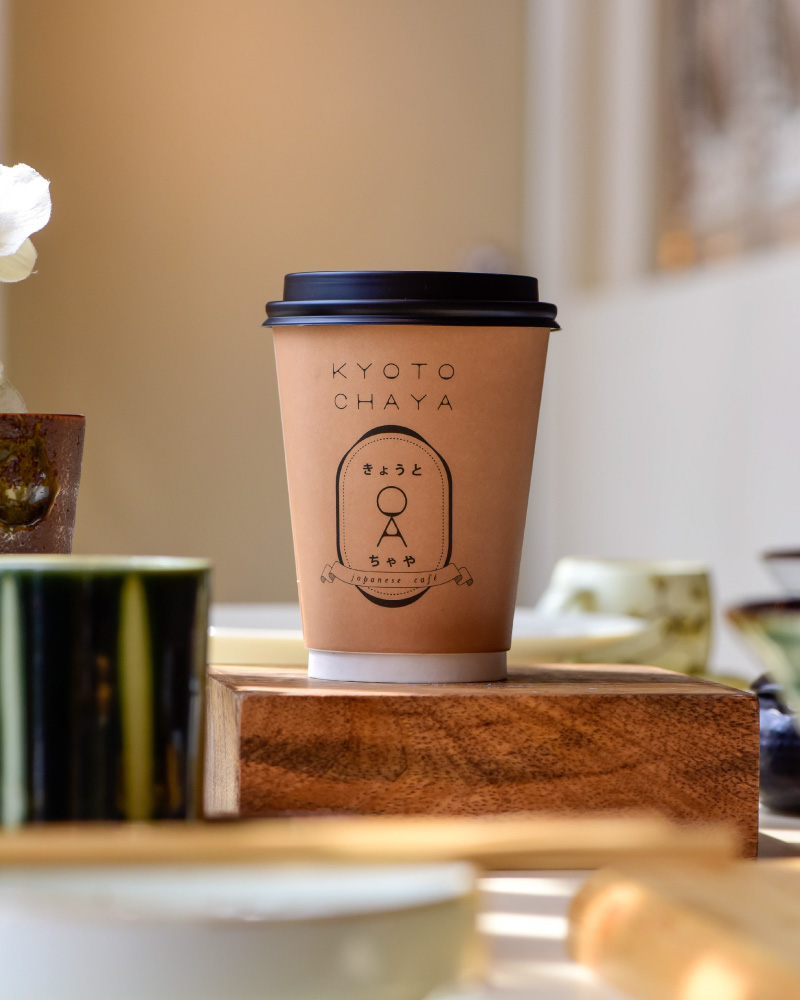
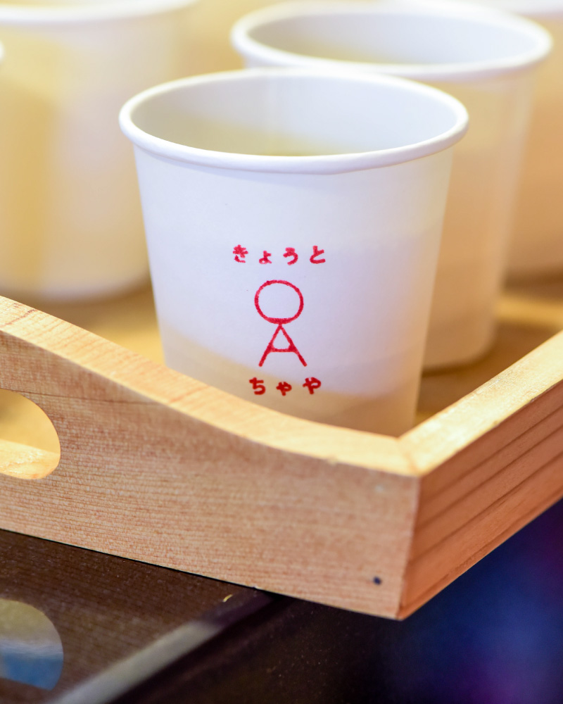
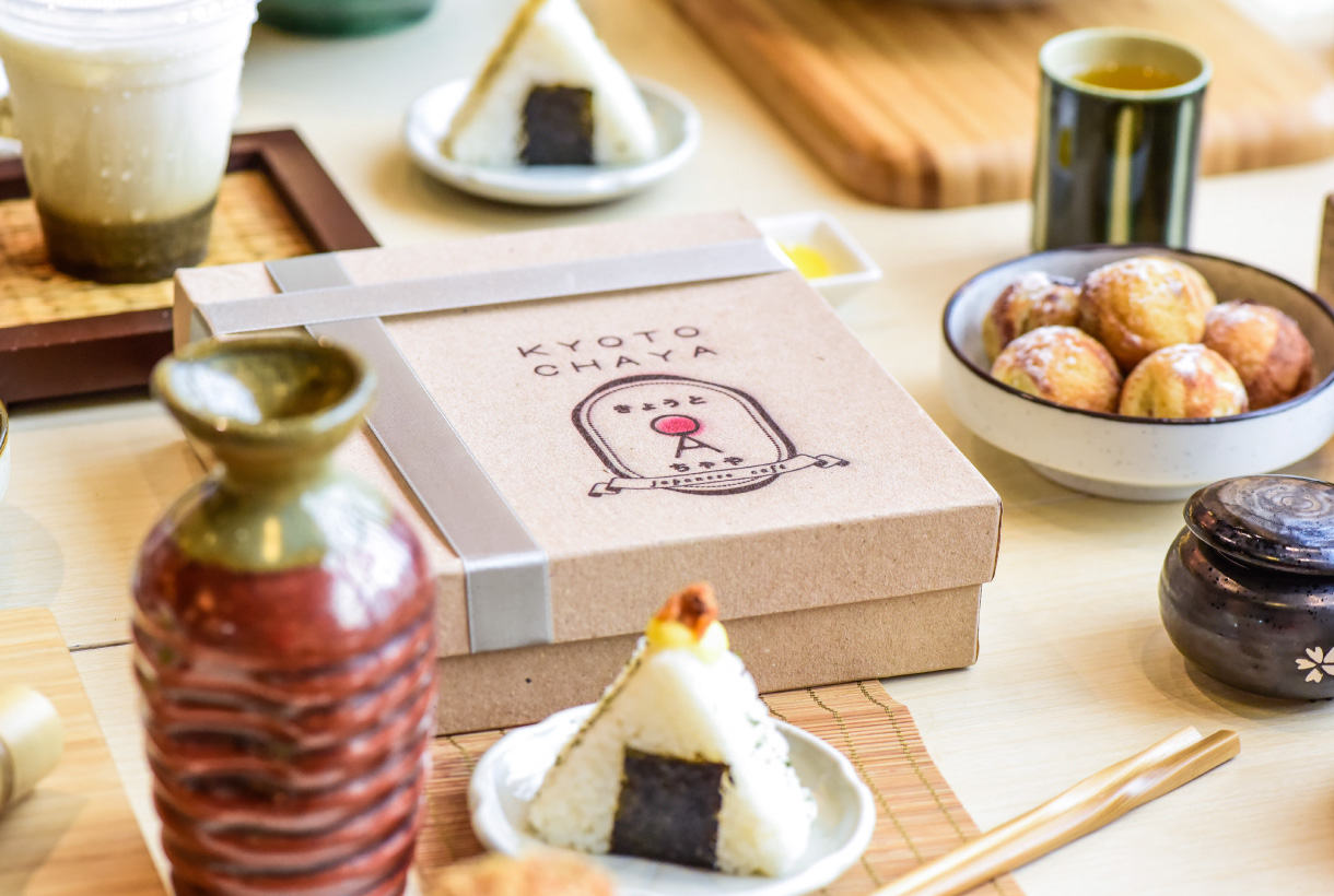
The identity begins with the large and illustrative logo, broken down and into various lock-ups. Every part of the logo was inspired by various Japanese tea paraphernalia. The custom logotype is geometric but soft, characterized by the understated width variations.
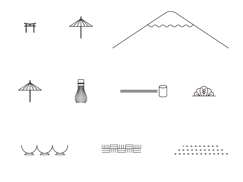
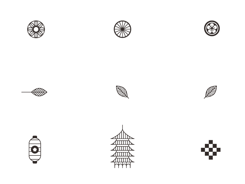
Iconography —
To balance the old and the new, we paired traditional Japanese patterns with modern iconography. We drew elements from the logo and created a set of icons that were crisp and consistent, but we constantly balanced these out with a set of soft colors inspired by traditional Japanese pastries.
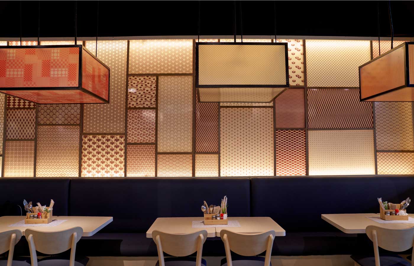

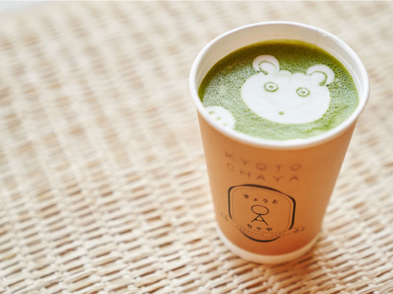
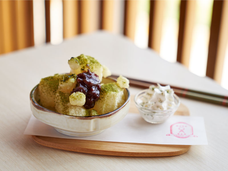

It is subtle with hints of the intentional quirk. There is always that crafted delightful detail in the stillness of its simplicity.
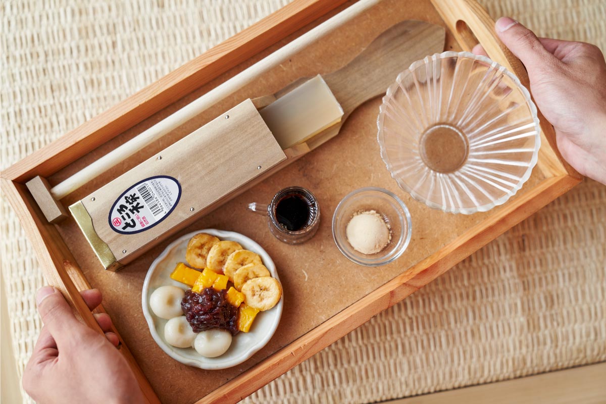


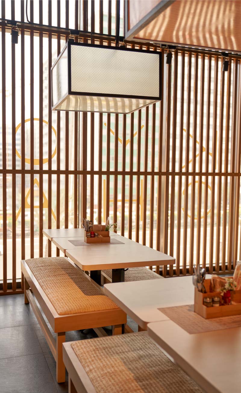
Kyoto Chaya is a deep breath. It is a wide window. It’s a relaxing afternoon.


— PREV
Latitude
NEXT —
Las Flores