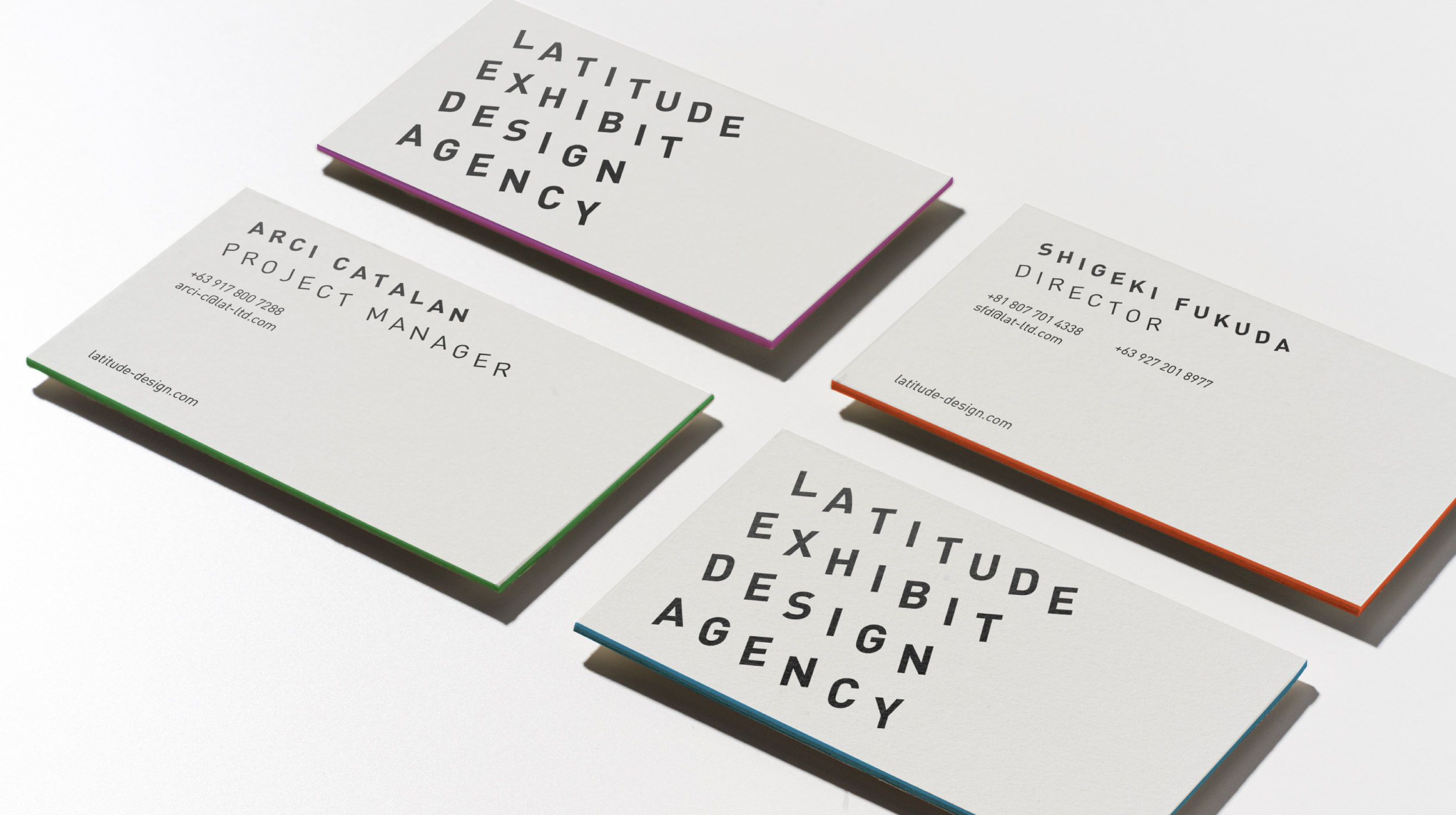
- Visual Identity
- Website
Design Challenge —
How might we visualize Latitude’s end-to-end service?
Latitude is a Tokyo-based exhibition design agency that plans, designs, and manages exhibits from all over the world.
For Latitude’s rebrand, we stayed true to visual essentialism or the disciplined pursuit of less. We included only what was necessary, introducing minimal but impactful changes. All of which were in line with the brand values of quality and simplicity.
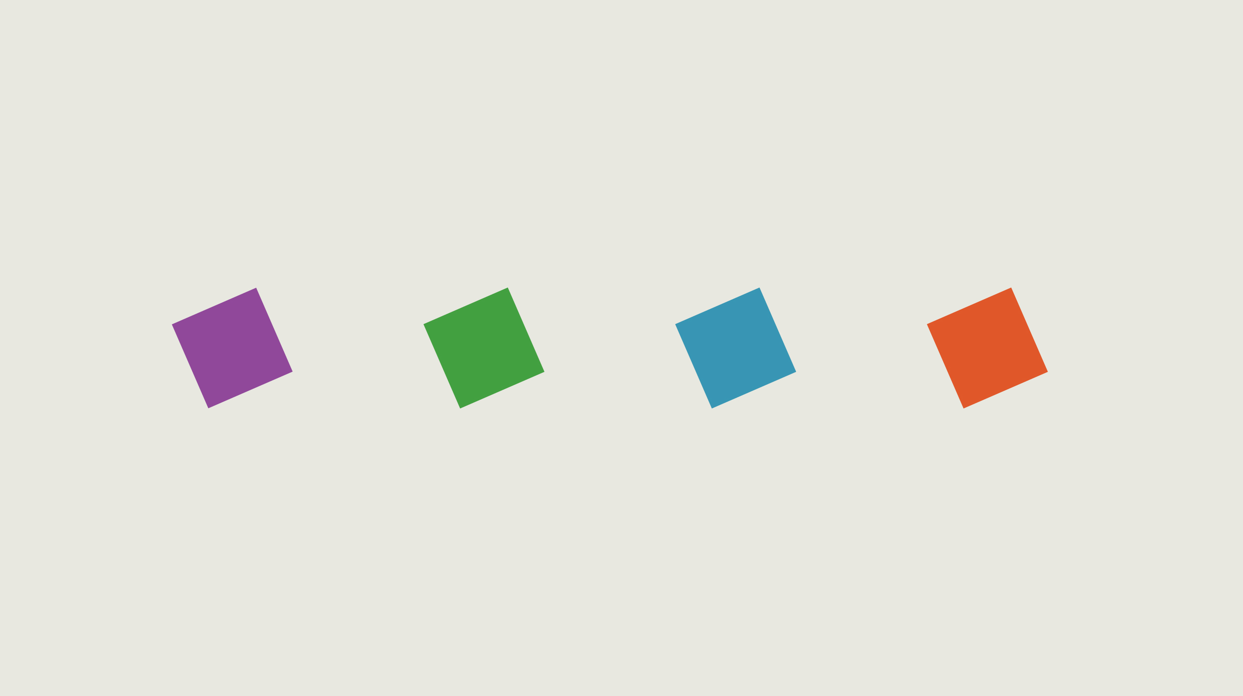
The little details that make all the difference. —
Latitude is the angular distance of a place north or south of the earth’s equator. The angle used on the text and other brand elements is based on the earth’s natural tilt of 23.5°.
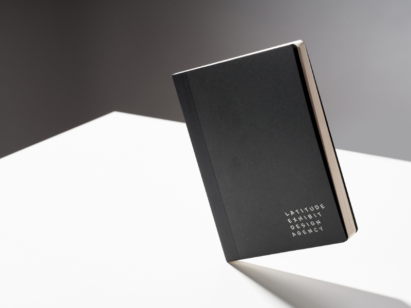
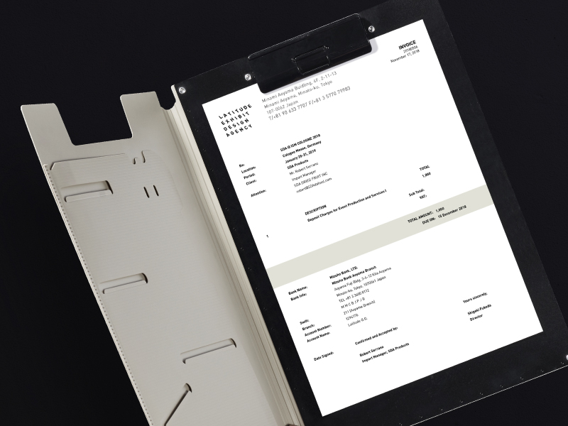
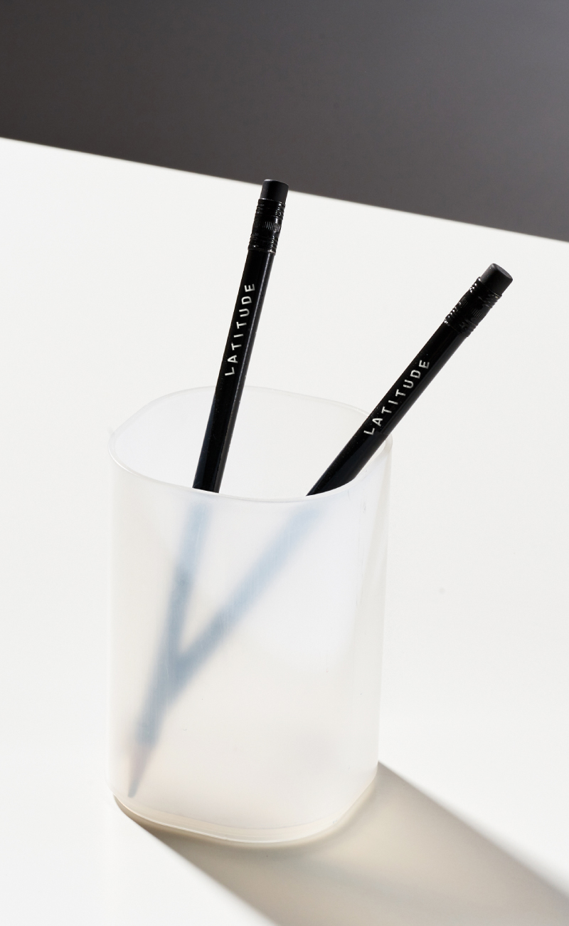
Simple but fine details are what make up this distinctly Japanese-inspired identity.
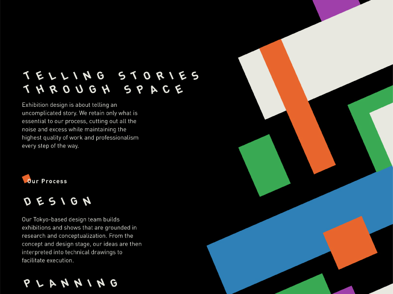
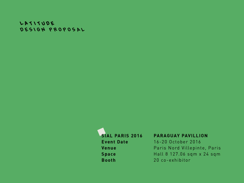
Each client of Latitude has a story to tell and Latitude believes in telling simple and uncomplicated stories.
They cut out all the noise while maintaining the highest quality of work in every step of their design process.
— PREV
Menarco Tower
NEXT —
Kyoto Chaya