- Environmental
- Illustration
- Verbal Identity
- Visual Identity
- Website
Design Challenge —
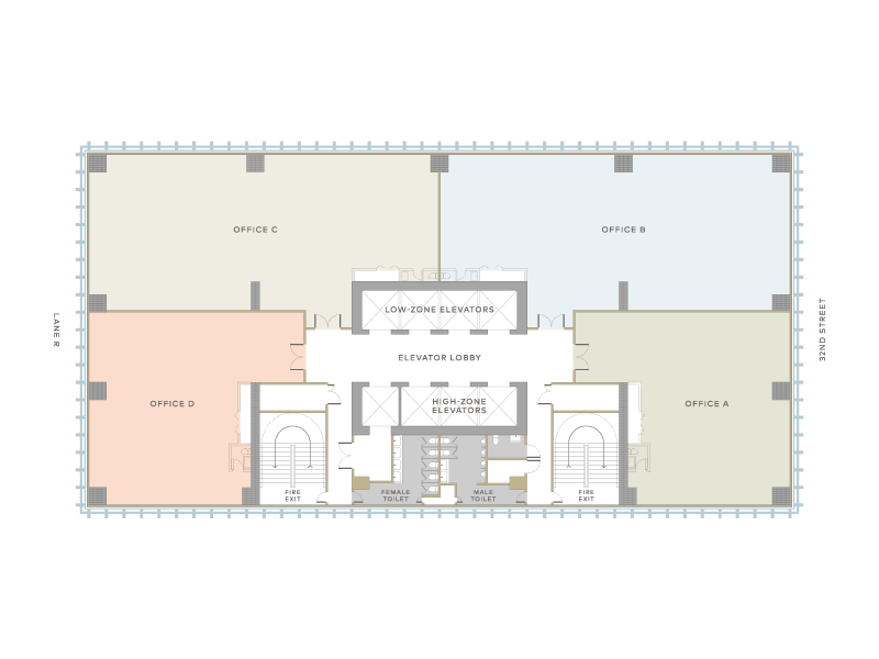
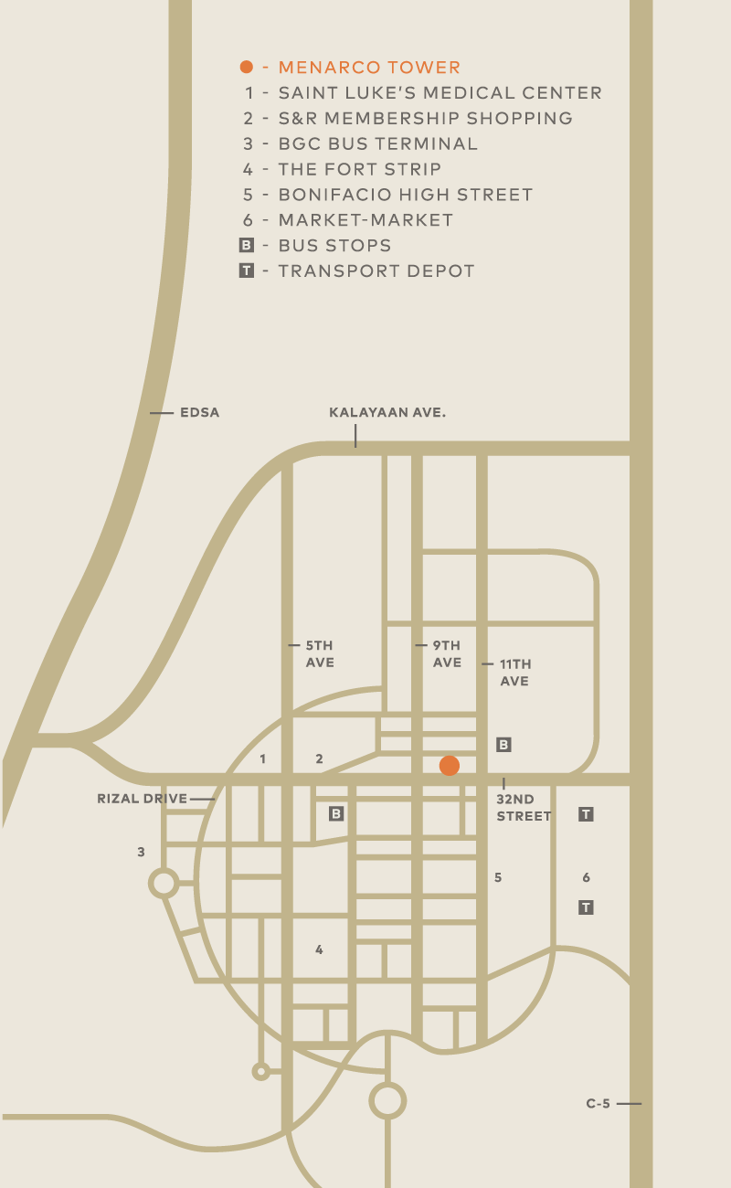
Menarco Tower is a multi-awarded boutique office development located at 32nd Street in Bonifacio Global City. It is currently home to offices like Facebook and Urban Ashram.
We began working with Menarco in 2014. Their vision was to create a building that put the wellness of their tenants first. We had to create a comprehensive brand, spanning identity to wayfinding, and ensure that it encapsulated their vision of creating the healthiest building in the Philippines.
The identity —
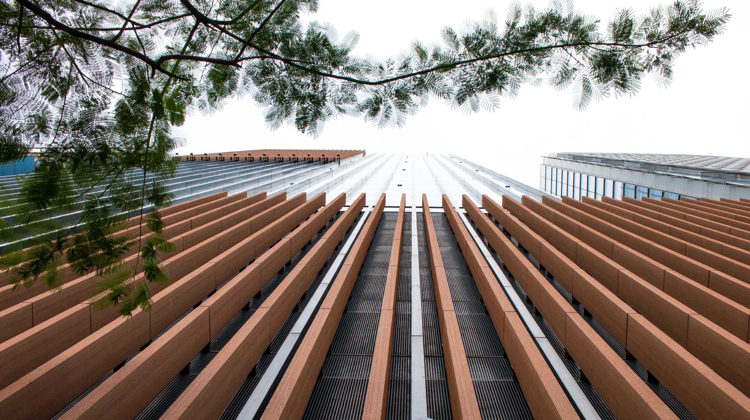
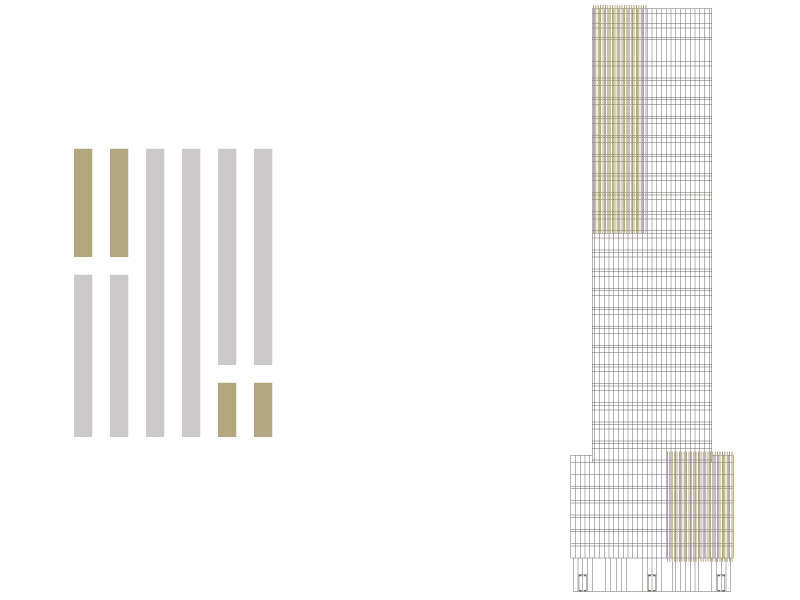
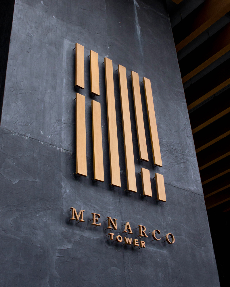
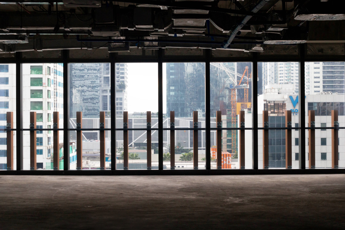
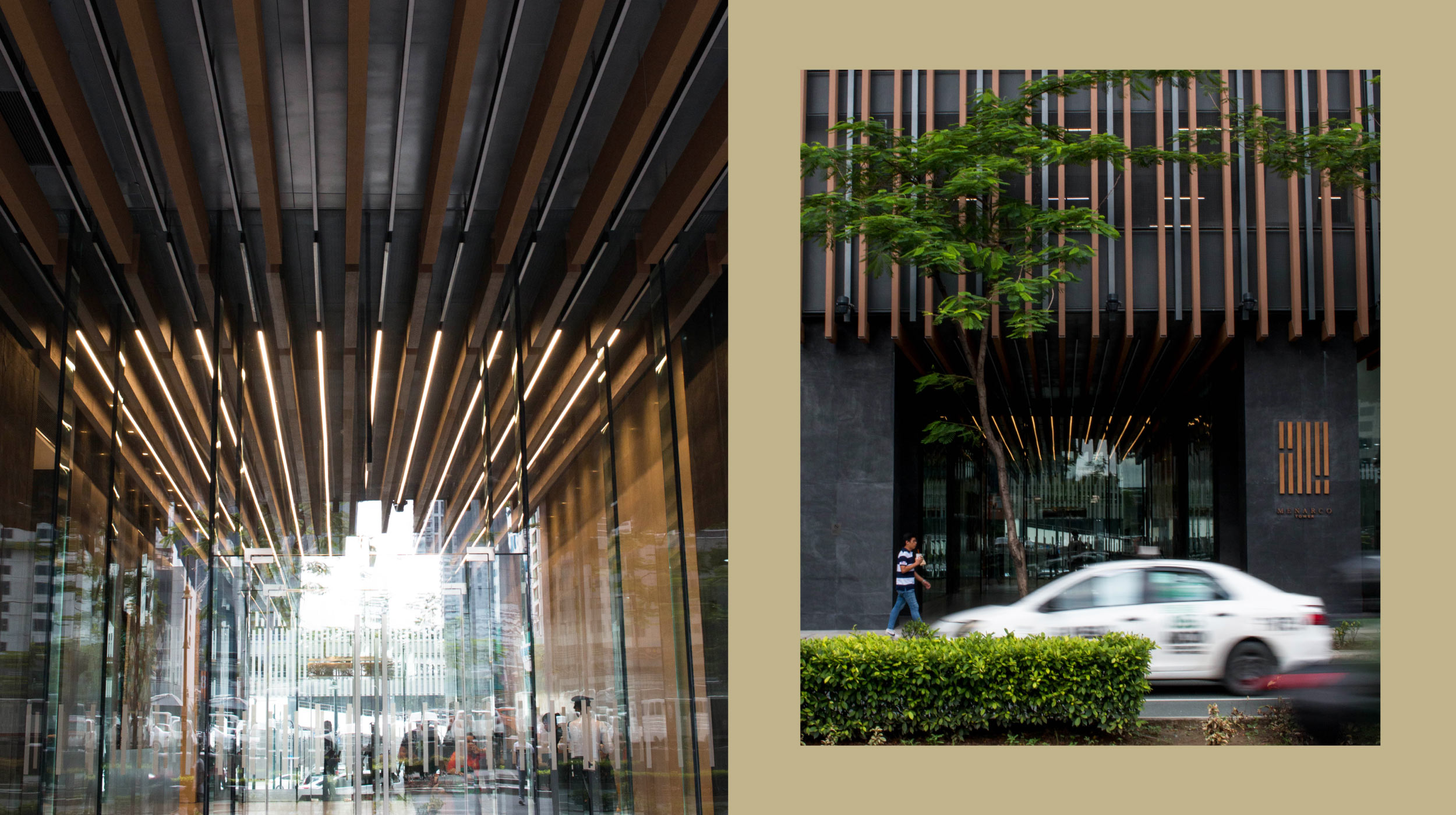
From the outside, Menarco’s commitment to wellness is represented through its unique architecture. Vertical wooden fins are the building’s distinguishing feature, spanning from the ground to the 32nd floor. It is from these fins that we built the key visual element, which forms the bedrock of our identity.
Brand elements —
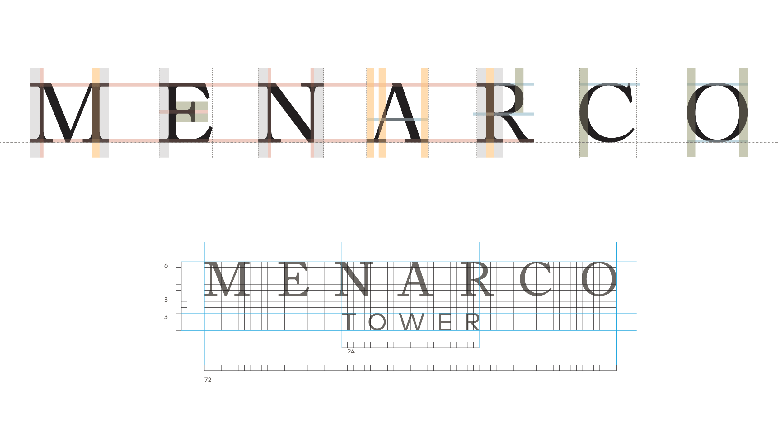
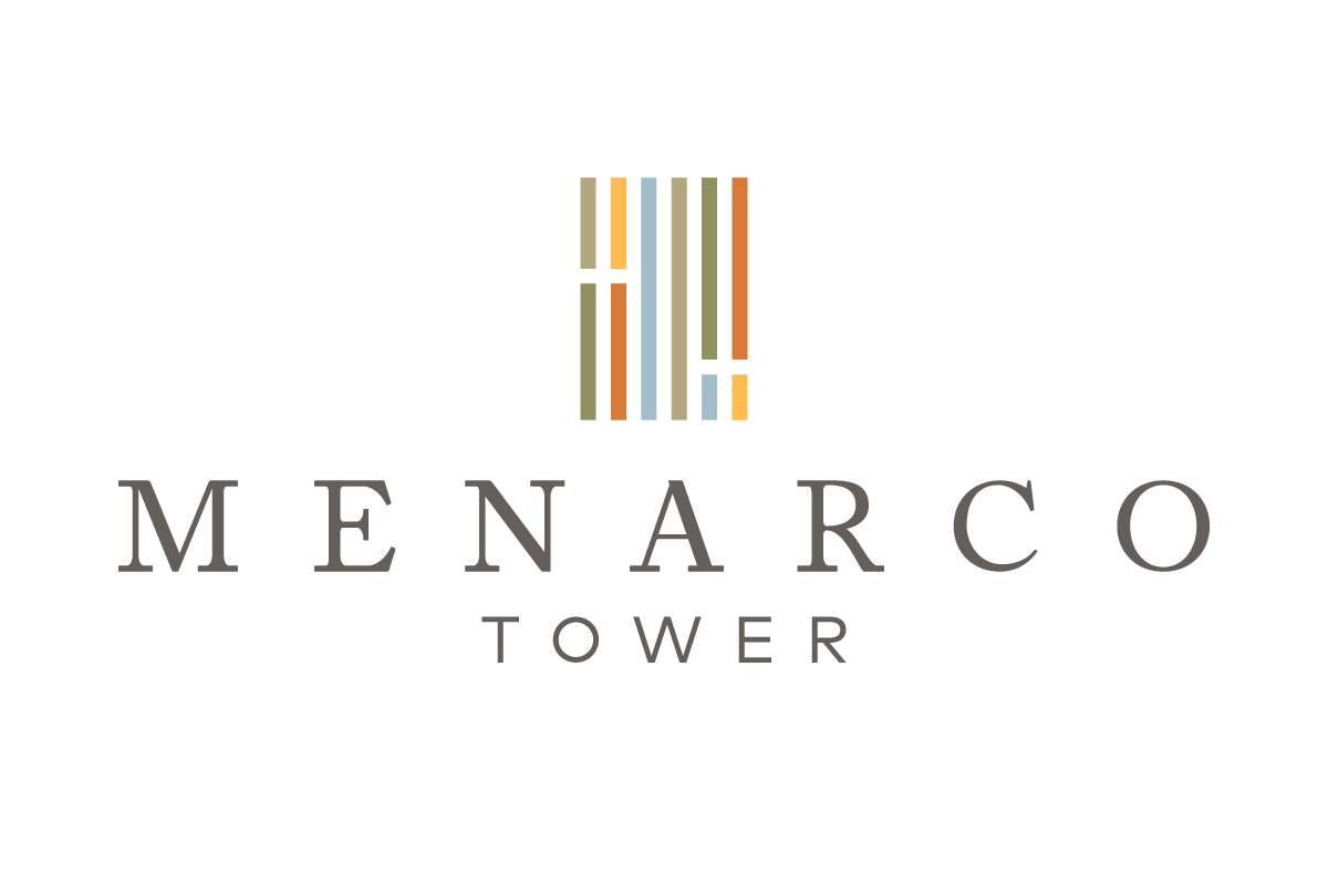
The custom wordmark is an adjusted form of Adobe Caslon Pro, set to consistent height and spacing. Following this, the descriptor is also an adjusted form of Mark Pro to provide warmth to the logo while still maintaining symmetry.
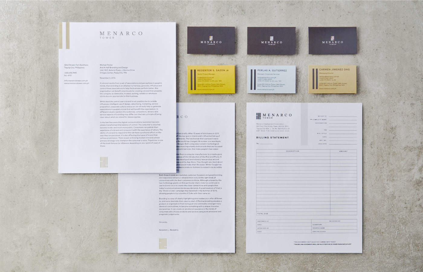
The fins of the building are interpreted into colored bars that appear throughout the brand. It provides structure in different layouts and acts as a highlight for blocks of text.
The Menarco Journal —
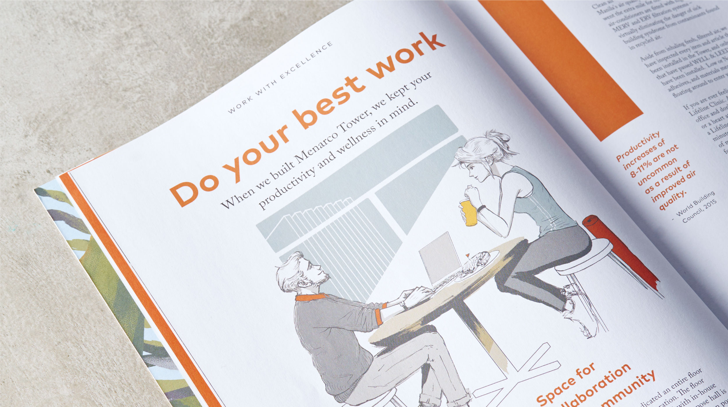
Instead of the usual brochures of corporate buildings, we drew inspiration from lifestyle magazines, boutique hotels, and shared spaces.
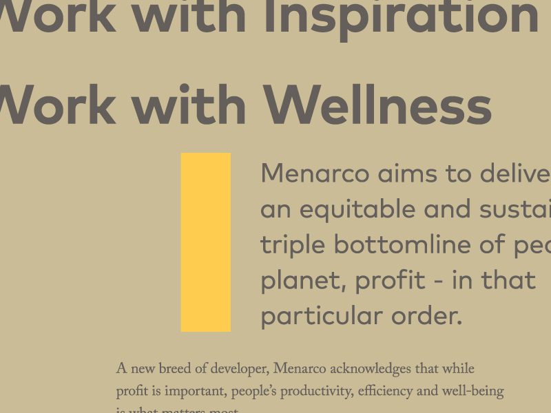
We created a magazine called the Menarco Journal as opposed to creating a tri-fold brochure. The brief was to design against what we knew of typical office towers, which were, more often than not, stiff and uninvolved. With our bright colors and multiple illustration styles, the magazine gives potential tenants a taste of what it means to work with Menarco.
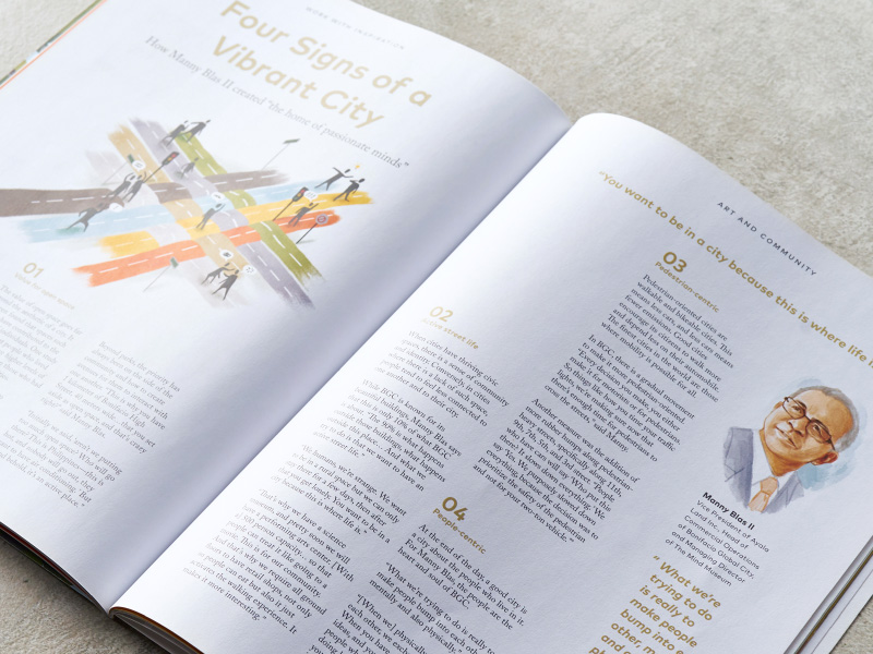
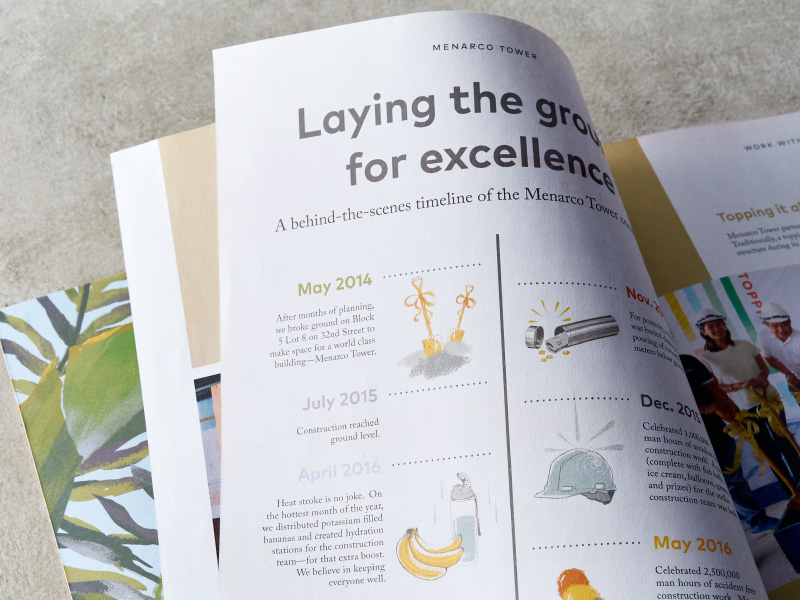
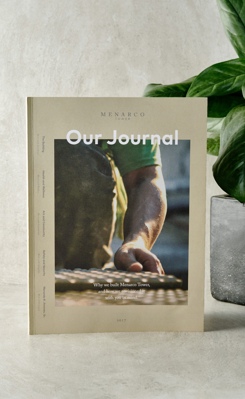
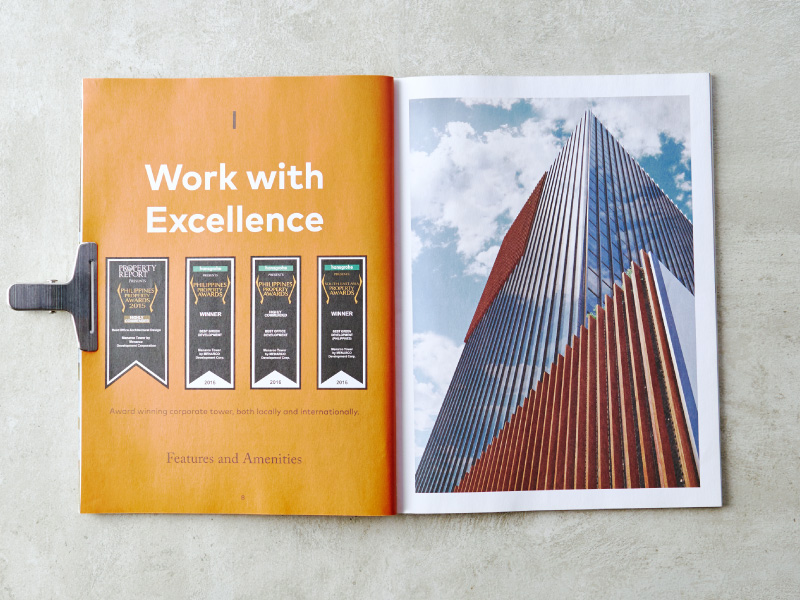
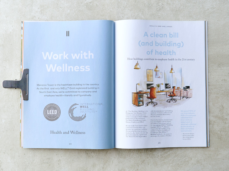
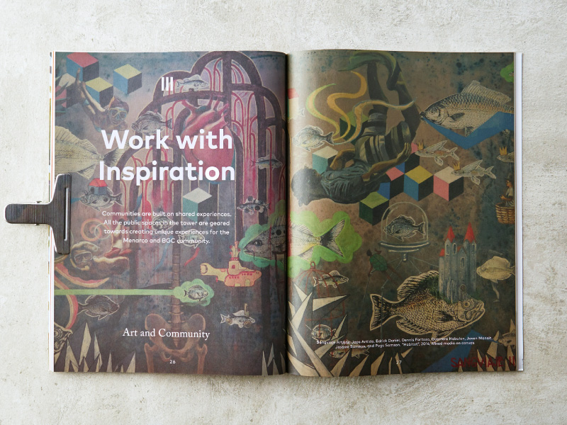
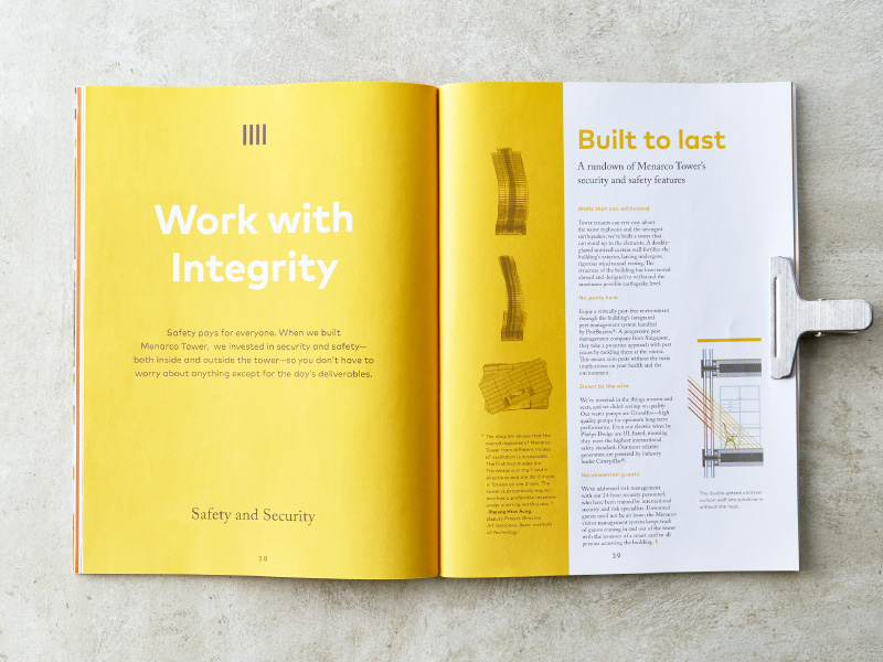
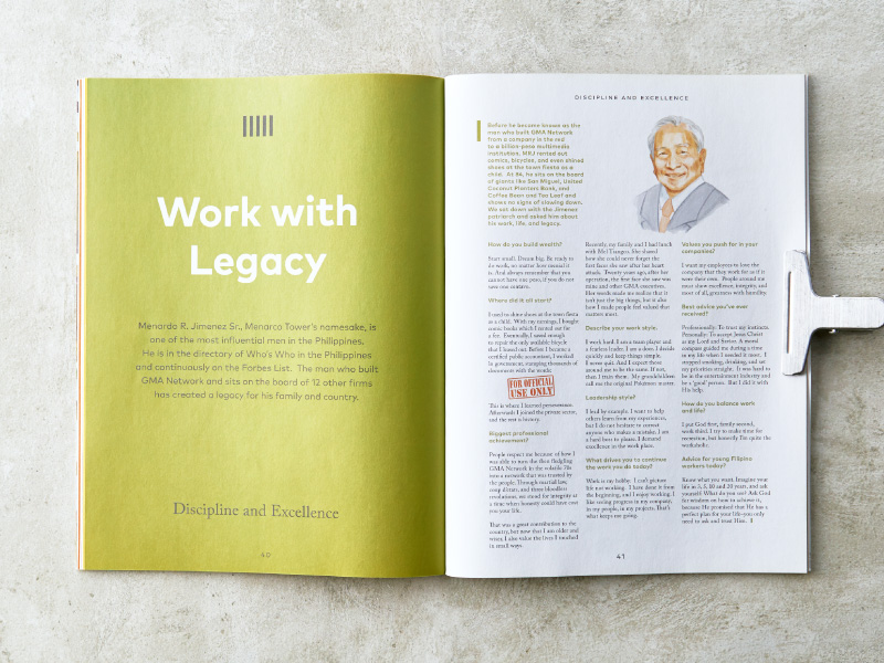
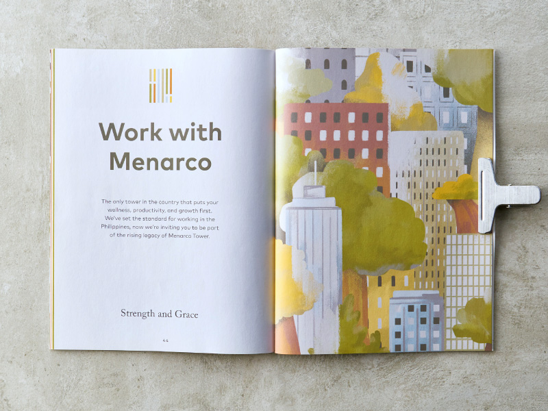
The magazine communicates what Menarco stands for. The whole team was involved in the conceptualization and production of the magazine. Each member having contributed an article or illustration from scratch, creating insightful and informative articles on wellness.

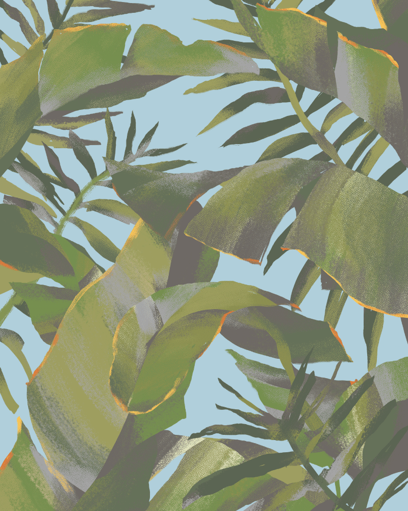
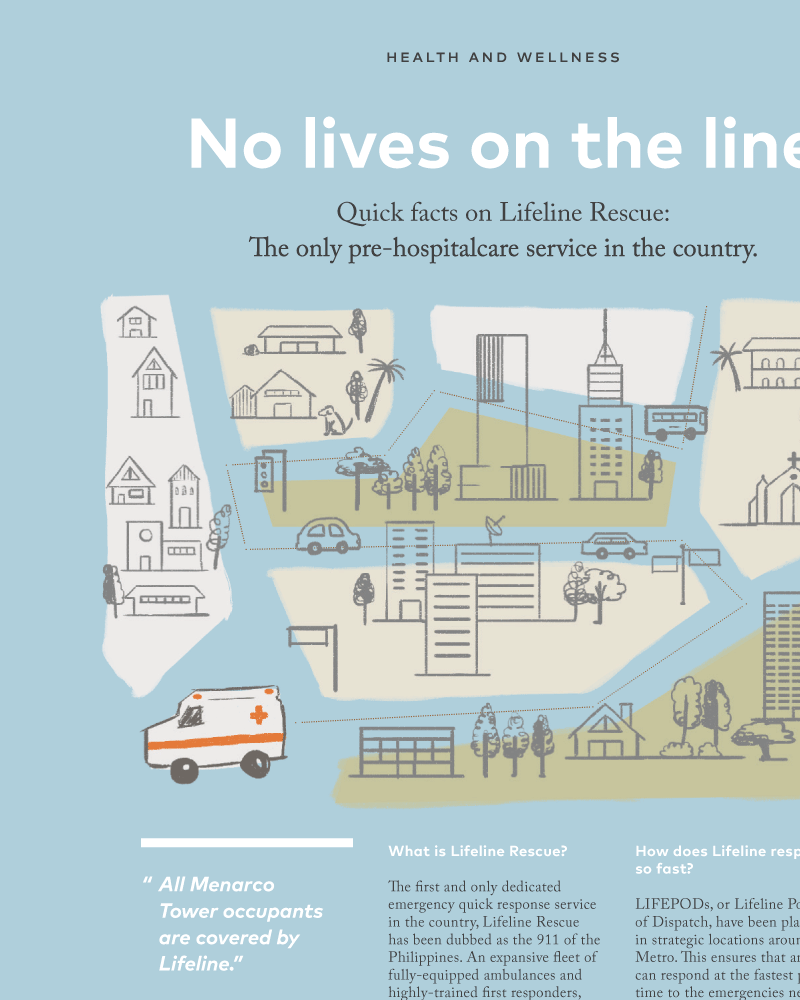
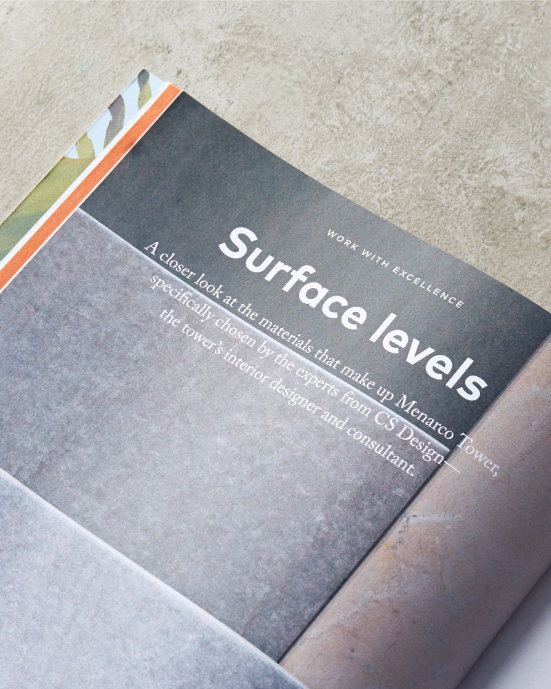
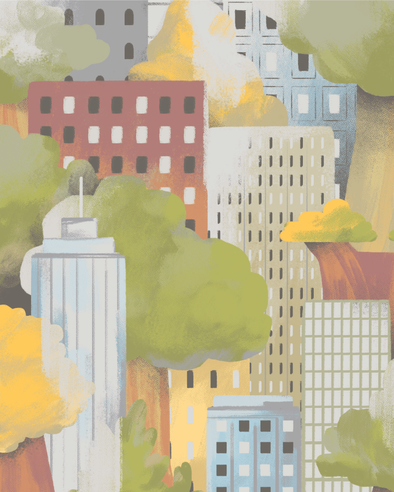
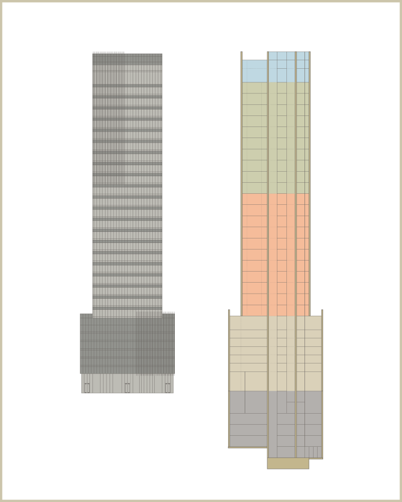
In line with Menarco’s marketing efforts, we still had to communicate the more technical details and features of the building in an interesting manner.
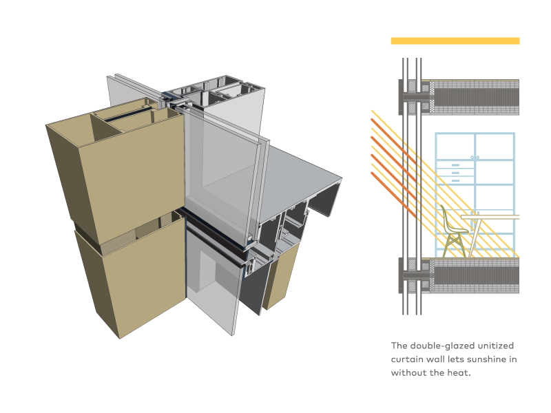
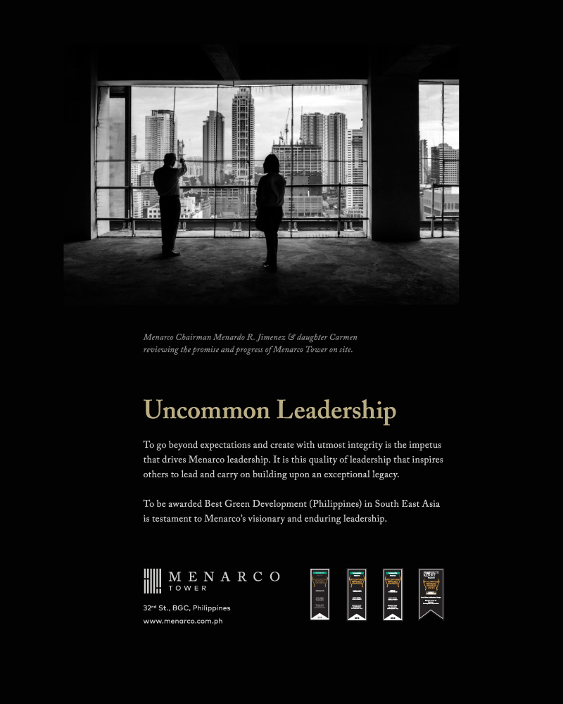
“Menarco Tower has been designed to be the safest and most conducive working place in the country.”
— Menardo Jimenez, Chairman
Building construction —
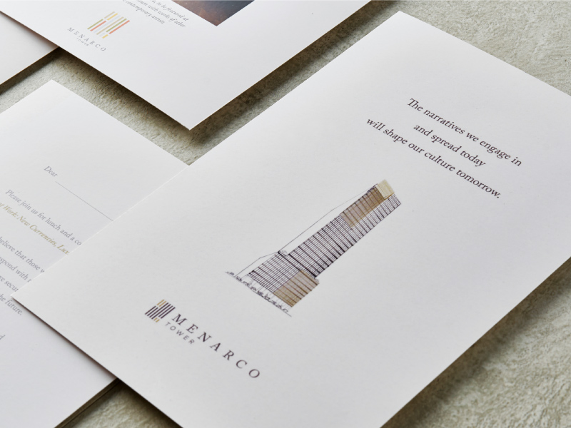
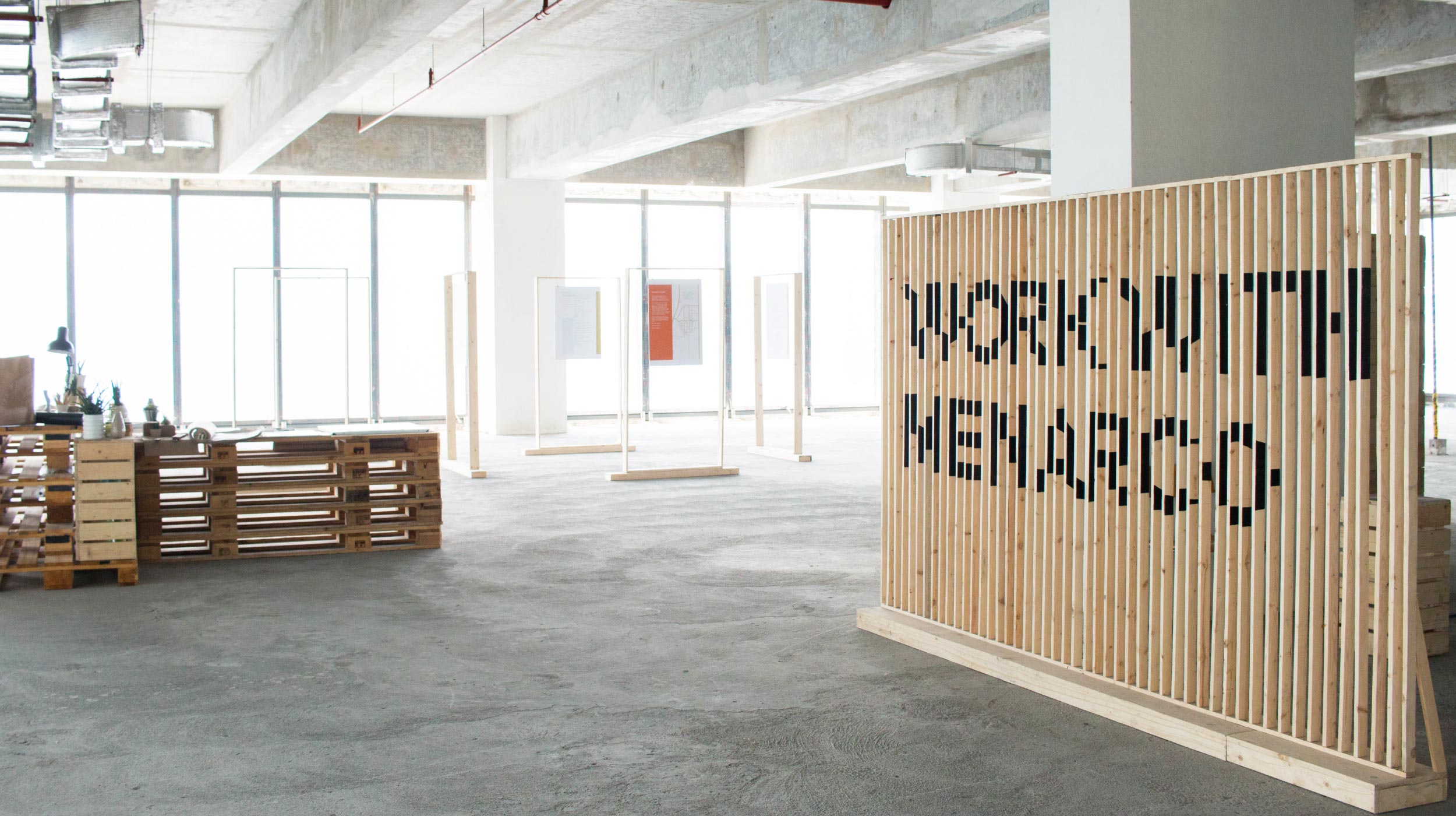
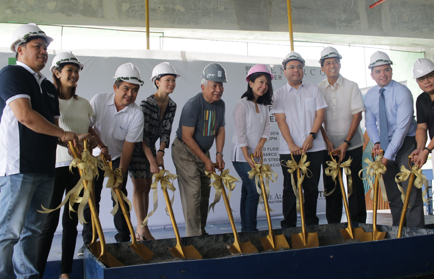
As Menarco’s partner, we saw the building break ground till its topping off. We’ve been there throughout the building’s biggest milestones, creating collaterals for their showroom and events such as their Topping Off ceremony.
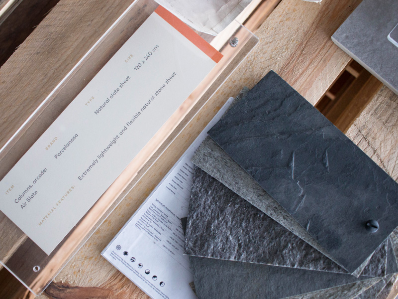
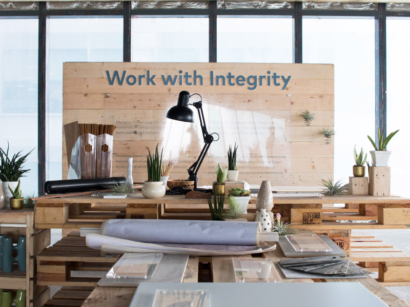
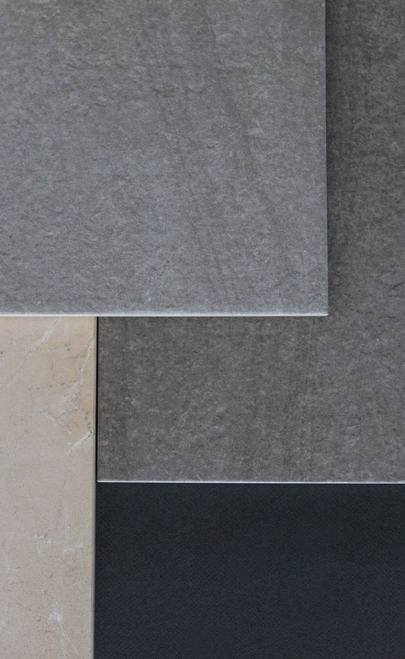
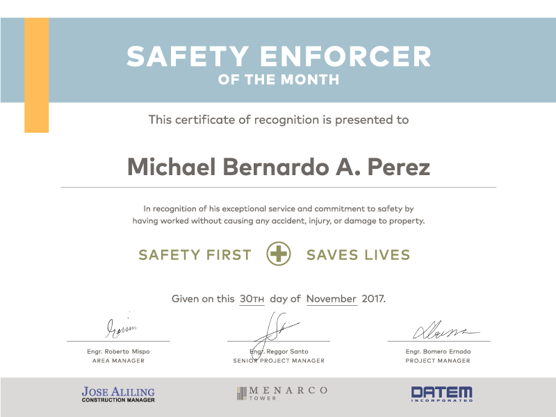
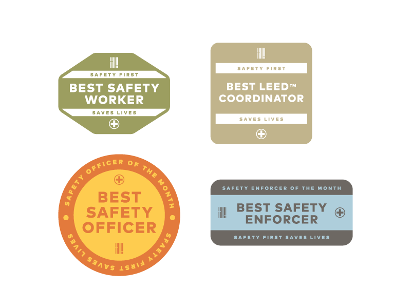
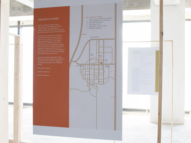
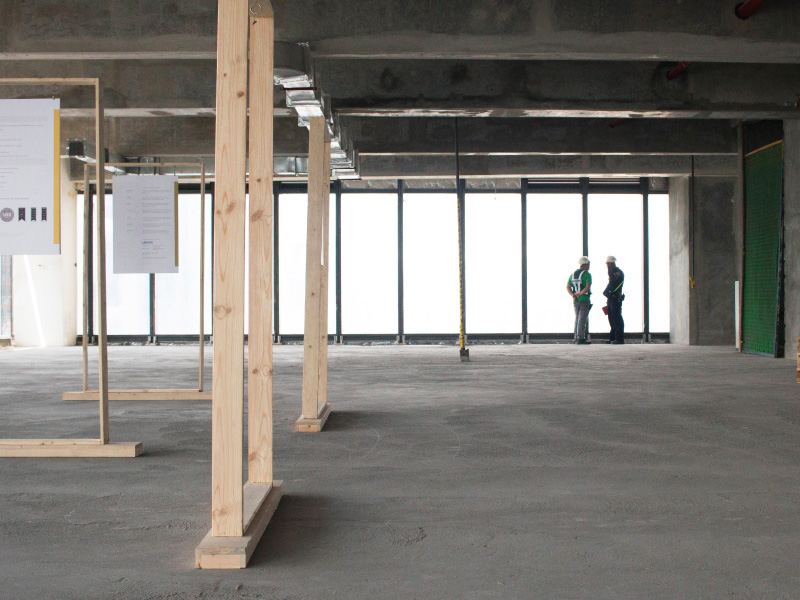
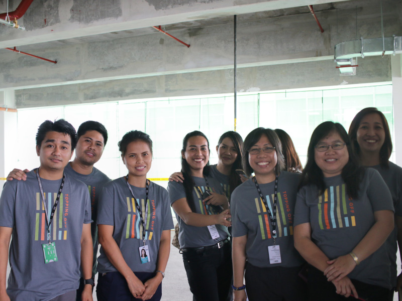
In designing the identity, we often returned to the building’s philosophy of putting people first. The brand was not just for potential tenants, but it was also for the hundreds of employees involved in the construction and day-to-day operations of the tower.
The Tower —
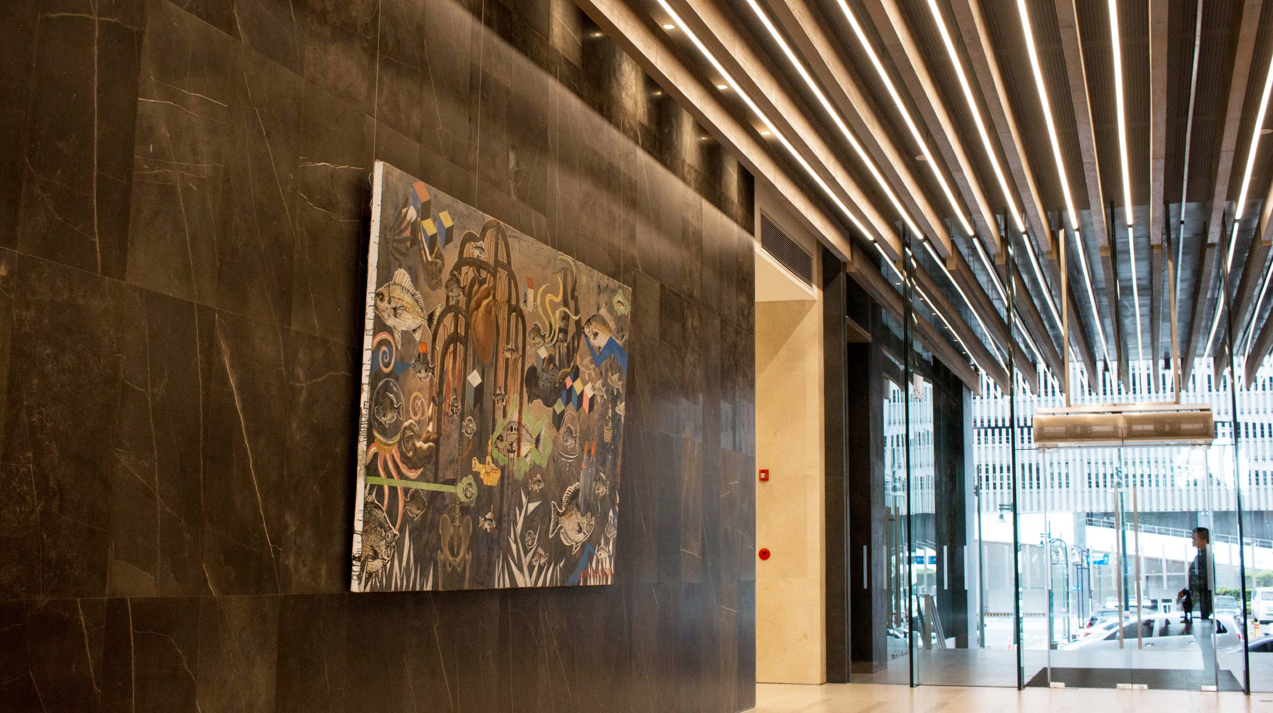
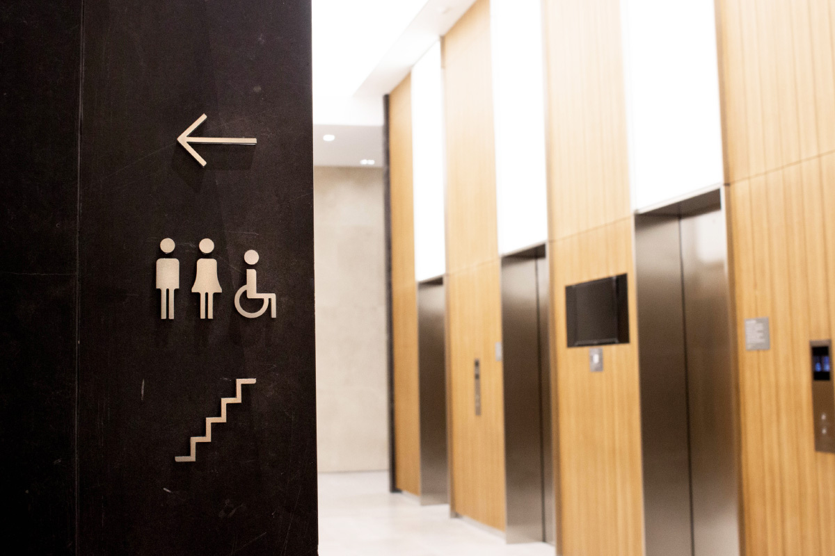
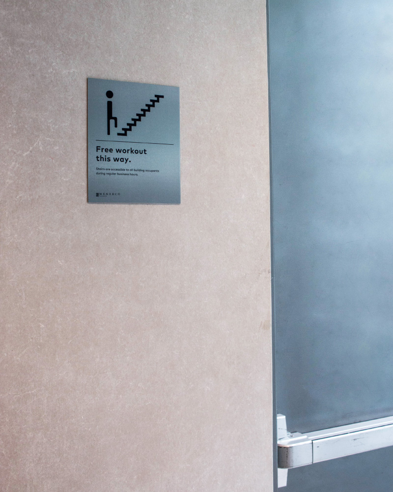
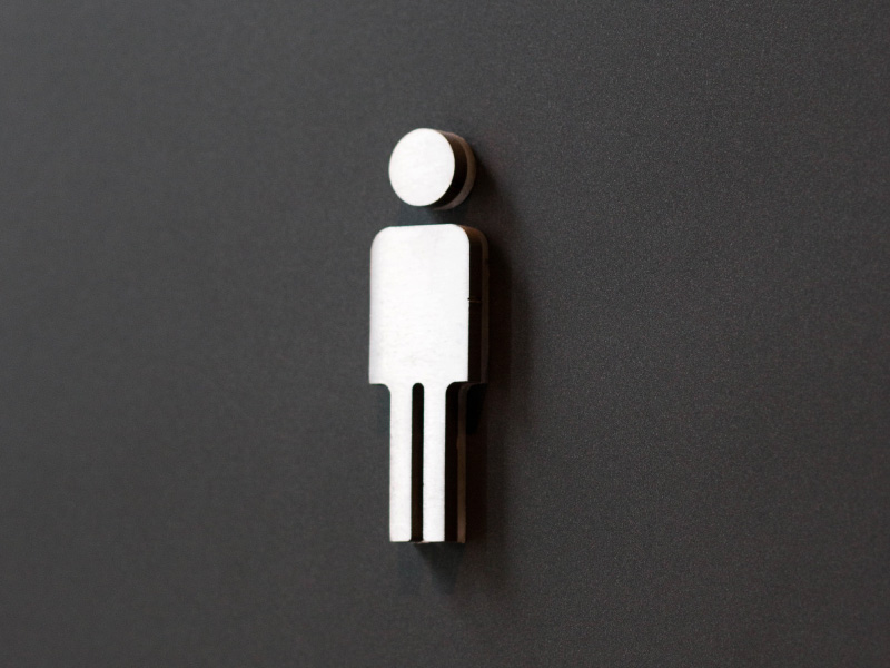
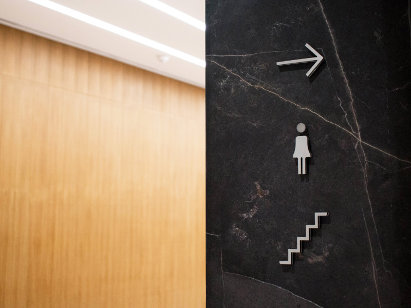
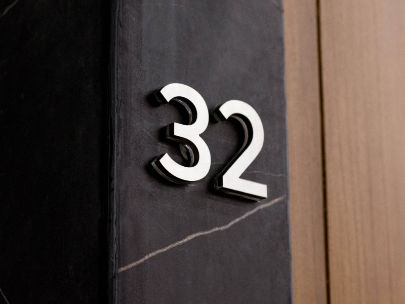
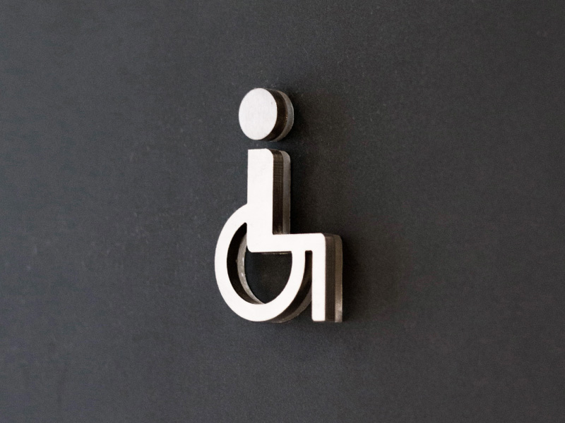
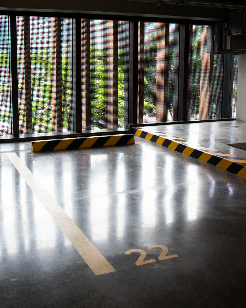
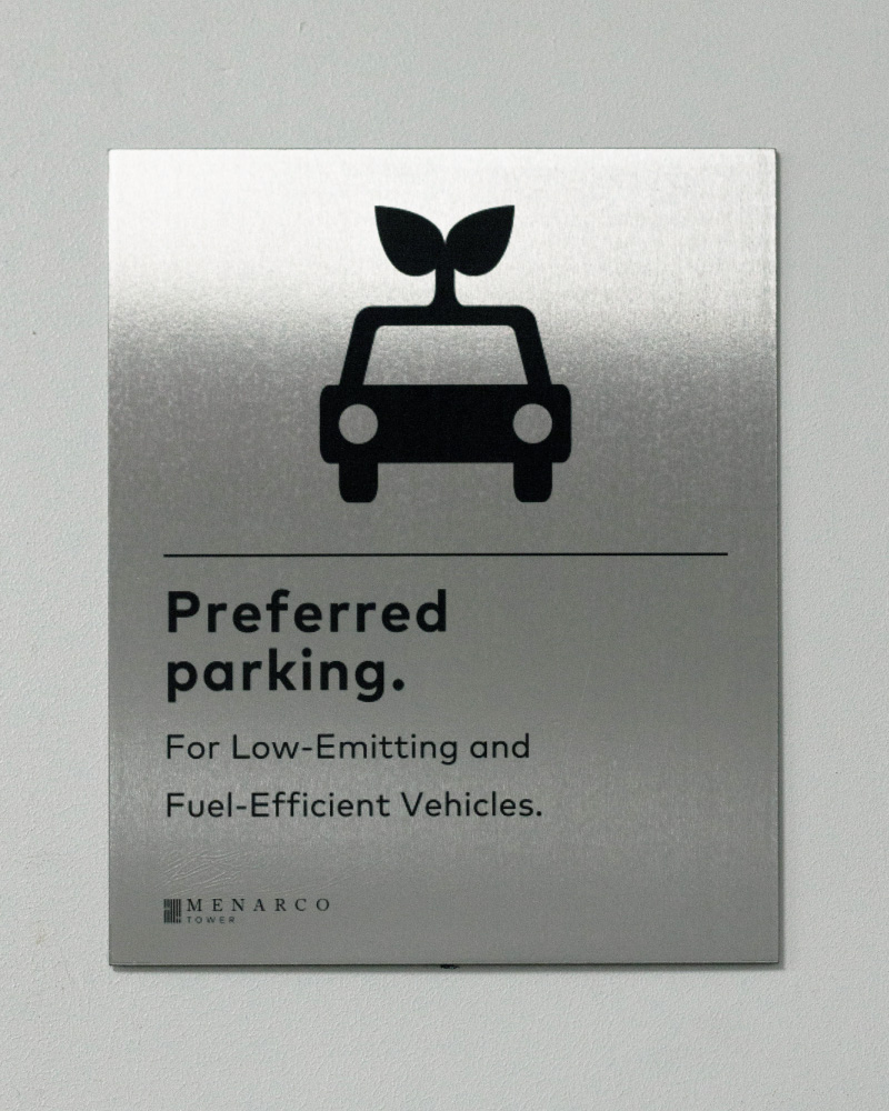
In order to connect with Menarco’s tenants, the brand needed to be present inside the tower. We created a comprehensive wayfinding system that starts from the parking and goes all the way up to the 32nd floor.
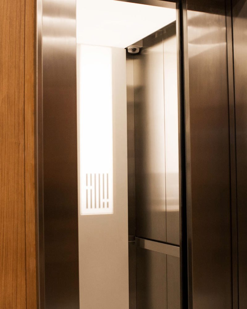
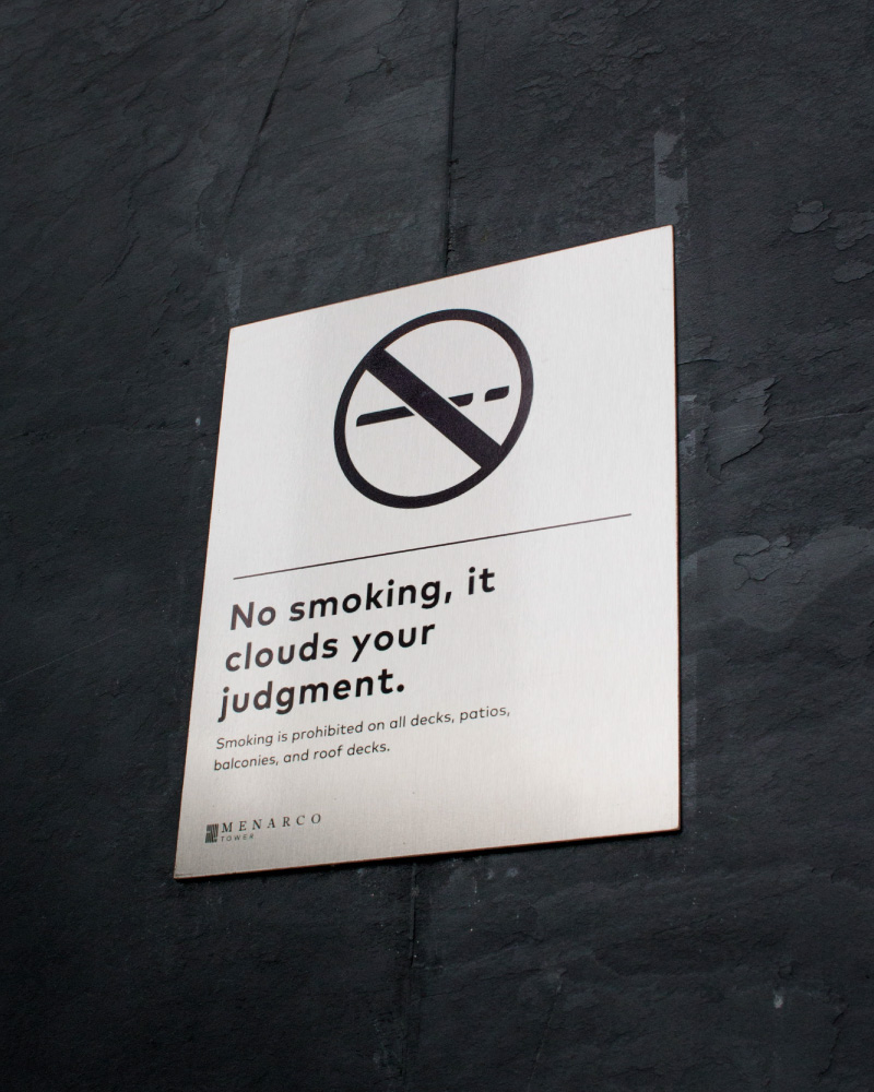
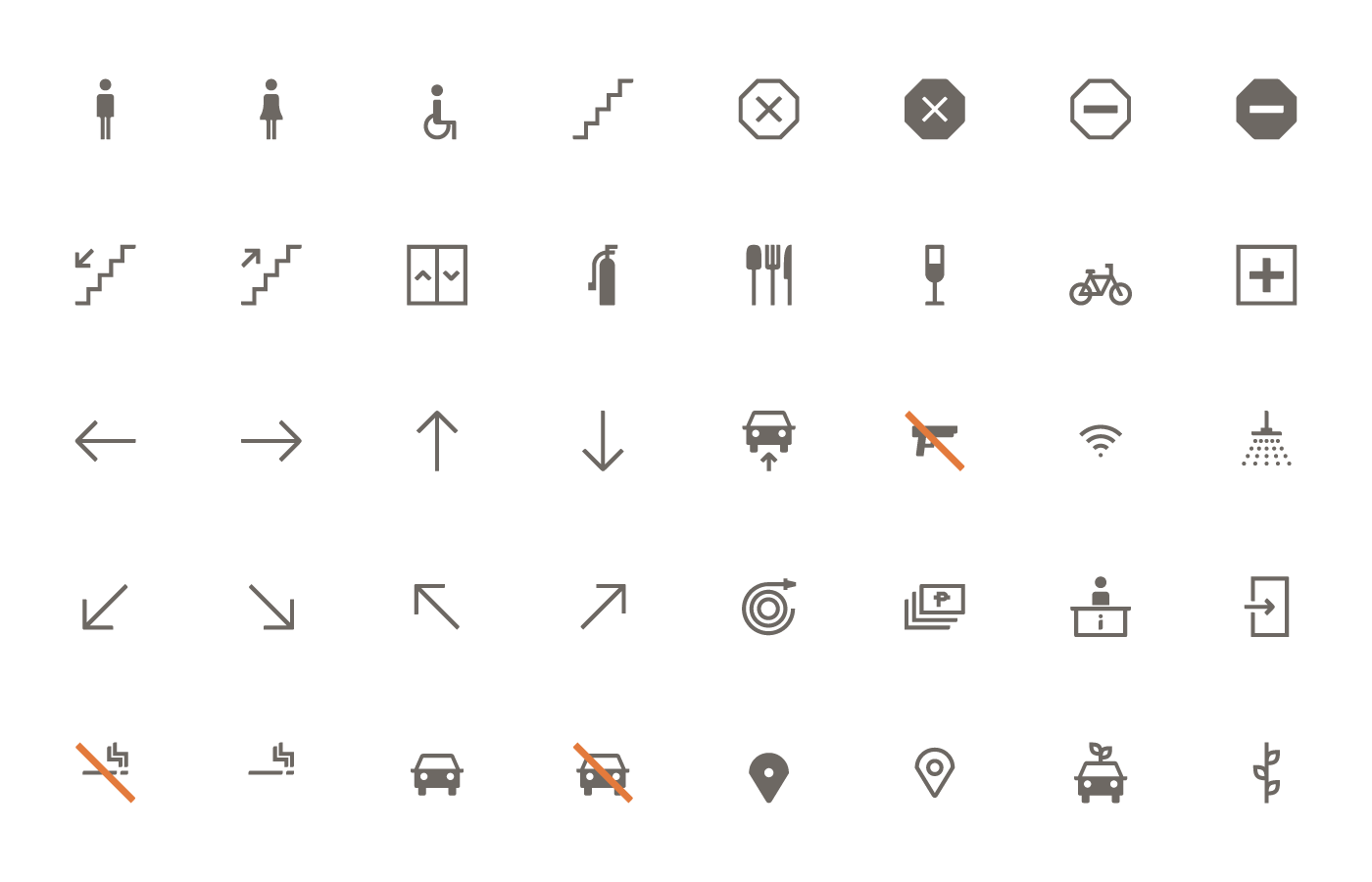
A custom icon set was developed for the wayfinding system based on the curves and measurements of the Menarco logotype. Custom icons showcase the features of the tower, creating a seamless experience for people working inside.
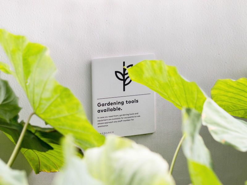
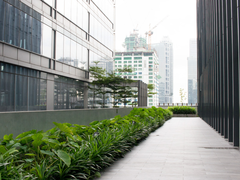
The brand brings out the strengths of the tower’s design and the transformative vision behind its execution. Currently, Menarco has achieved LEED Gold and WELL certification—the international standard for buildings that are recognized to benefit both the environment and the individual.
As it stands, Menarco is the healthiest building in the country and the best place to work.
— PREV
Scout's Honor
NEXT —
Latitude