- Environmental
- Naming
- Verbal Identity
- Visual Identity
Design Challenge —
How might we create an environment that encourages community while still respecting the individual pace?
As a spinning studio, Perigon is built on an environment that encourages community and progress. But this progress respects the individual pace, letting riders move at their own time and strength. It is about fueling that desire to do better every time.
Progress, not perfection is Perigon’s motto. The brand we designed for Perigon had to bring out that sense of community and growth. Which is how we built our brand, using visuals of progression and movement.
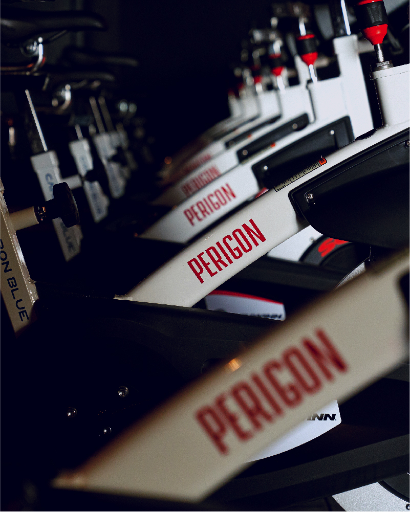
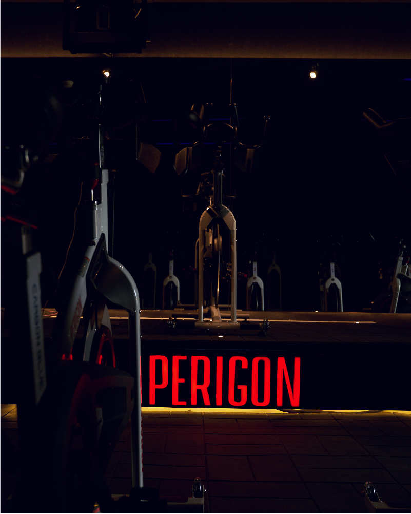

The identity is built on a perigon: A 360-degree angle.
Our shapes are different, all angled differently. But these shapes follow the path of a circle at different degrees. These shapes represent the different levels of progress but are all united under one brand. These are used as accents or containers for various materials.
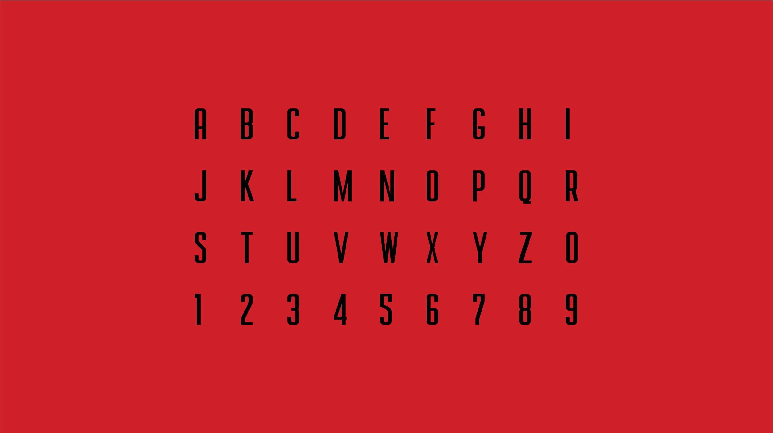
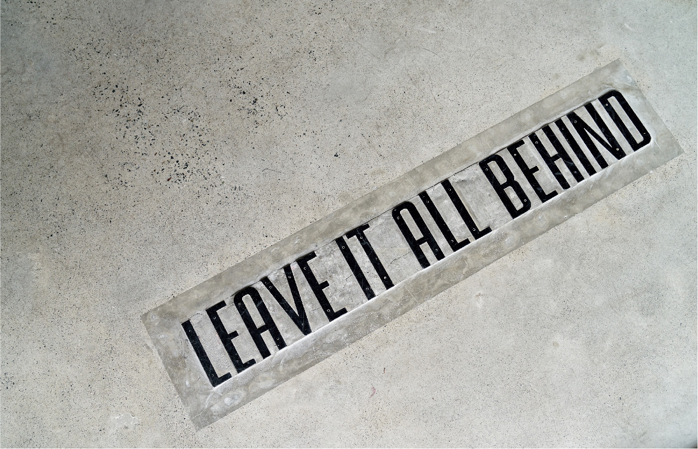
In addition to the shapes, we designed a custom typeface called Perigon Sans which gives the studio more freedom with their materials. We also added provisions for the text to be stretched or warped to emphasize movement and growth.
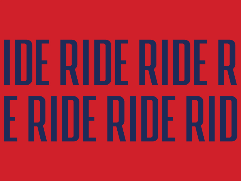
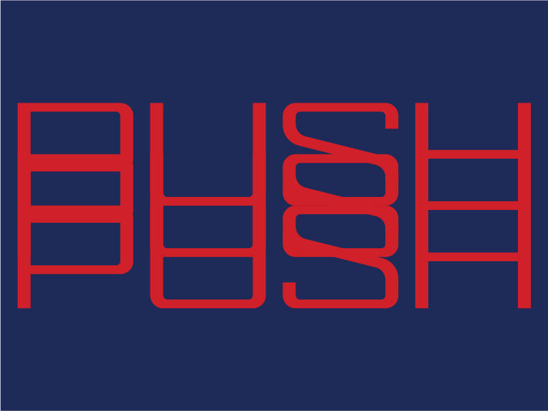
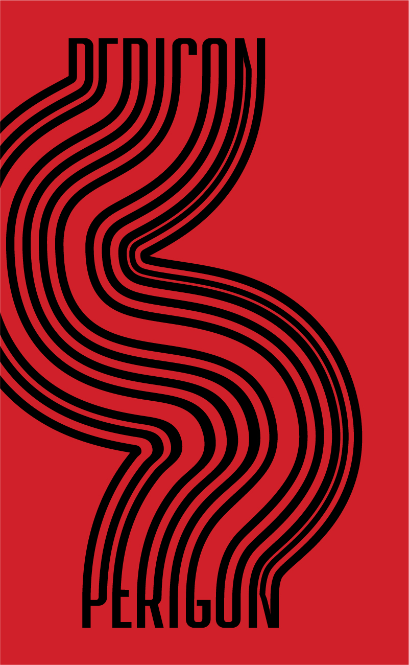
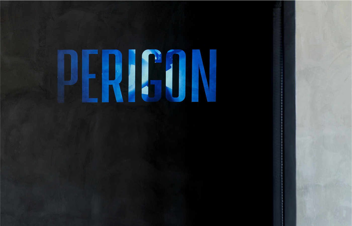
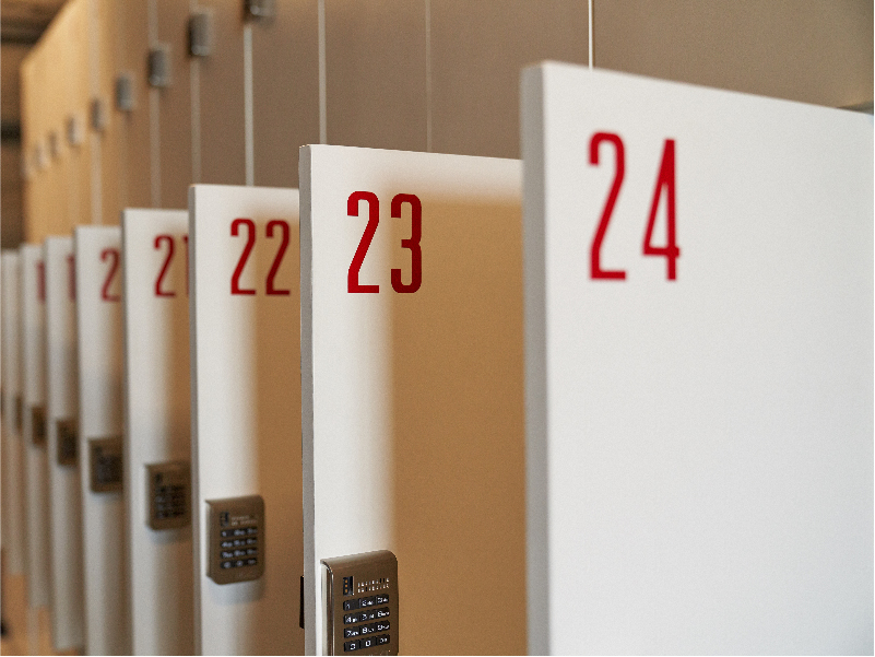

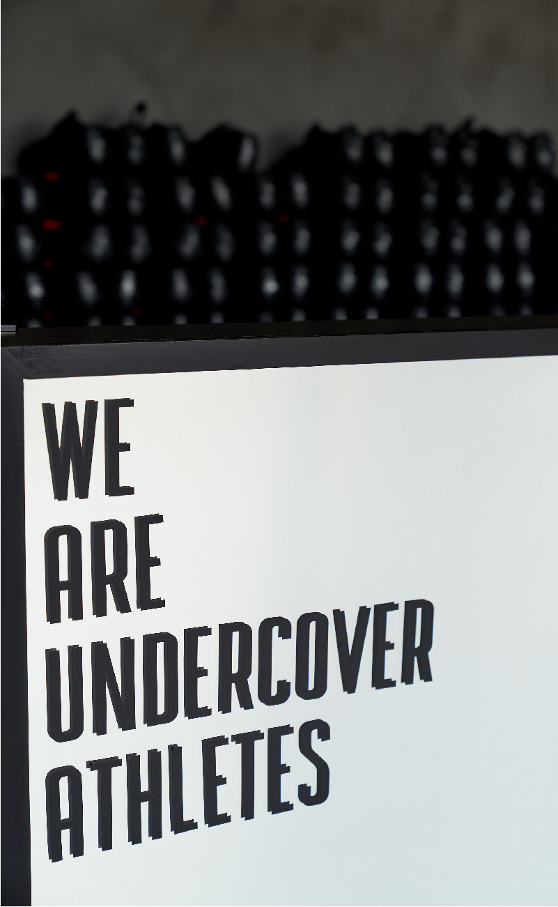
Perigon’s values of inclusivity, community, and growth are represented through the adaptability and fun of the brand’s key visuals.
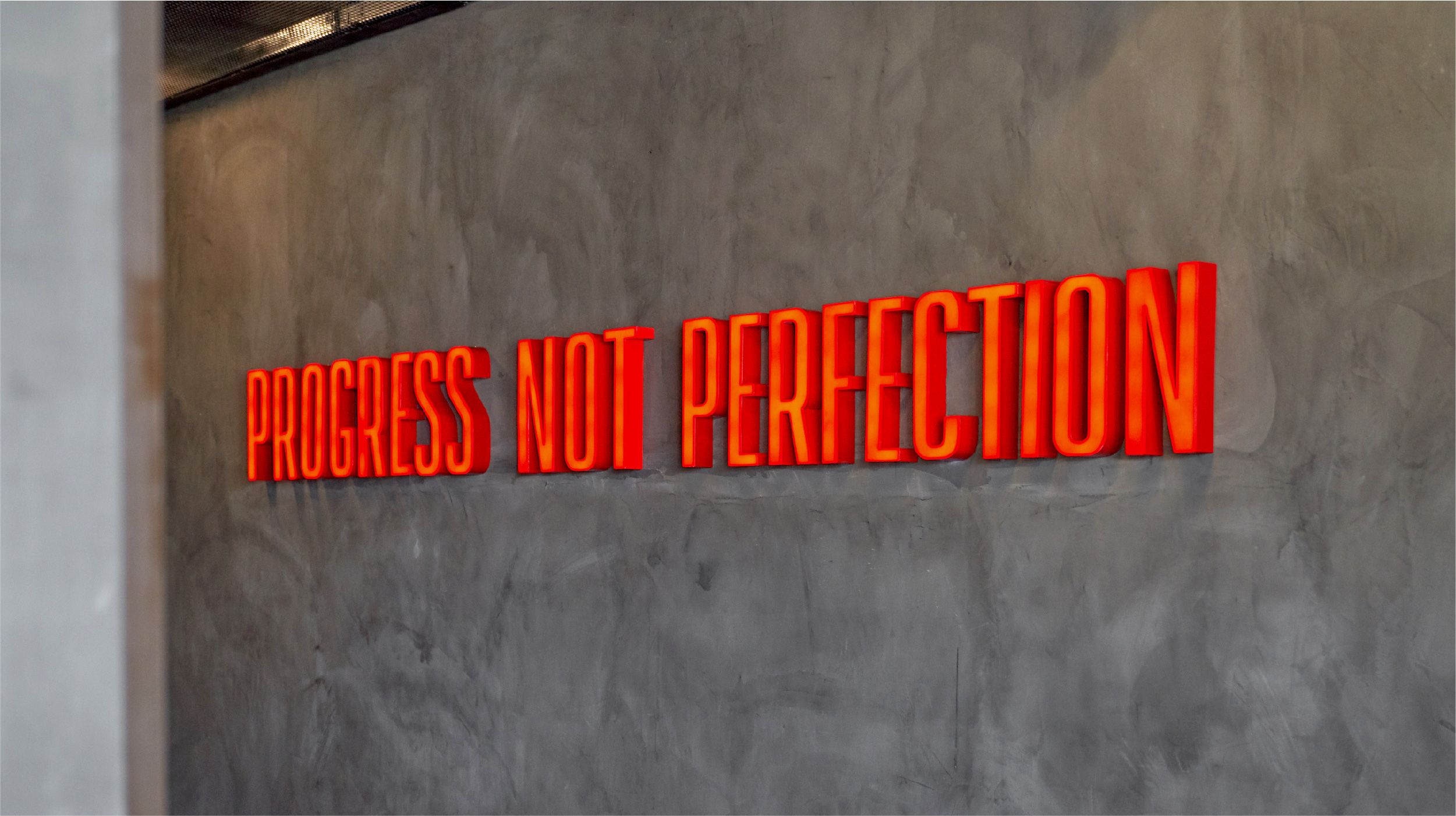
The brand depicts strength in movement—coming full circle, and then going beyond.
— PREV
Ram
NEXT —
AHA!