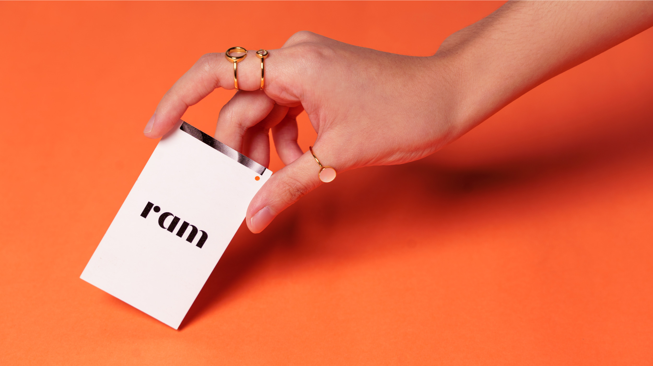
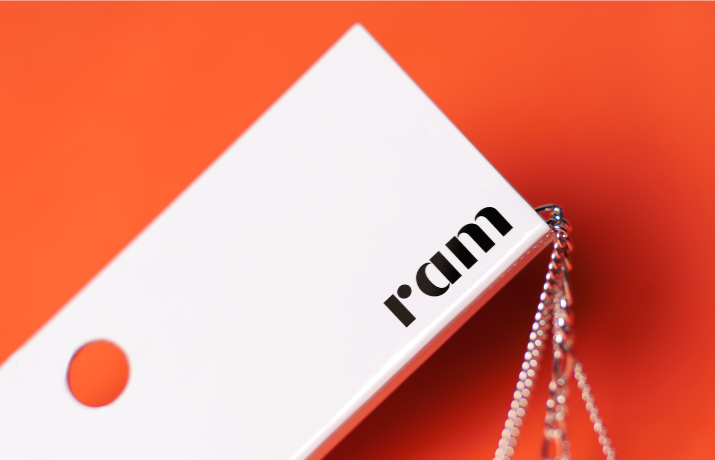
- Packaging
- Visual Identity
- & Nikka Gaddi — Photography
Design Challenge —
How might we create a brand that truly shows style without boundaries?
Process —
A jewelry brand started by mother and daughter duo, Rose and Martina, Ram is an ode to self-expression. Inspired by the women and men who are unafraid of expressing who they are through how they dress. The brand identity is big, bold, and self-aware. Handled by an excellent team of women, Ram is a brand that celebrates more than just the jewelry but the people who wear it.
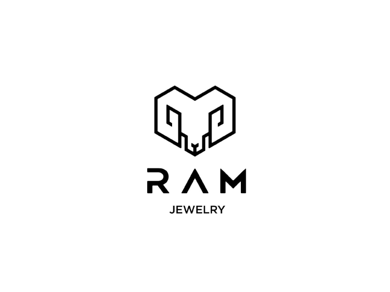
Before
After
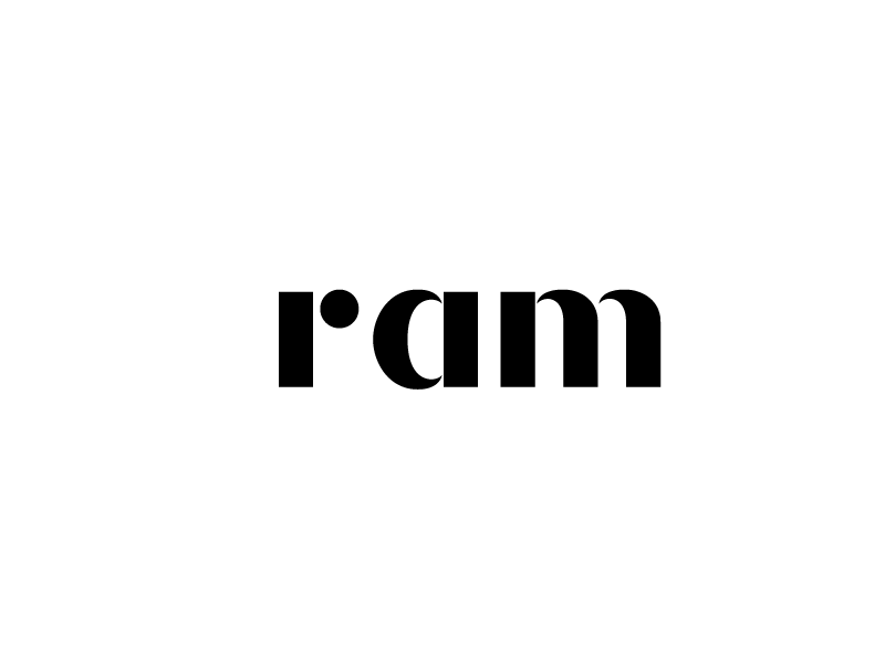
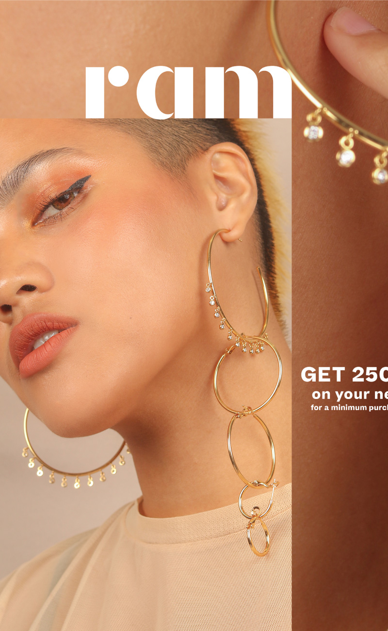
Originally standing for Rock and Metal, Ram now stands not for abbreviated words, but for boundless, unabbreviated style. The form of the new wordmark is drawn from the phrase “I am,” with the ‘r’ now resembling an ‘i’ punctuated by a dot beside it.
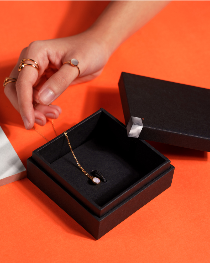
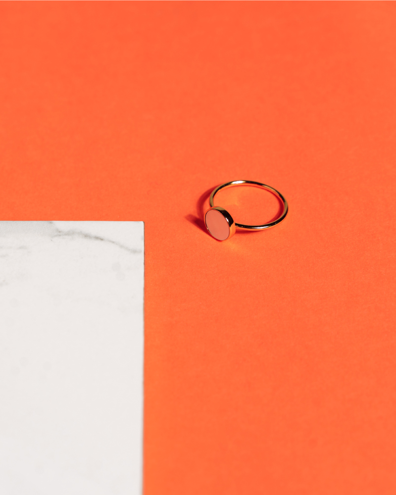
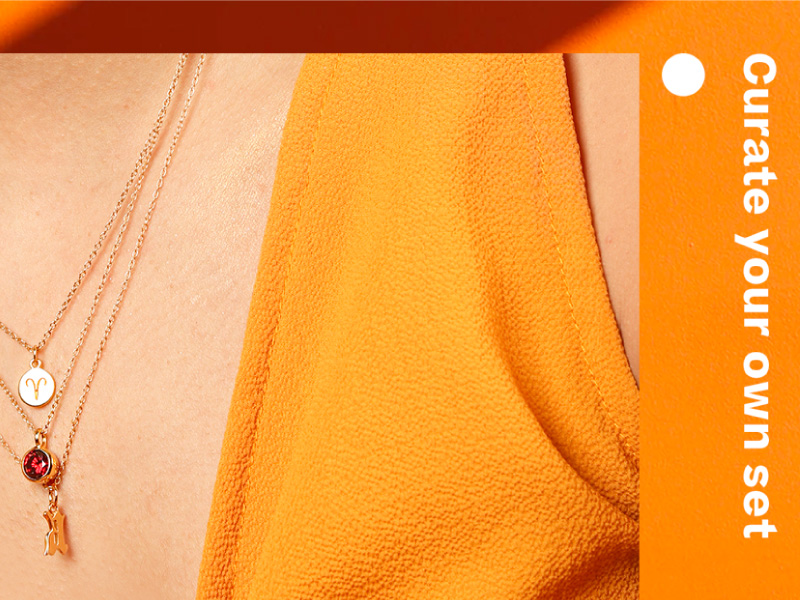
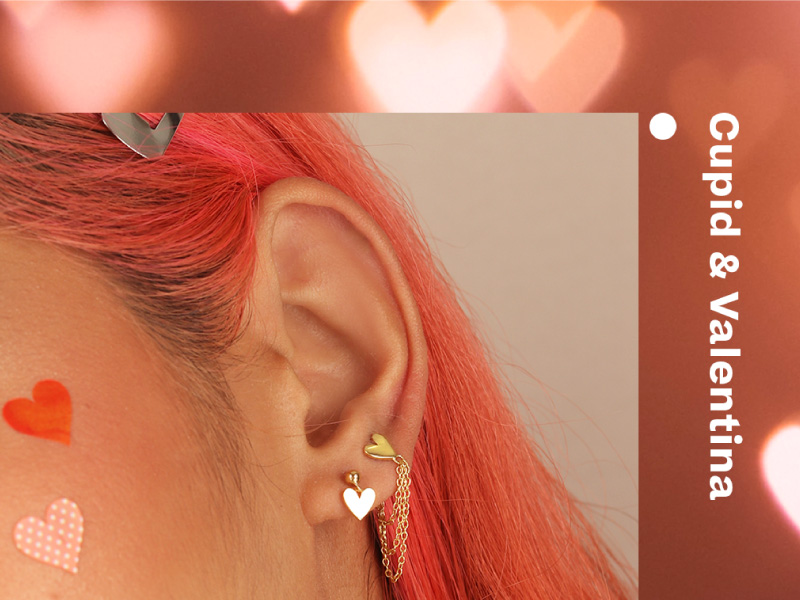
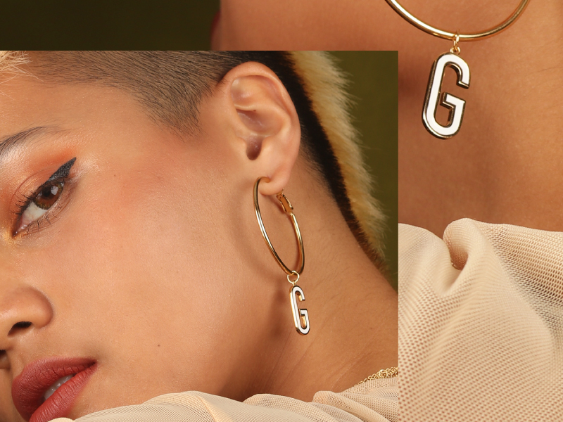
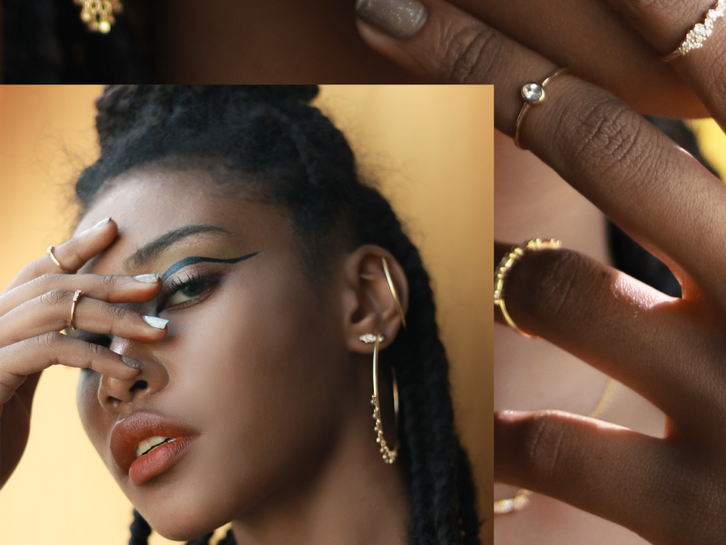
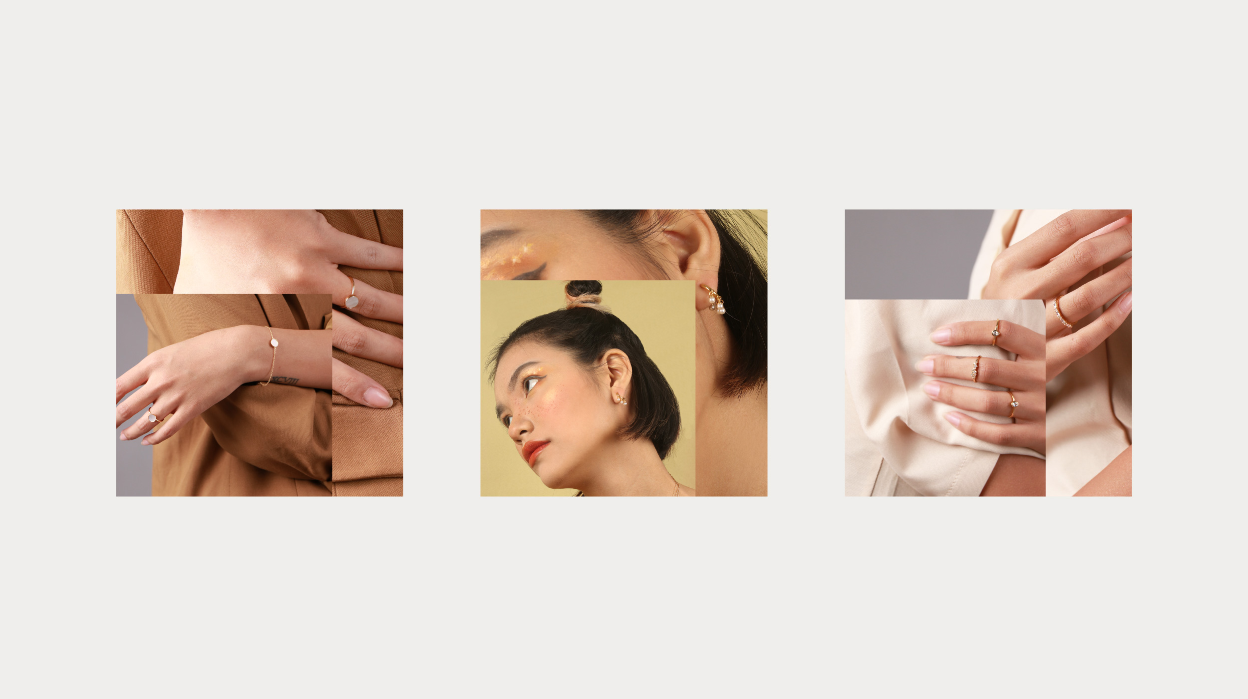
Ram’s identity uses a unique key visual: A flexible grid and a colored circle highlight which punctuates it. We created a flexible grid based on the logo icon. As an application, this could be stretched any which way and filled in with photos, textures, or solid colors. But more than this visual system is the spirit and the style of the brand, which is seen in their photographs, social media, and more.
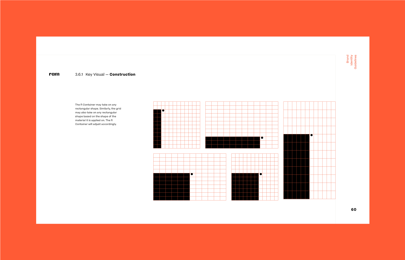
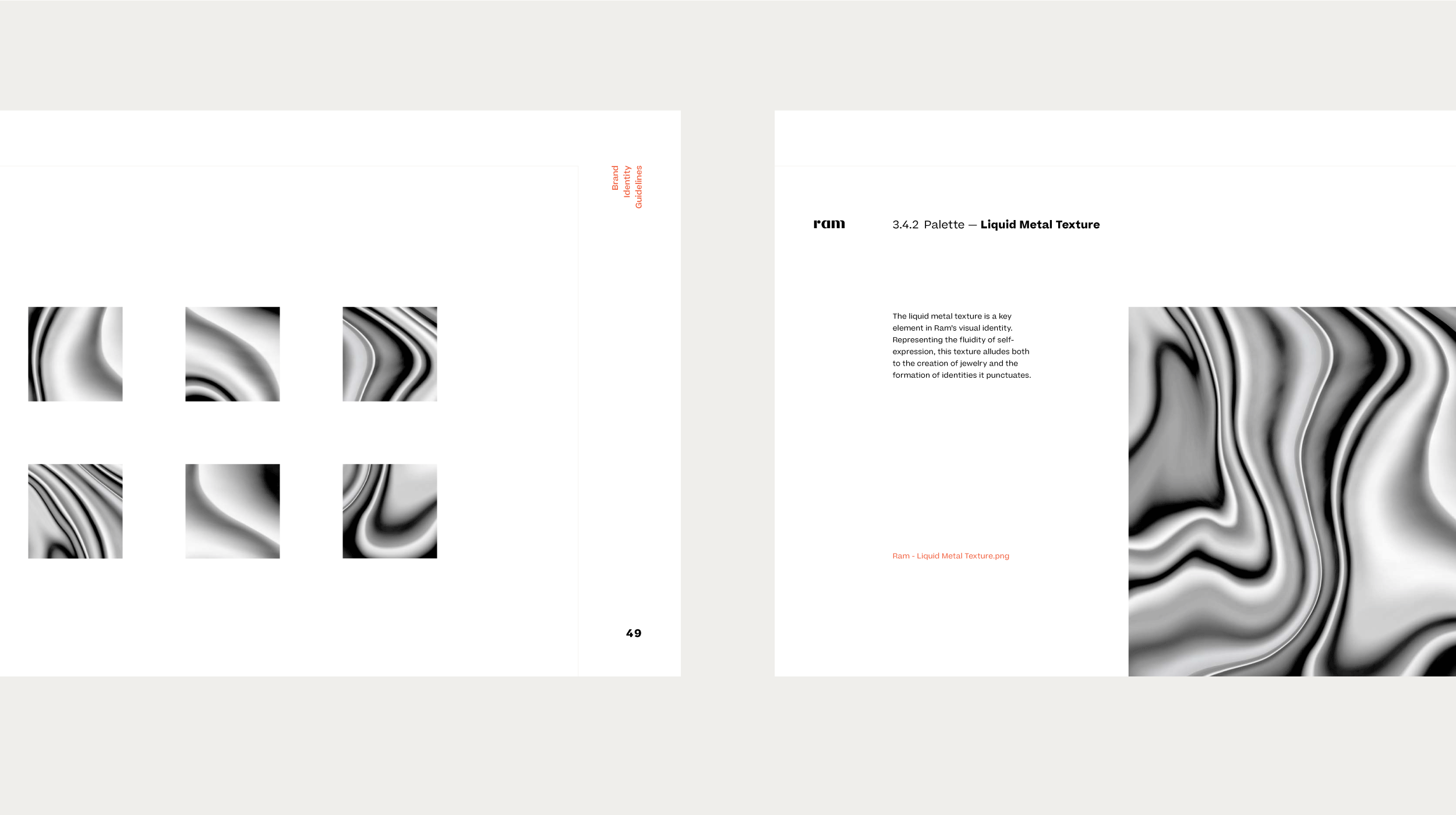
The contents of the grid may also be changed to suit whatever creative direction each jewelry collection may have. This way, Ram is not tied to a single set of graphic elements. That is to say, with a flexible visual identity system, they can present themselves in a truly boundless way.
Ram is an example of a brand left in capable hands.
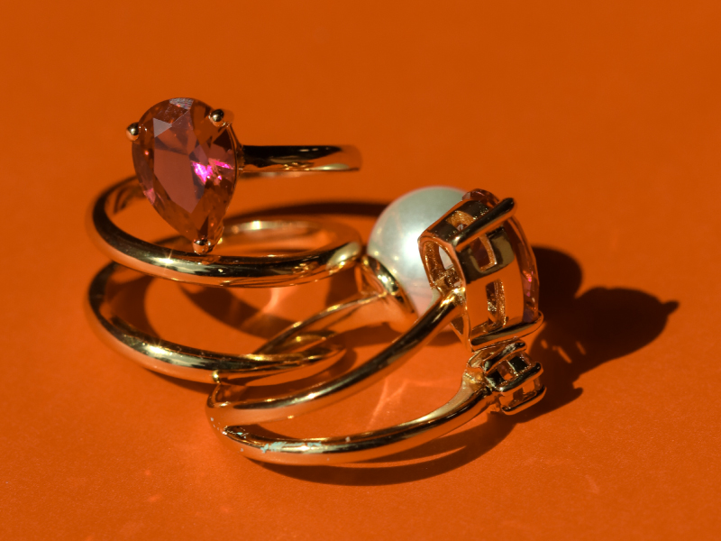
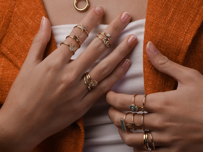
Nikka Gaddi and Mary Velarde imbibe the spirit of the brand and have been able to take the brand to new heights. These girls reflect the spirit of Ram, or style with no boundaries.
— PREV
Studio Cantero
NEXT —
Perigon