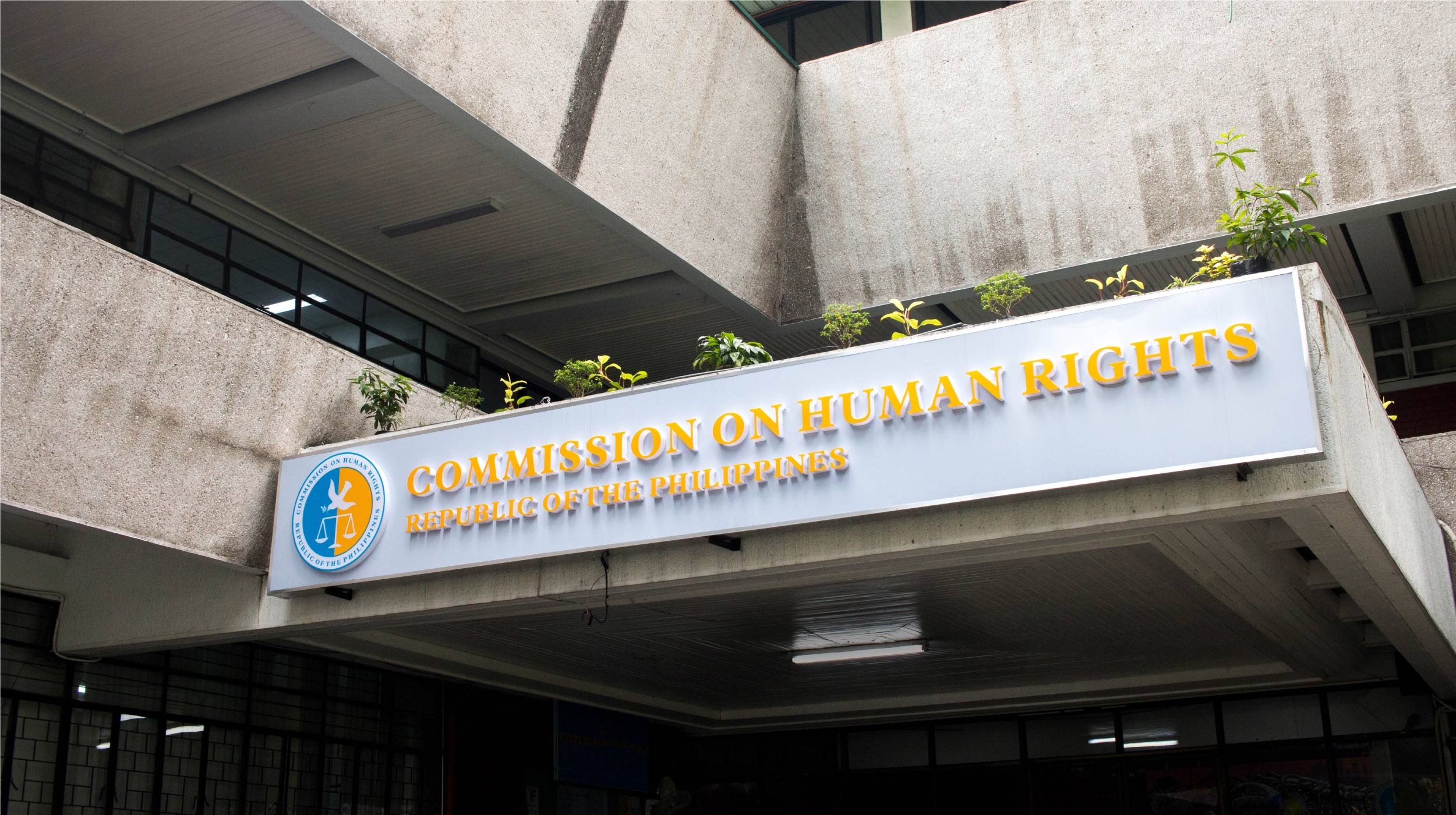
- Environmental
- Visual Identity
Design Challenge —
How might branding assist the Commission in their mandate of the promotion of human rights?
Disinformation only breeds discord, and the Commission on Human Rights (CHR) knows this firsthand. In the age of President Rodrigo Duterte’s popular drug war, the Commission has been called many things. They’ve been called kampi ng mga adik (allies of drug users), an obstruction to true justice, and even the Commission on Criminal Rights.
The Commission promotes and protects human rights. They monitor abuses made by the state—the police force, government, and military, but not crimes by civilians. This mandate has been grossly misunderstood, thanks in large part to fake news and malicious intent.
As designers, we’ve no illusions: Branding is not the solution to fake news, but maybe it’s a start. Through Helping Half, we started working with the Commission in early 2017 to find out how design could play a role in the promotion of human rights.
The problem —
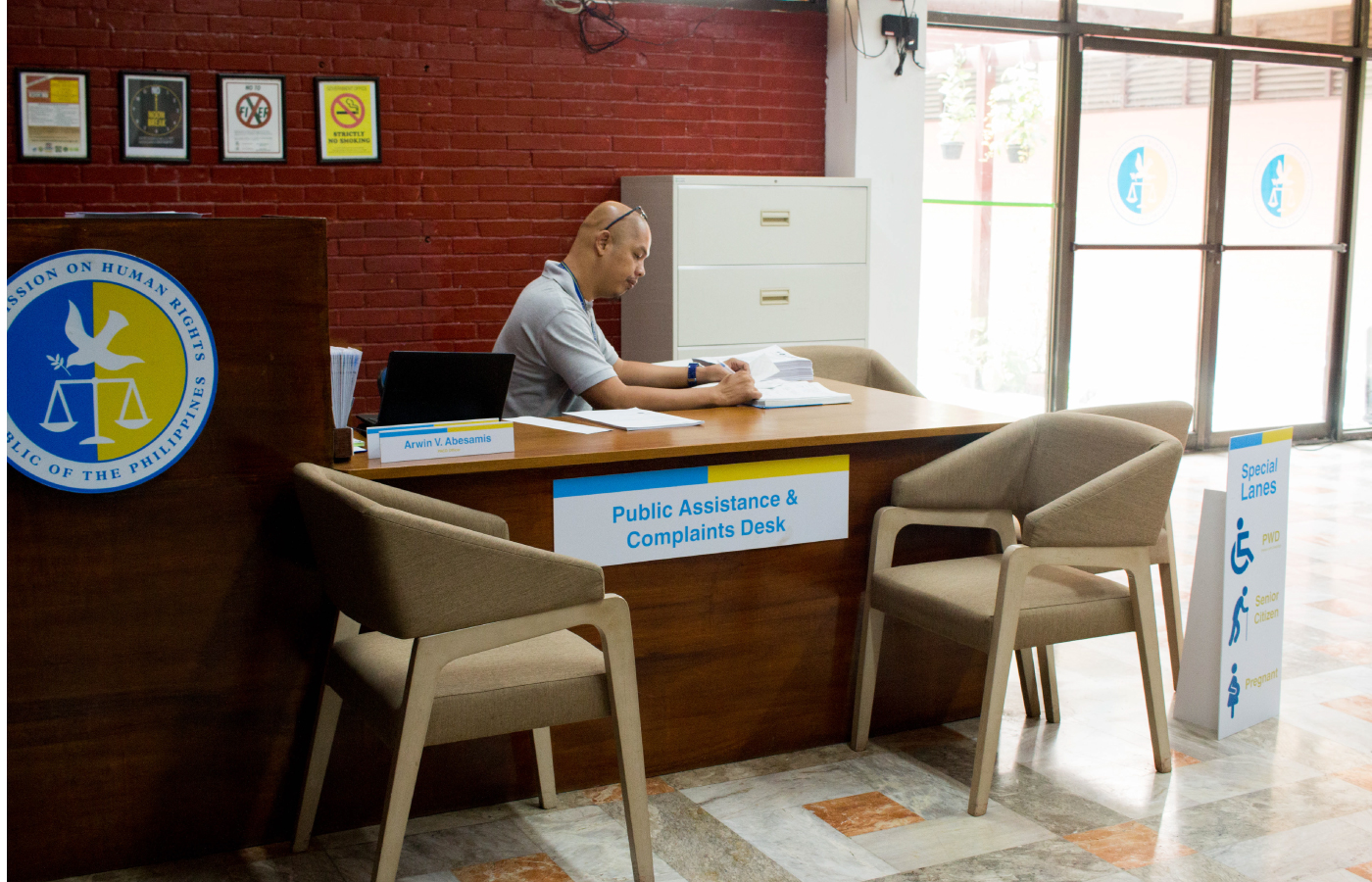
The CHR has 23 regional offices, many of which operate separately from the Central Office. With no corporate identity guidelines, important documents that are issued in Region IV-A may differ greatly in look and feel from those issued in Region X. Without consistency and unity, trust and credibility are put into question. This adds to the growing mistrust of the public, which ultimately leads to low morale for the CHR.
Our process —
After months of regular visits to the Central Office and neighboring regional offices, we immediately saw that there was an absence of consistency. One regional office would do its own thing, another would have a different approach. For us and our partners in the Commission, it was a matter of setting standard guidelines. We had to restore the authority and integrity embedded in the original design of the Commission’s seal. We wanted to give the CHR something they could be proud of while restoring the public’s trust in the defenders of human rights.
Before
After
Our design solution —
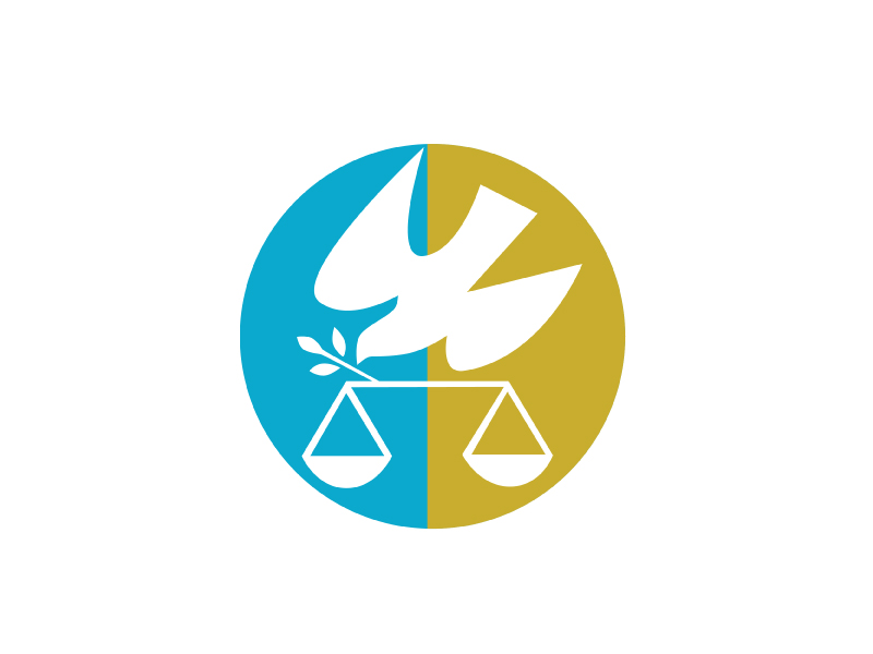
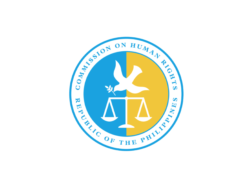
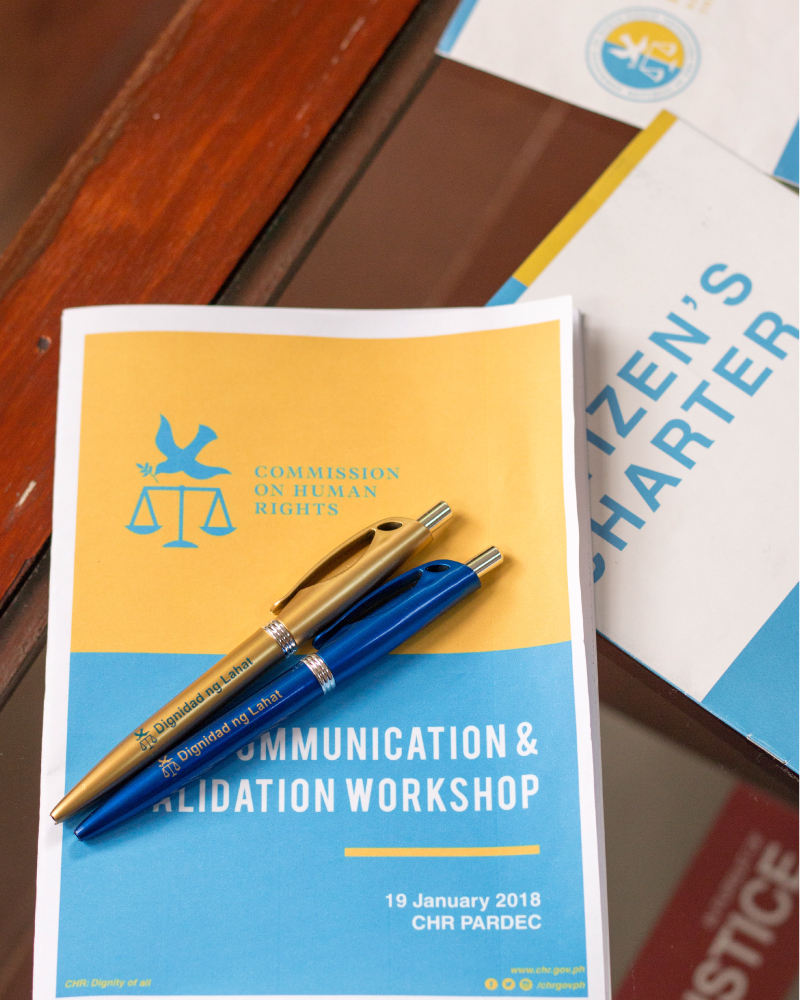
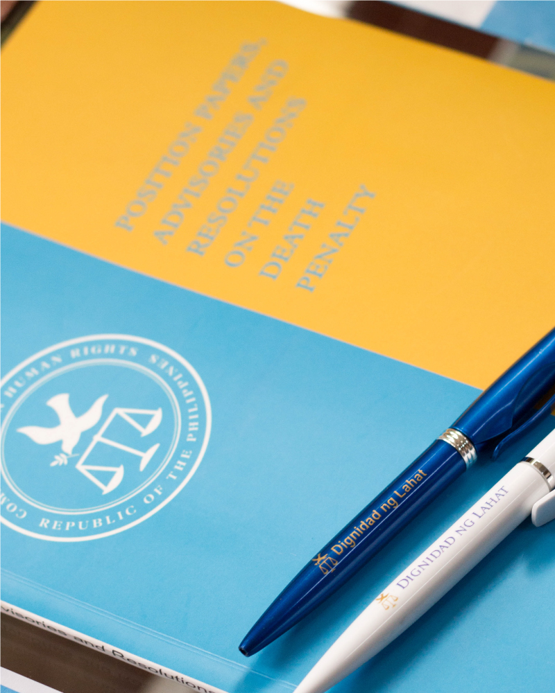
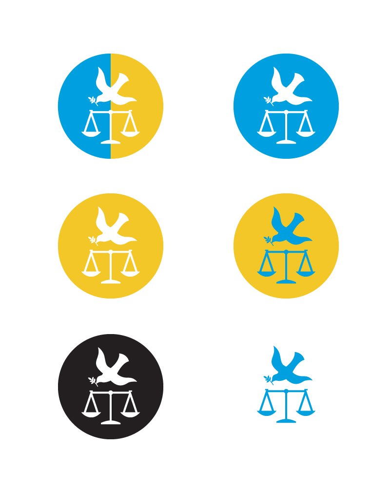
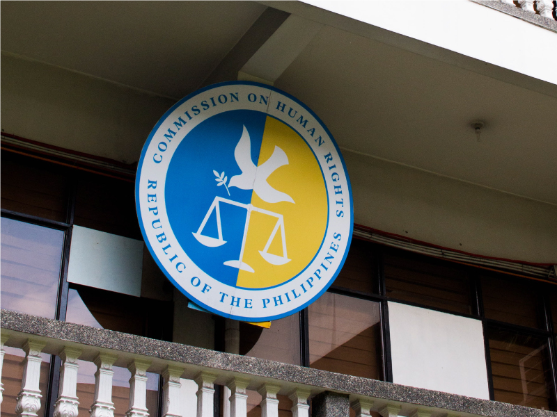
We redrew the logo but kept all the core elements intact. The colors were updated and the typefaces were set. We made single-color versions of the logo (for easy printing and photocopying) and made use of free fonts. We wanted the brand identity to be an asset, not a burden.
The secondary mark —
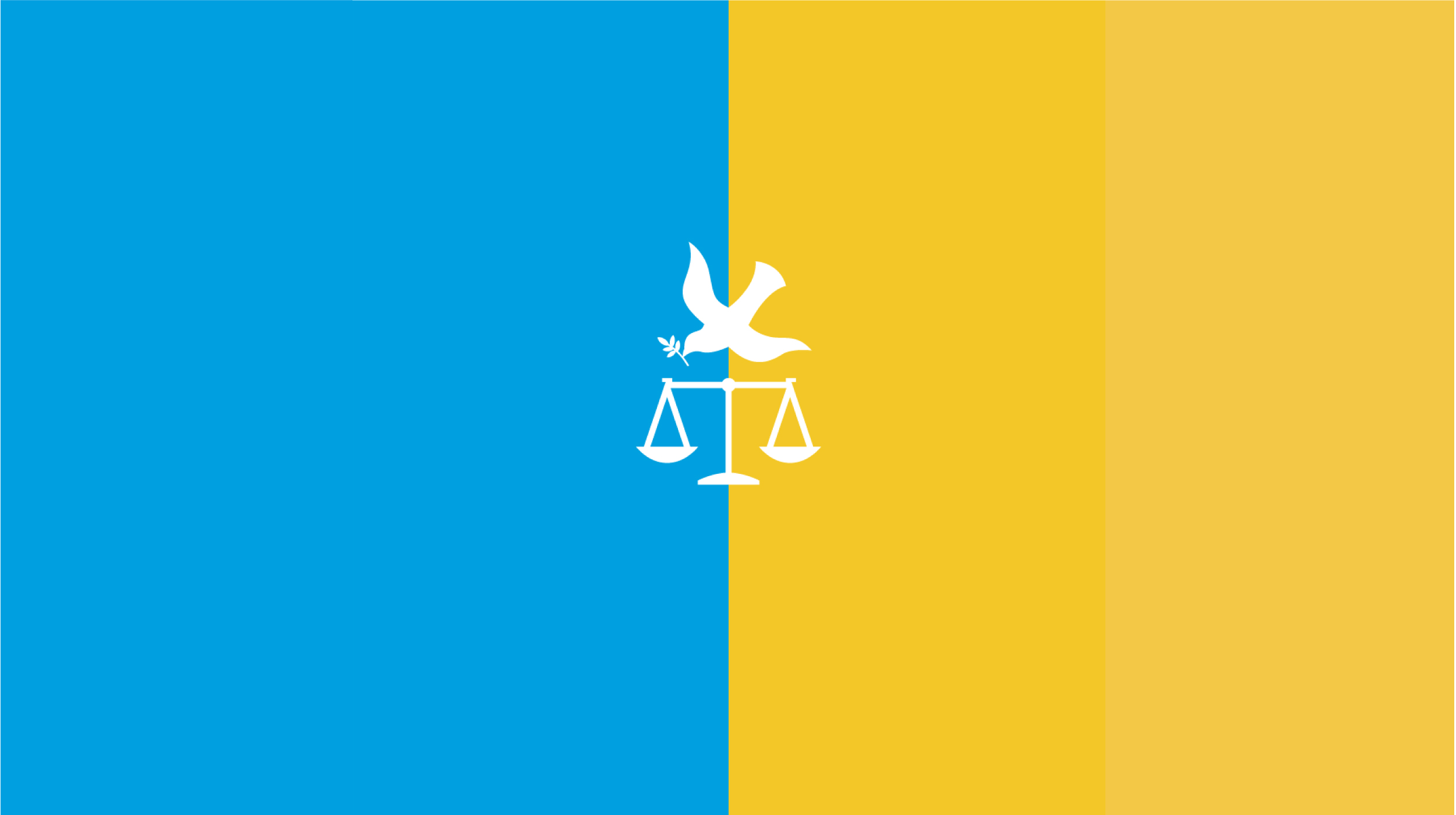
A major change was the introduction of a secondary mark, which consists of the redrawn dove and the scale.
This mark is used for the casual functions of the CHR, such as marketing events and their online presence. The use of this mark is meant to elevate the use of the seal. The seal may now only be used for official releases such as statements and resolutions.
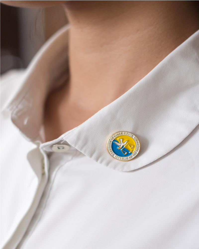
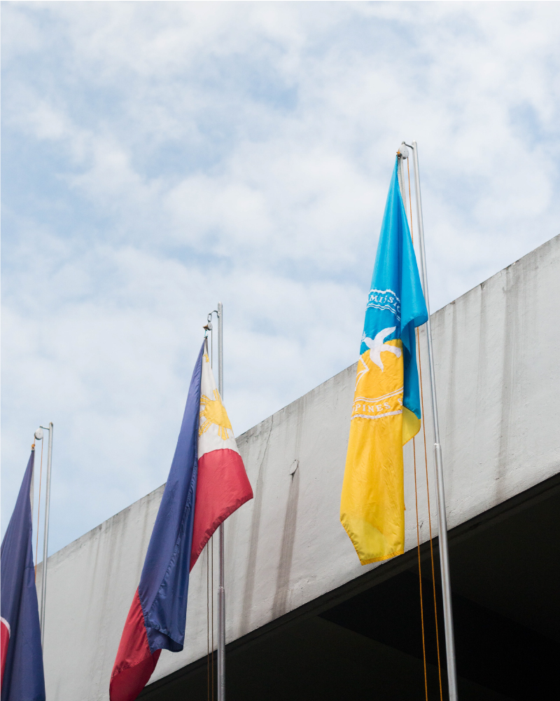
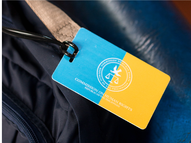
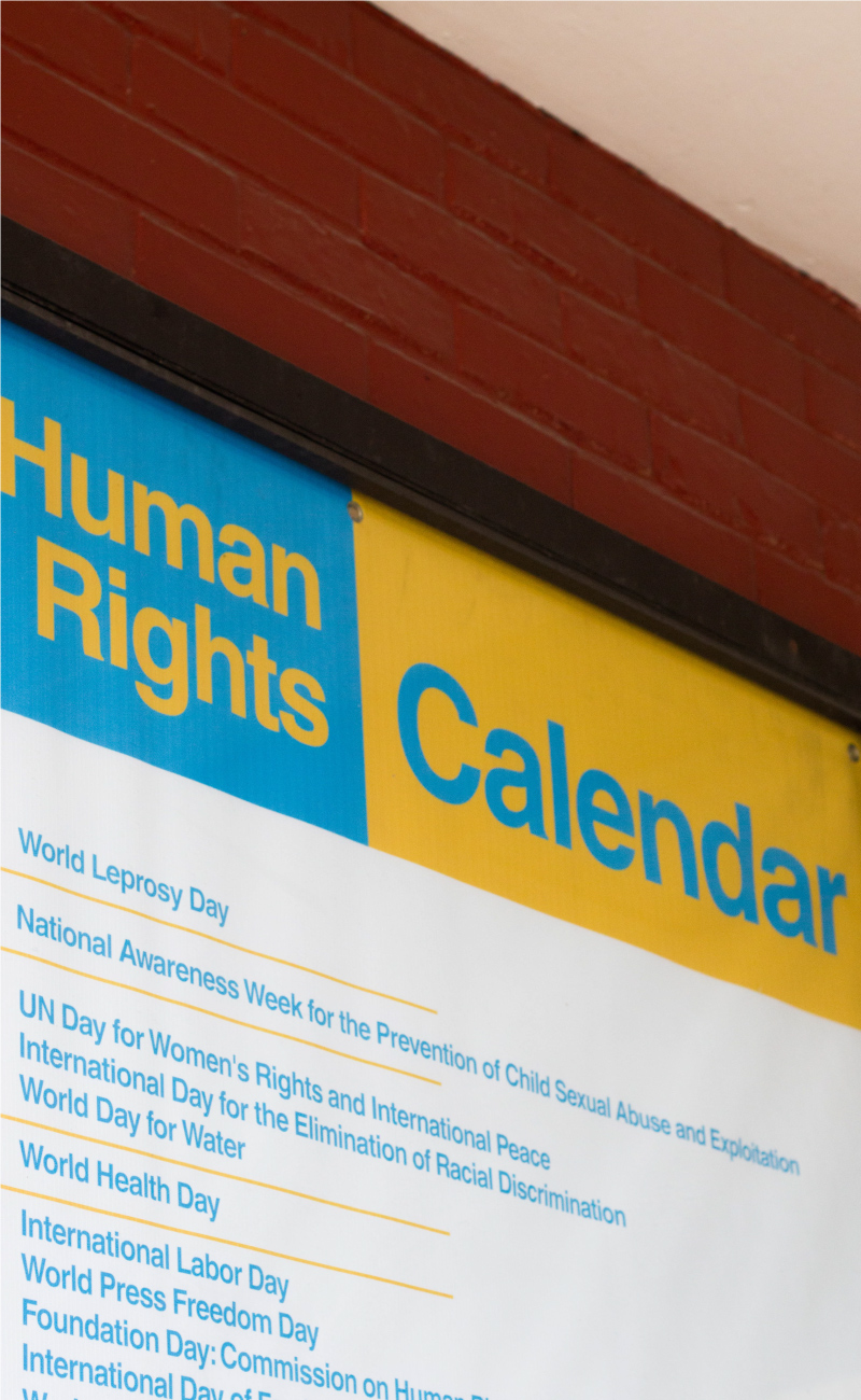
The guidelines we created were simple and compact. In a Commission-wide meeting held late 2017, all the regional offices were oriented about the rebrand and educated on how to apply it. The identity has since been used for nameplates, lapel pins, shirts, the website, social media and various news outlets nationwide.
While branding is no solution to fake news or human rights abuses, it can lend a sense of legitimacy to those who apply it. It allows a certain measure of control over public perception. It may not change opinions overnight, a good brand should breed familiarity and trust—qualities which weigh more than gold in today’s world.
— PREV
Hurray Interior Design Group
NEXT —
Milagritos