
- Visual Identity
Design Challenge —
How might we create an all-encompassing brand that organizes and unites the different endeavors of Astoria?
Astoria is a hotel and resort group with 8 boutique properties all over the Philippines. We approached the brand by bringing out the distinct qualities of every property while unifying them under the umbrella of Astoria—a brand of excellent service and Philippine hospitality.

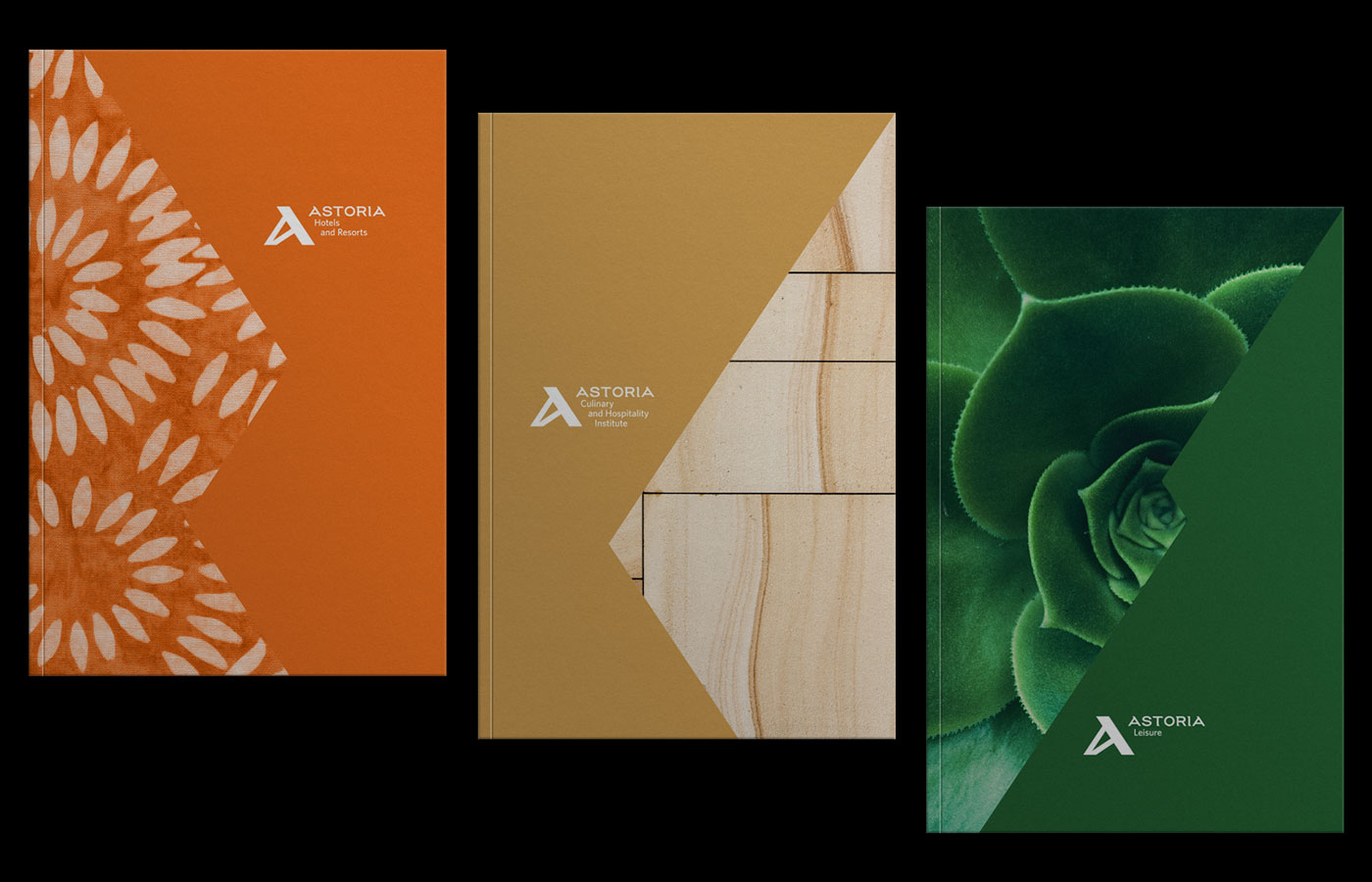
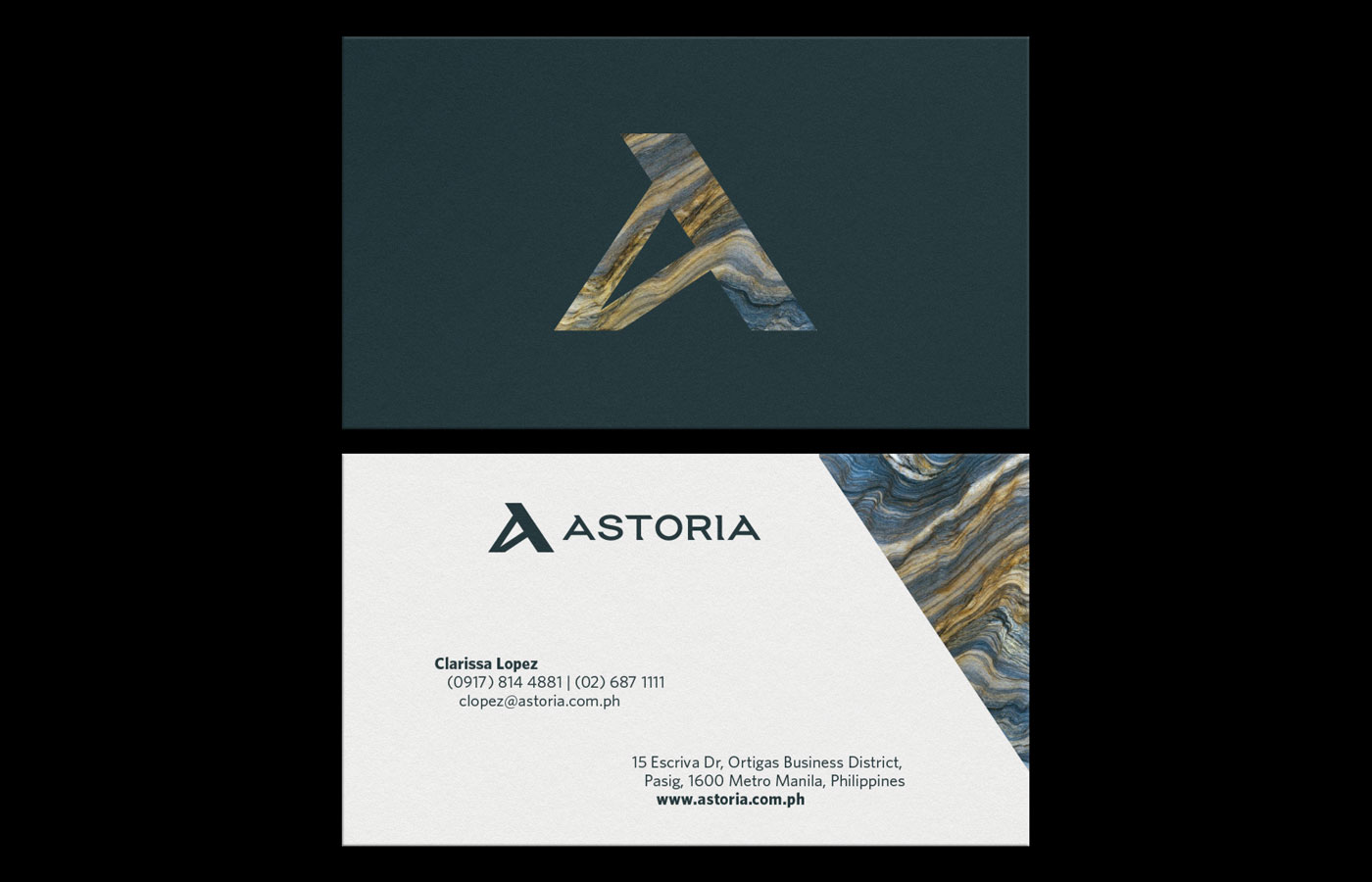
Texture is a key visual element in our identity. With this, we assigned colors and textures to each hotel, resort, and sub brand. These visual elements were designed to best represent the authentic experience in each property. However, this variety was also balanced by the structure and integrity of our custom logotype and reimagined ‘A’.
For flexibility, we created a custom grid based on the logo structure. Consequently, the grid can be stretched and filled out in any way. It is then the foundation for all sorts of graphic treatments and executions.

— PREV
Le Sucre Lab