- Packaging
- Visual Identity
Design Challenge —
How might we add a new layer to celebrations?
Process —
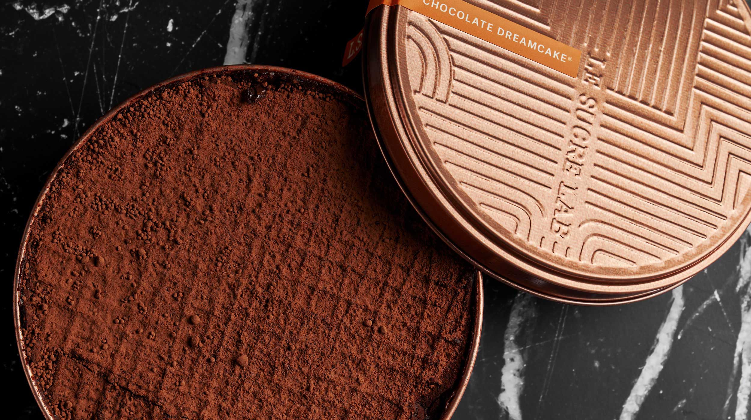
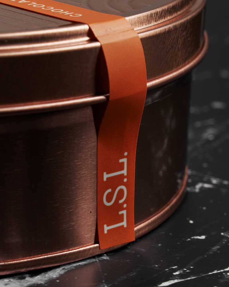
Le Sucre Lab is a pastry studio that came to us at the point of their expansion. They wanted a brand that reflected their ingenuity and love for confections, and packaging that expressed the indulgence of every cake. We asked ourselves: how do you make people taste a Dreamcake before they even open the can?
Design Solution —
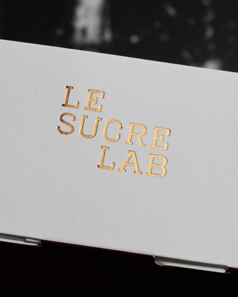
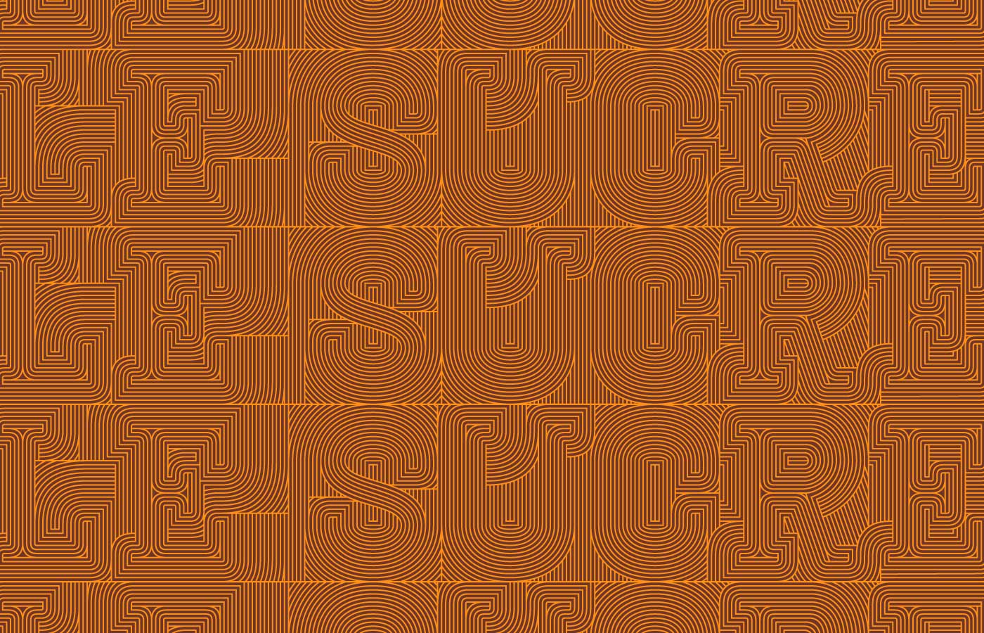
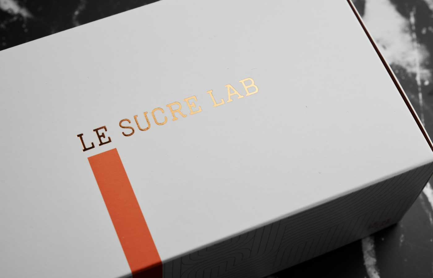
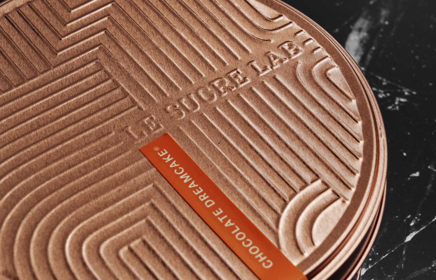
We drew inspiration from the layers of the cake itself, creating an expanding pattern based on the custom logotype we designed. The line pattern can be cropped, expanded or embossed depending on the collateral, making it flexible to use without drawing attention away from the can.
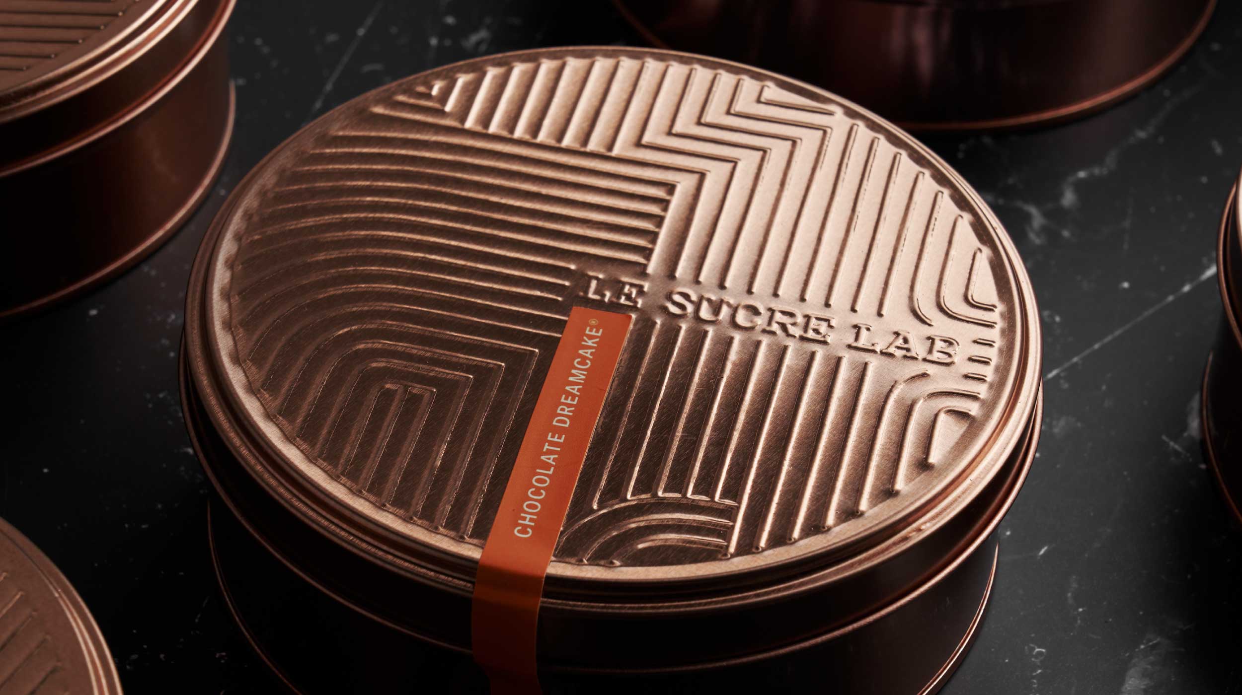
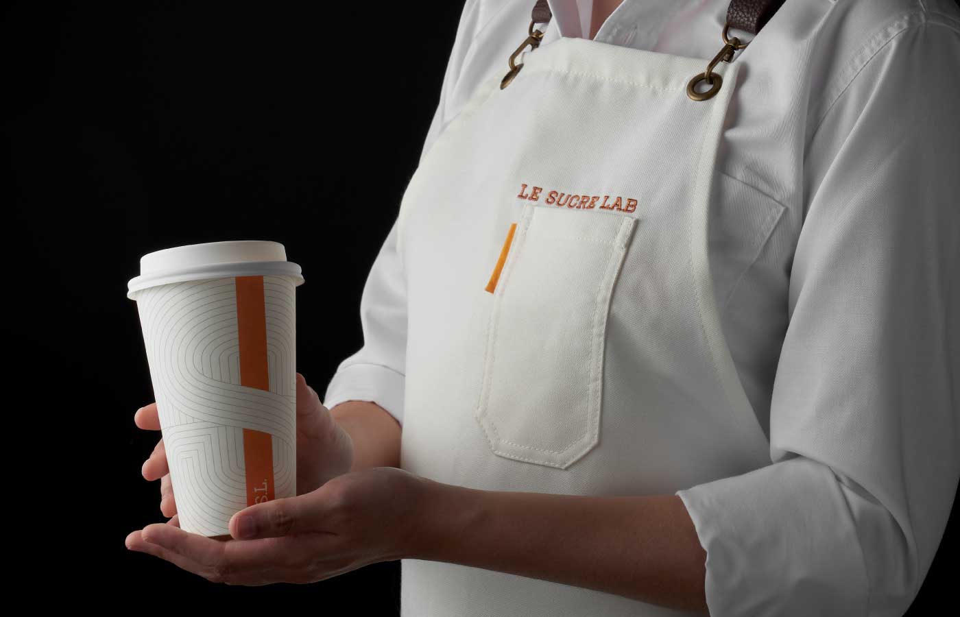
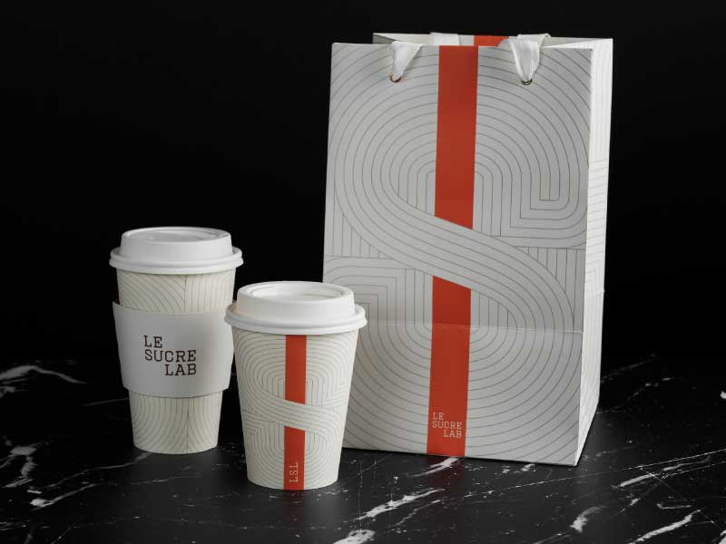
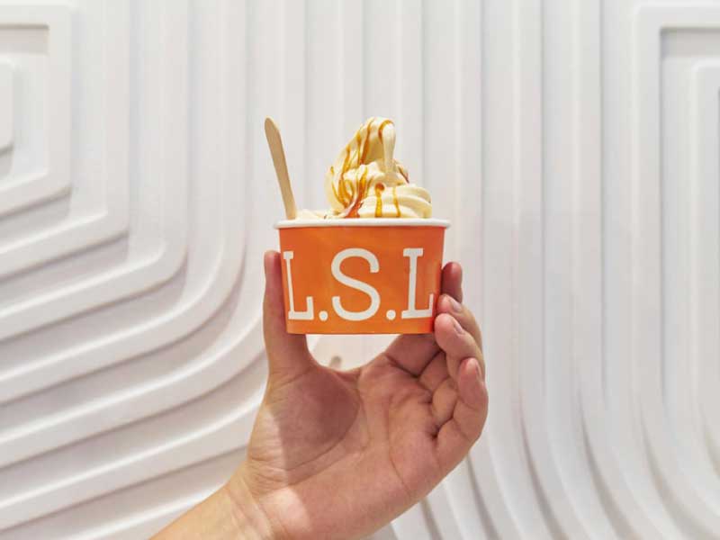
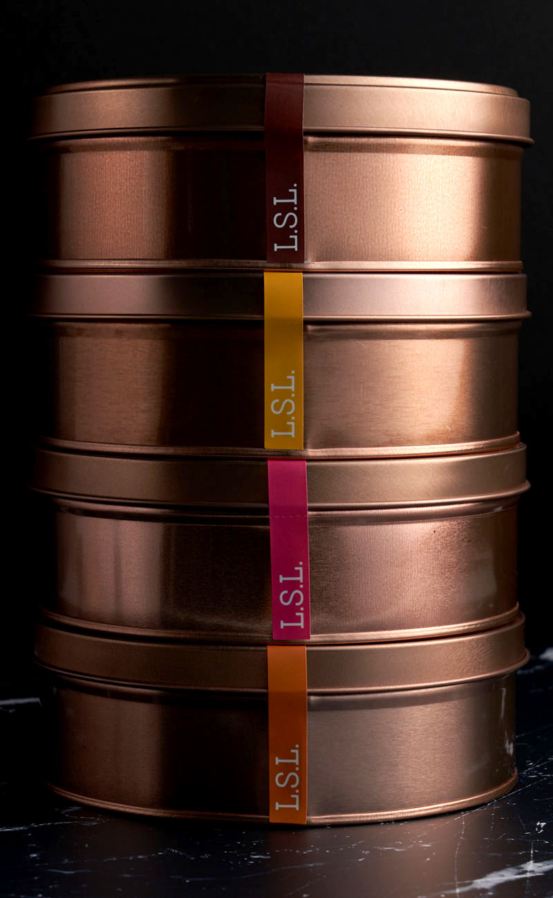
By themselves, the cakes and confections of Le Sucre are deliciously indulgent. Our design respects that by keeping things confidently straightforward — reflecting a subtle luxury and letting the product shine for people to celebrate with.
— PREV
First Pacific Leadership Academy
NEXT —
Astoria