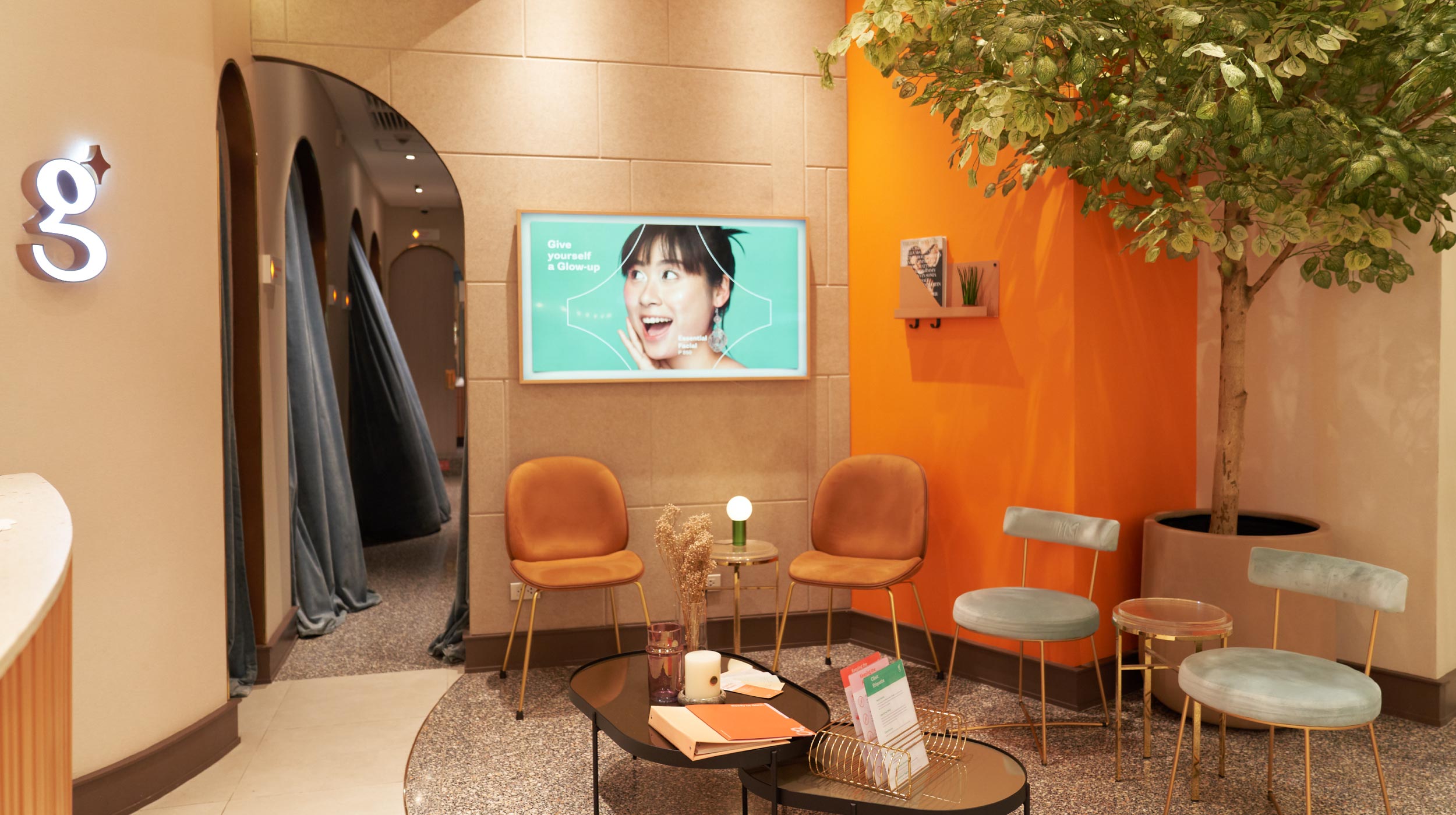
- Environmental
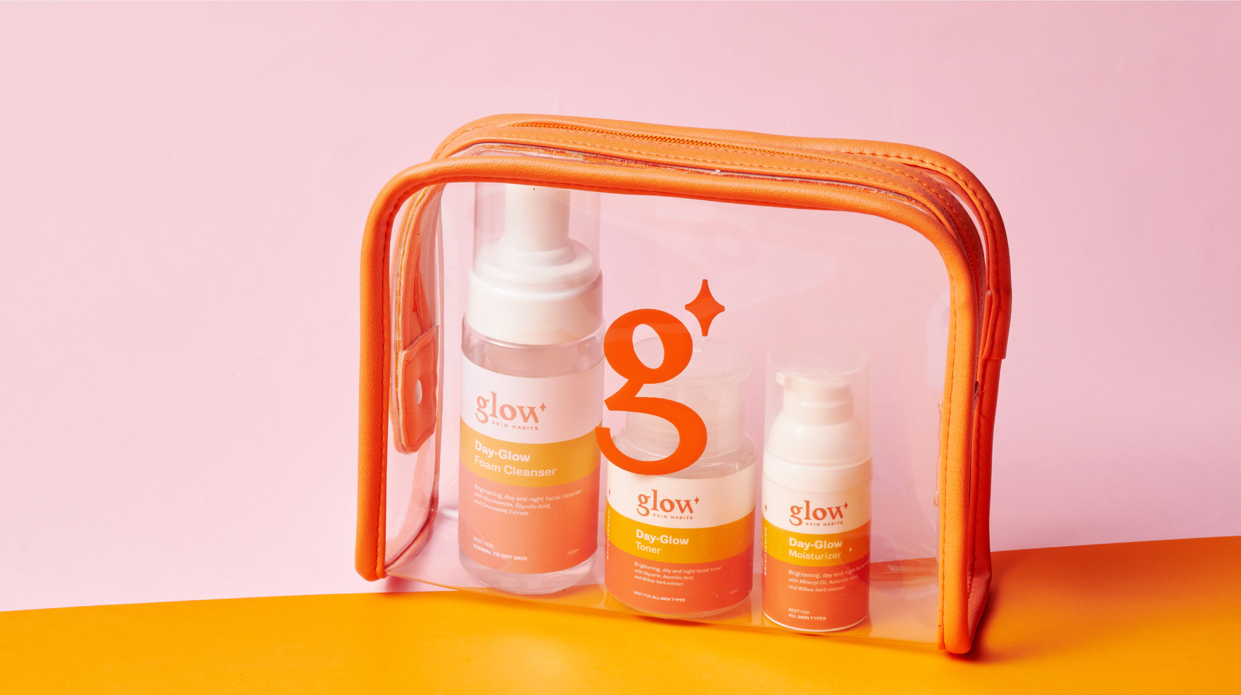
- Packaging
- Verbal Identity
- Visual Identity
- & Nikki Ruiz — Photography
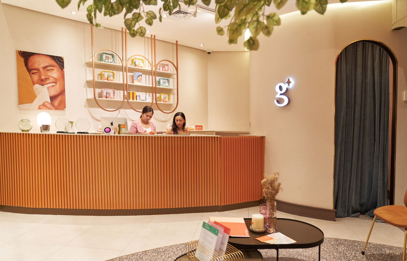
- & Heim Interiors — Interior Design
- & Ada Laud — Styling
- & Martine Cajucom — Styling
Design Challenge —
How might we make premium pampering into something practical?

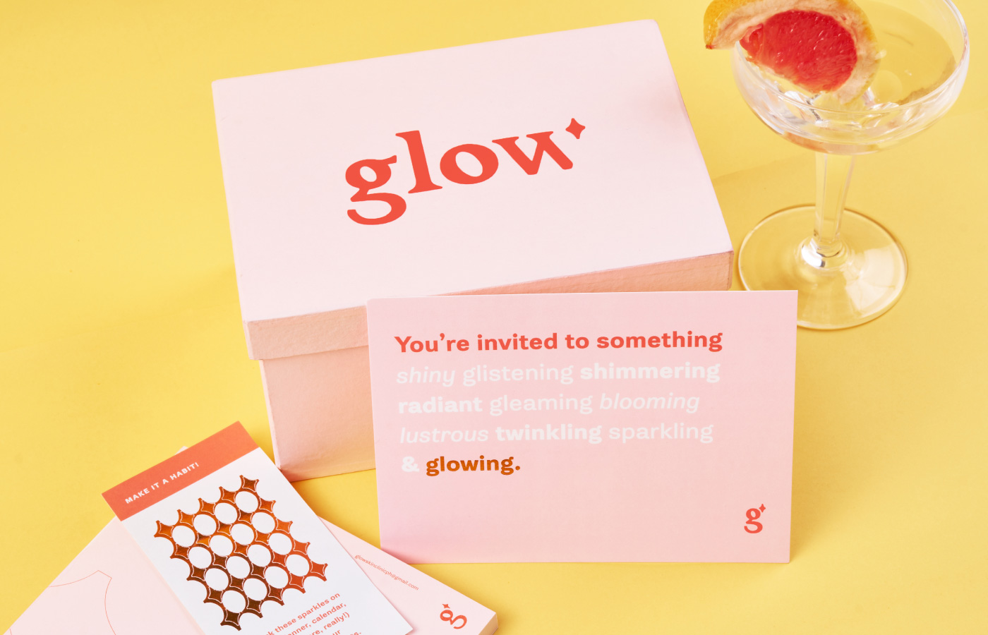
Caring for yourself doesn’t have to come with regret or compromise. Glow Skin Clinic offers specialized rejuvenation treatments that bring out that glow from within.
The brand —
There used to be a large gap between luxury aesthetic clinics and low-end skin clinics. When it came to caring for one’s self, the options available were either low quality or unaffordable. There was no in-between.
Glow Skin Clinic bridges that gap and shows that caring for yourself should not be difficult. Instead of compromise, self-care should be both relaxing and liberating. Glow provides premium aesthetic treatments at a reasonable price that doesn’t scrimp on quality. Glow Skin Clinic celebrates the beauty within and helps it glow from the inside out.

That sparkle —
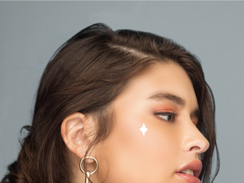
The custom logotype gave birth to a Sparkle icon which appears all over the brand.
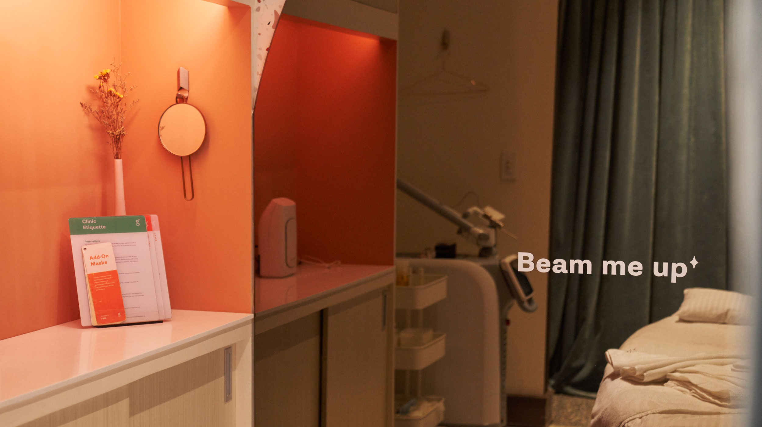
This icon acts as a literal highlighter, used on photos, wayfinding signs in-store, and even for their social media.




Our process —
For Glow, the brand identity was about striking the balance between indulgence and education. This balance, we found, was self-care. Taking the time off your schedule to care for yourself is neither vain or selfish but an awareness of self-worth. Glow is a brand that celebrates these things and more.
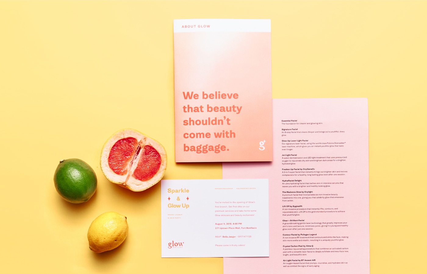
One way we define Glow’s brand is educational and easy glamour. Glow is bright and shiny, with its colors based on citrus fruits like grapefruit, lemon, lime, and orange. It’s also empowering and encouraging, furthermore, it takes the time to explain their skincare treatments in a way that is easy to understand.




Glow is a brand that believes so deeply in the power of value—getting value for your money, getting value for your experience, but above all valuing oneself.


— PREV
Space Encounters Gallery
NEXT —
Studio Cantero