- Environmental
- Visual Identity
- Website
- & Edmond Gozo — Design Strategy
- & Heima — Interior Design
Metro Pacific Water is a subsidiary of Metro Pacific Investments Corporation that invests in local water districts in order to bring clean water to communities all over the Philippines.
Starting with strategy —
With the help of Tinqer Design Strategist Edmond Gozo, Metro Pacific Water came to us with a clear direction for their rebrand. It had to communicate their purpose, that is: Investing in local water districts in order to bring clean water to local communities.
Before
After
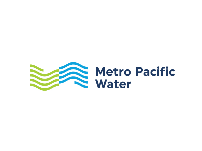
The logo represents the company’s strategy. As waves and hand reach in, they come together in perfect confluence. Green and blue are colors of forward-looking optimism, reflective of the company’s approach to their work. It is approachable but professional, combining expertise and heart.
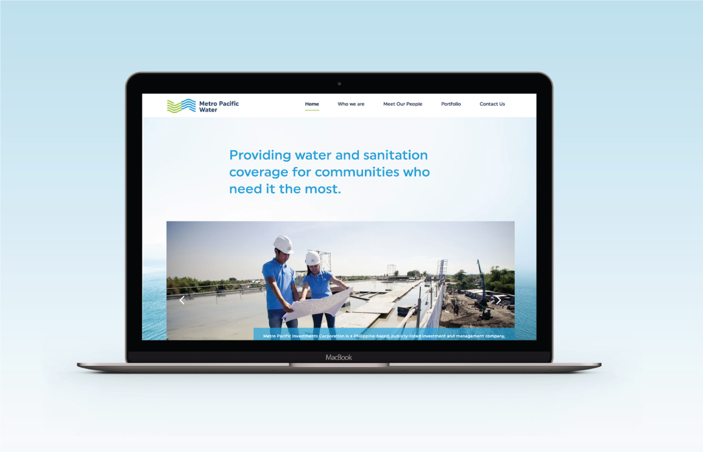
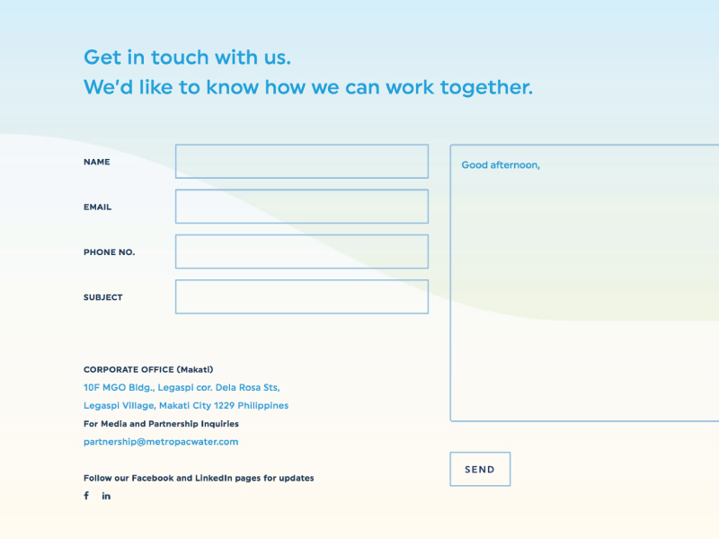
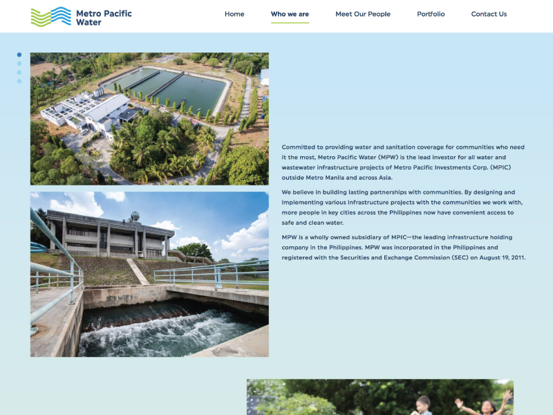
Bringing water to communities is not just a matter of technology but of human understanding. Overall, the brand identity distills MPW’s values of purity, confluence, flow, and their desire to address a very human need. We designed a website that would show their sample projects and their interaction with the community.

From design to interiors —
The alignment of strategy to design allowed the rebrand’s smooth translation into all their corporate documents, booth designs, website, and office interiors.
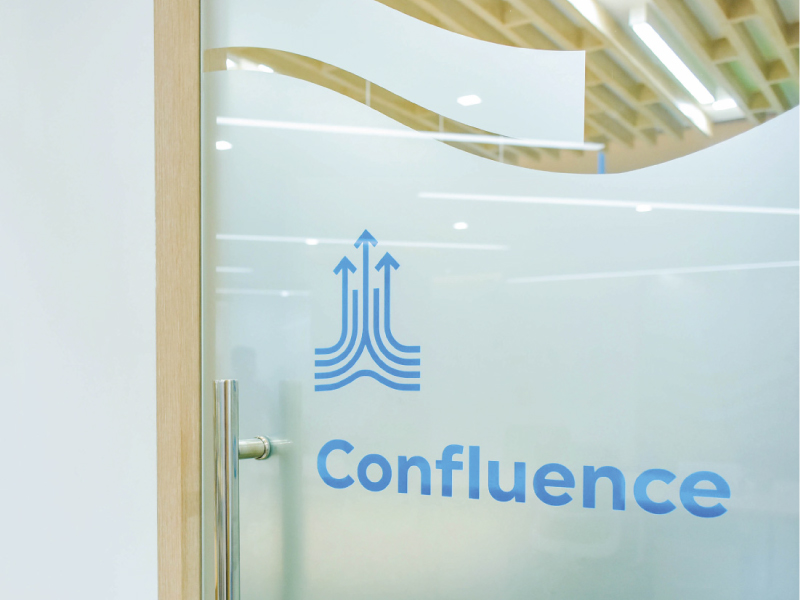
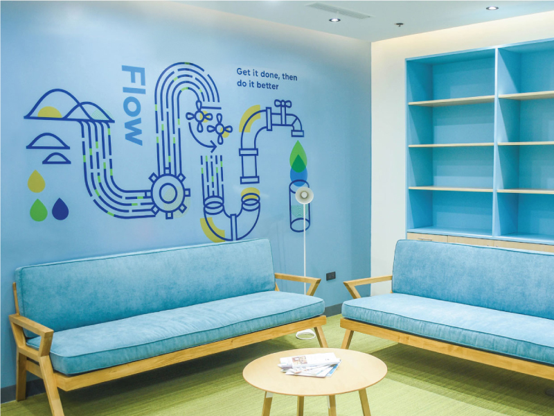
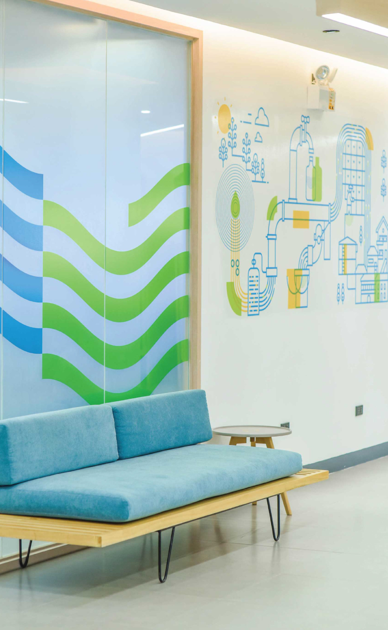

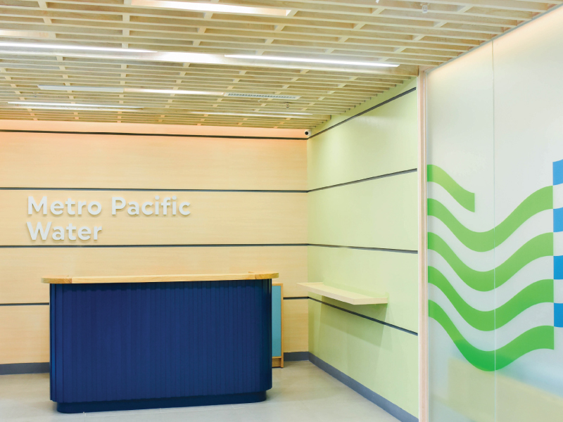
The rebrand won silver in the 2018 Asia-Pacific Stevie® Awards and a Silver Anvil Award at the 53rd Anvil Awards.
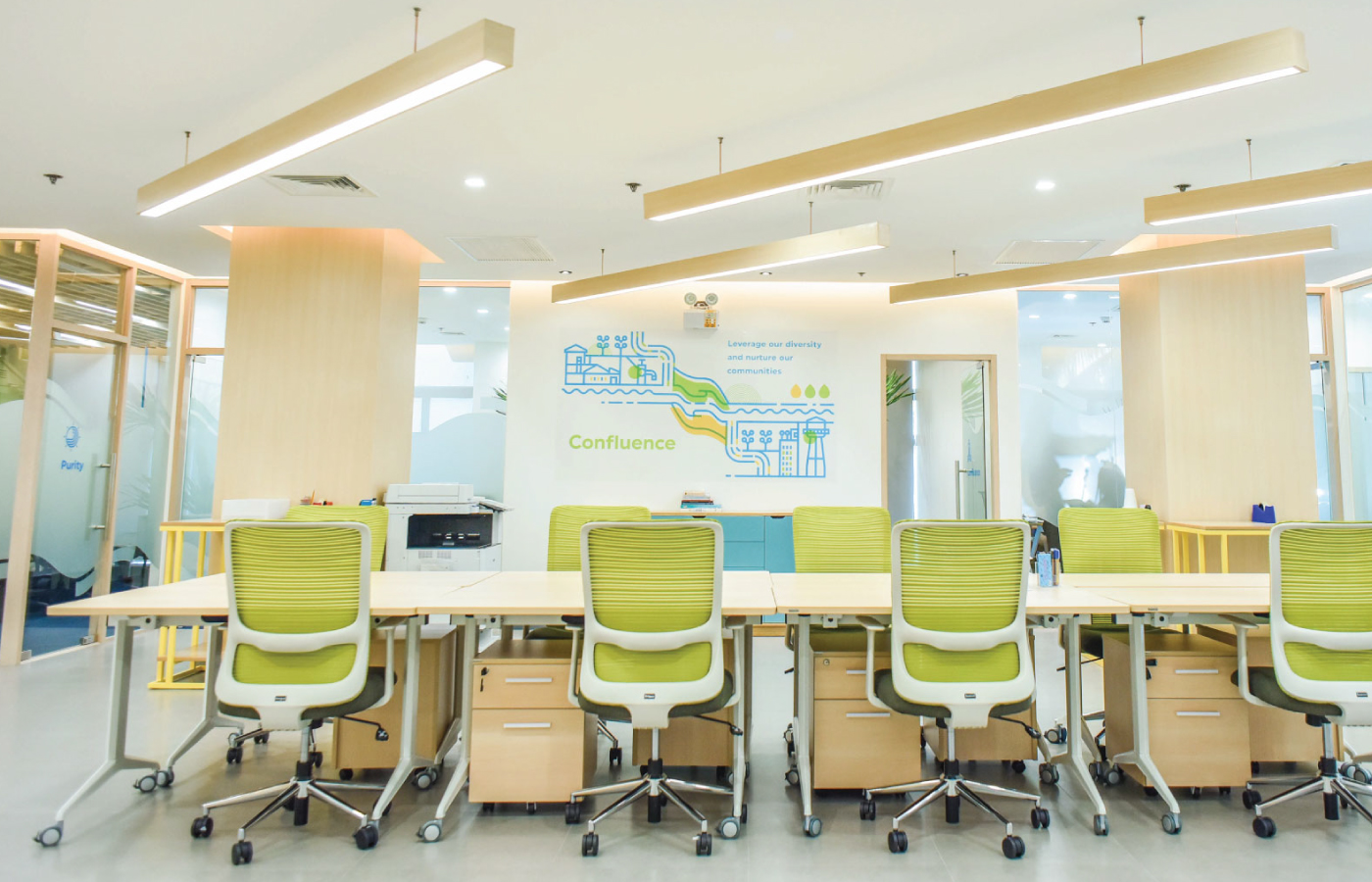
“This MPW Identity Project is a year-long process that started with asking key stakeholders on what MPW is to them – highlighting our focus on partnerships and people. The design studio, And A Half, translated our new identity into visually appealing aesthetics of blues, greens, and waves.”
— Nick Castro, Strategic Corporate Affairs, Metro Pacific Water
View the website through www.metropacificwater.com
— PREV
Akimbo
NEXT —
La Lola Churreria