- Environmental
- Illustration
- Verbal Identity
- Visual Identity
- & Space Encounters — Interior Design
- & Tori Chizu Design Team — Collaterals
Design Challenge —
How might we introduce doria to the local market?
The brand —
From one rice-loving country to another, it isn’t a surprise how quick we take to Japanese food. But when we were asked to design an identity for a fastfood chain that specialized in Doria, it didn’t ring any bells at first.
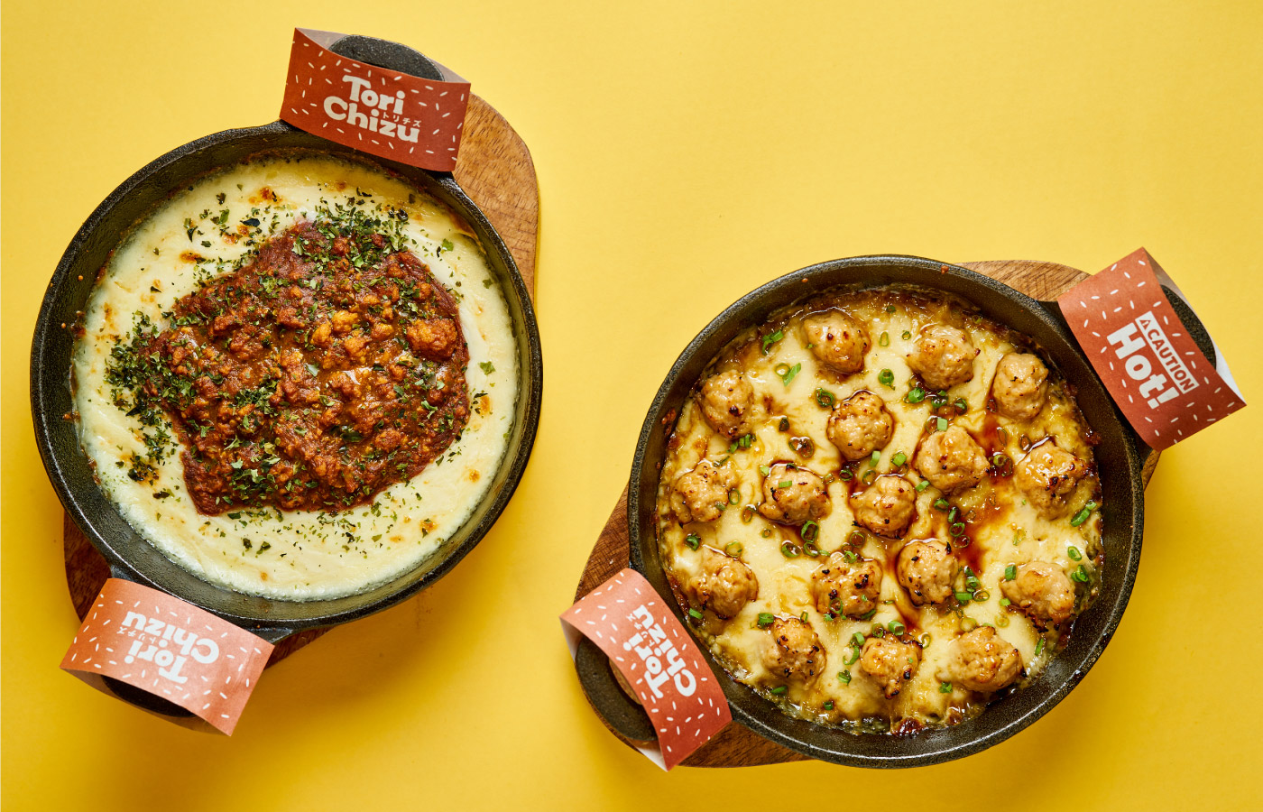
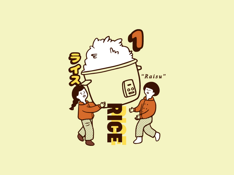
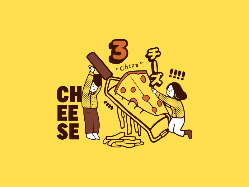
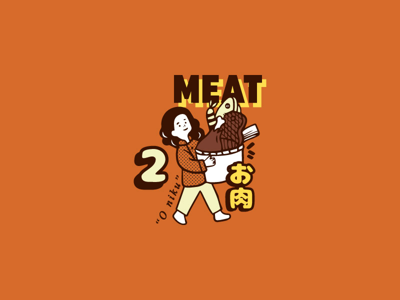
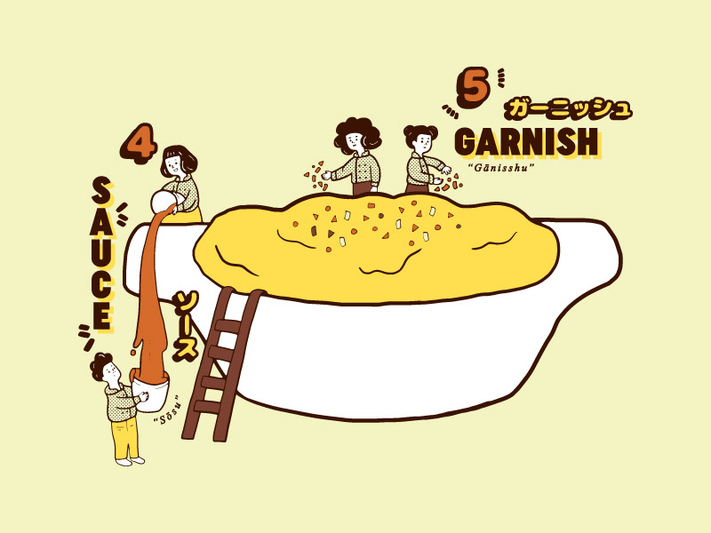
Doria is a yōshoku dish, which in essence is rice gratin layered with bechamel, cheese, and a meat of choice.
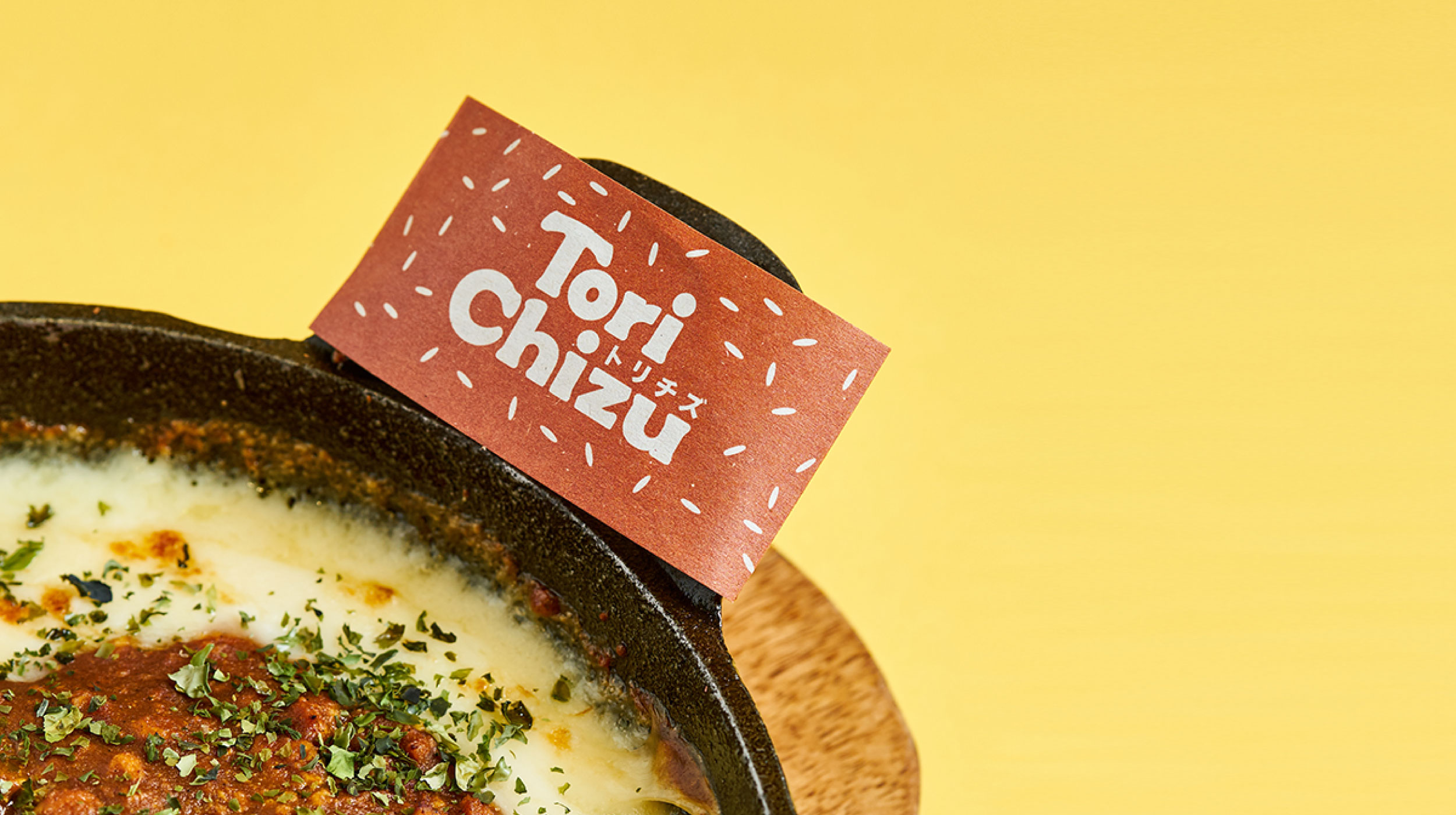
The brand of Tori Chizu (which means “chicken cheese”) had to be fun but also educational. It had to explain exactly what Doria was through visual and verbal cues. It needed to be appealing but most of all it had to be accessible.
Our solution and inspiration —
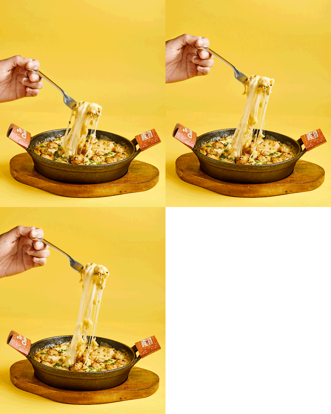
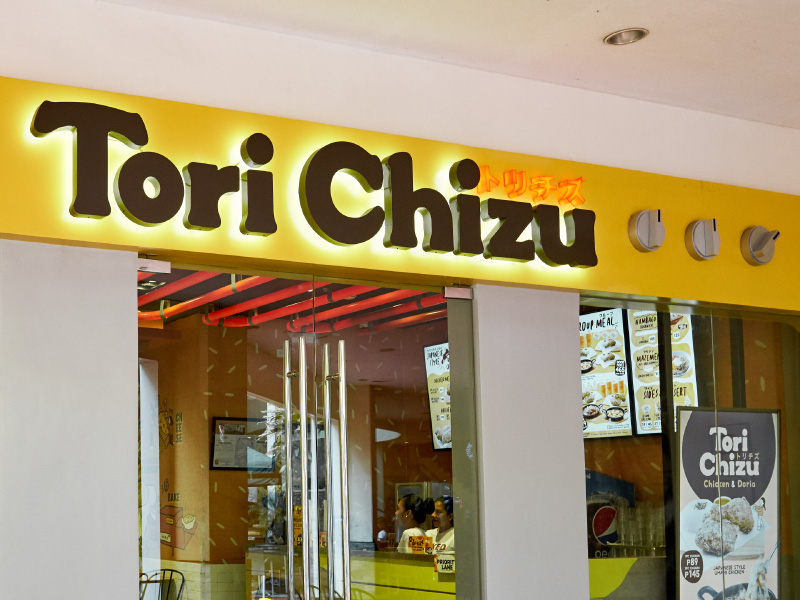
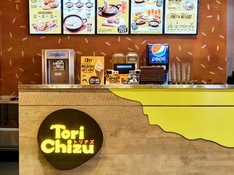
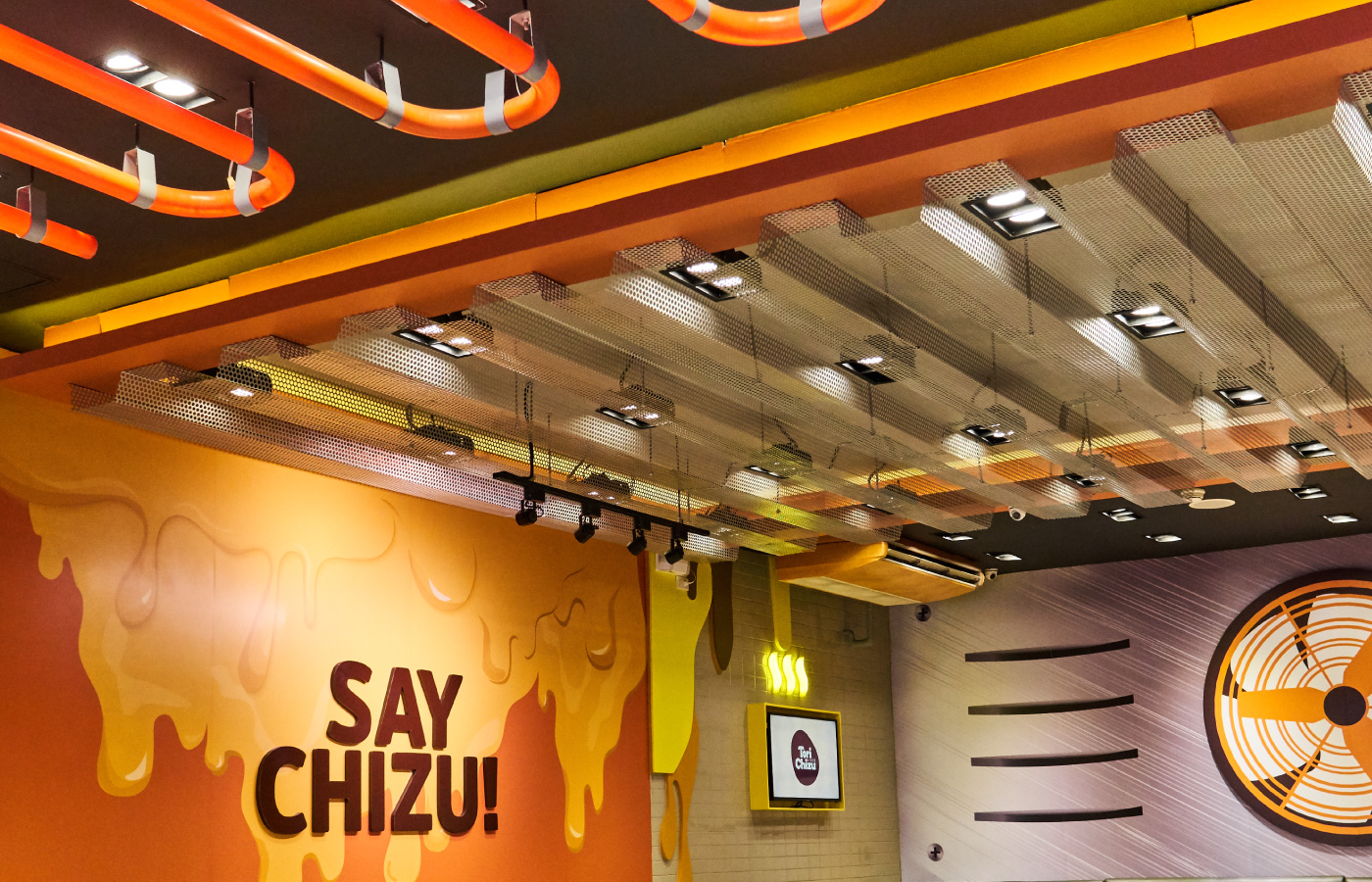
Eating at Tori Chizu is an experience. Stepping into the store is like figuratively slipping into a warm plate of Doria. Bright and warm hues of yellow and orange envelope the store, as if you were covered in a blanket of cheese.
Our process —
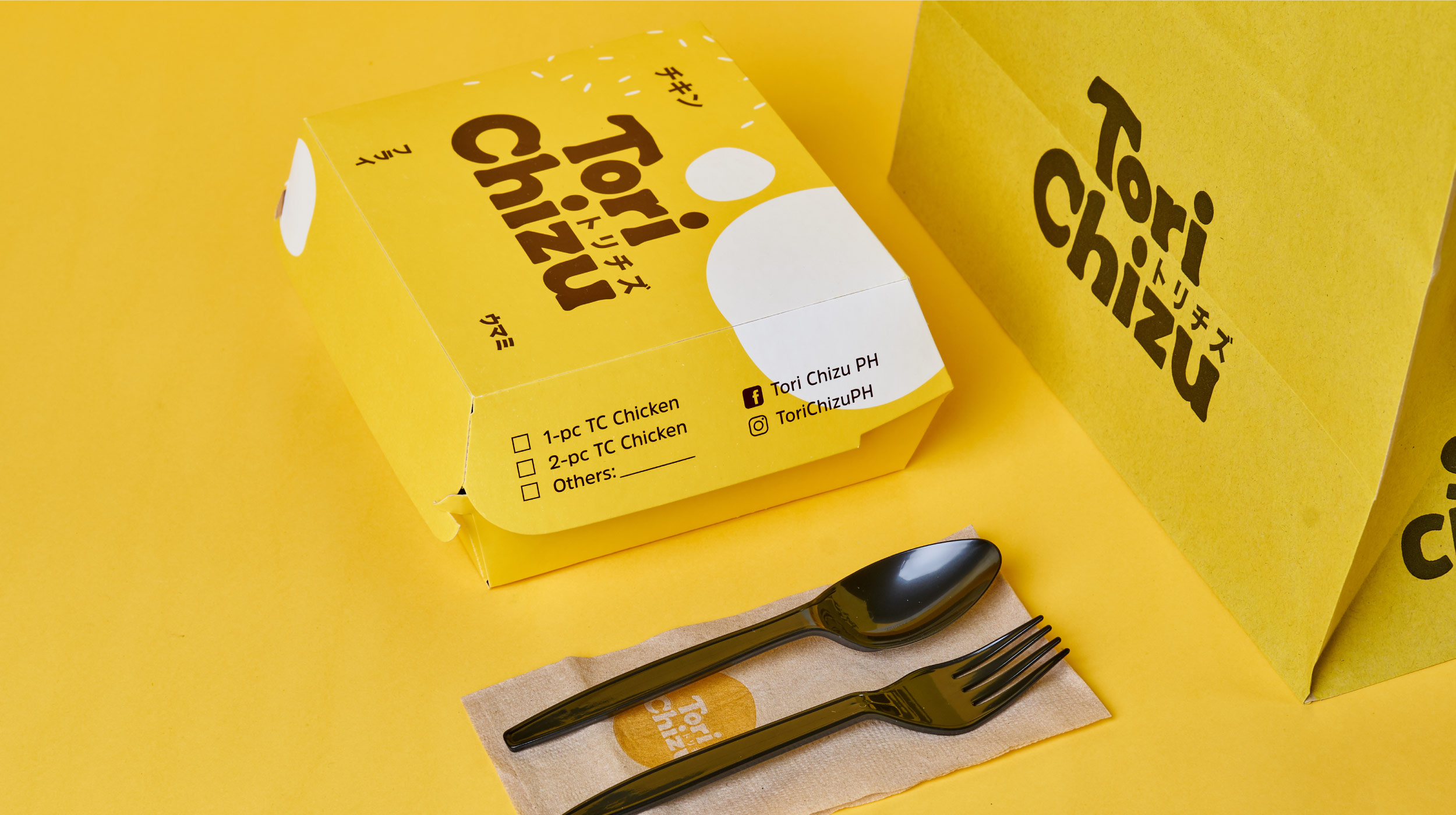
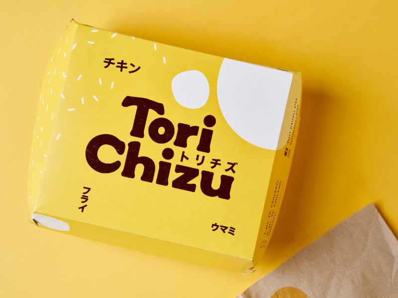
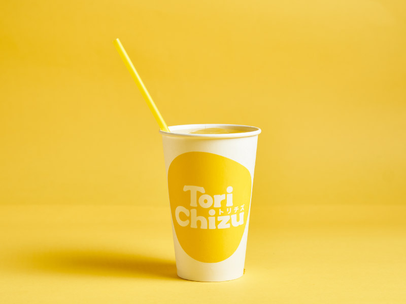
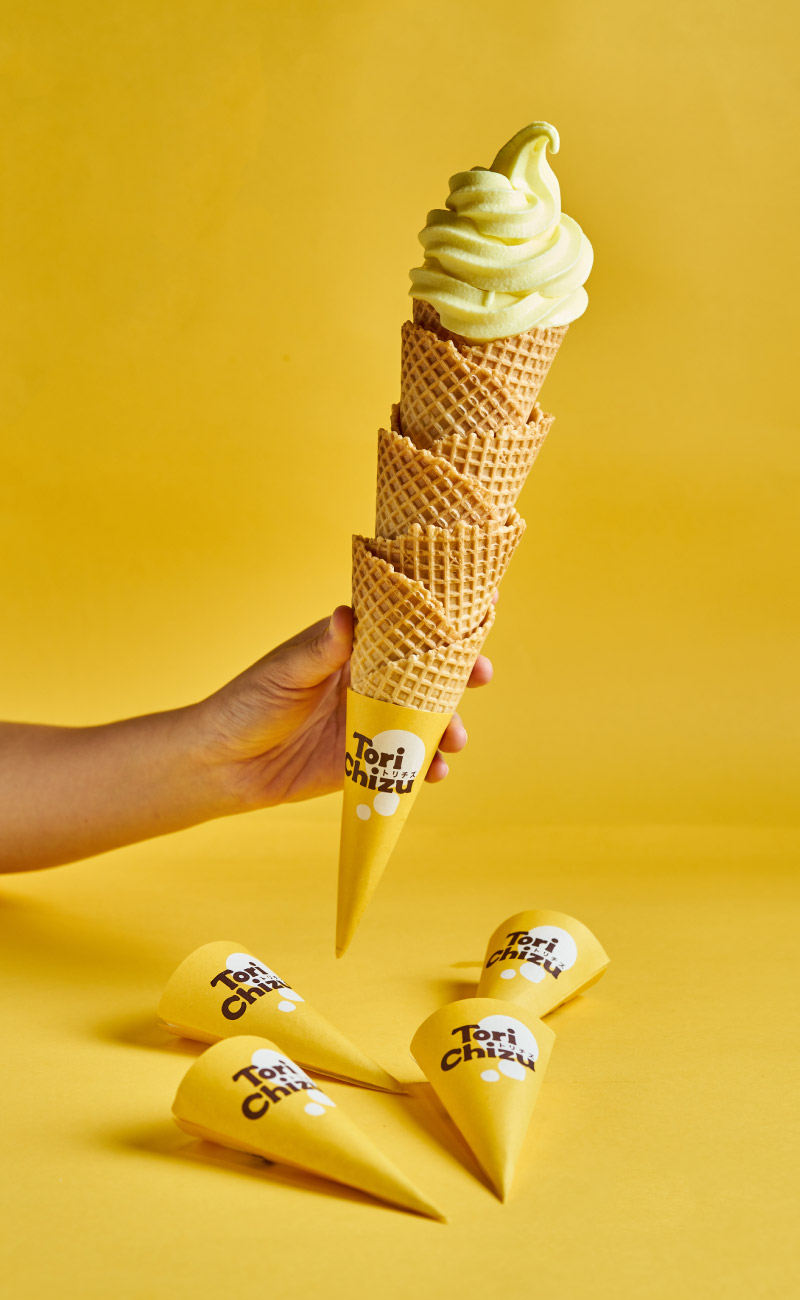
The identity lets customers have a taste of Doria before they’ve even stepped into the store. Patterns of rice grains, melted cheese, and layers of browns and yellows are just some of the key elements of the brand.
Illustrations —
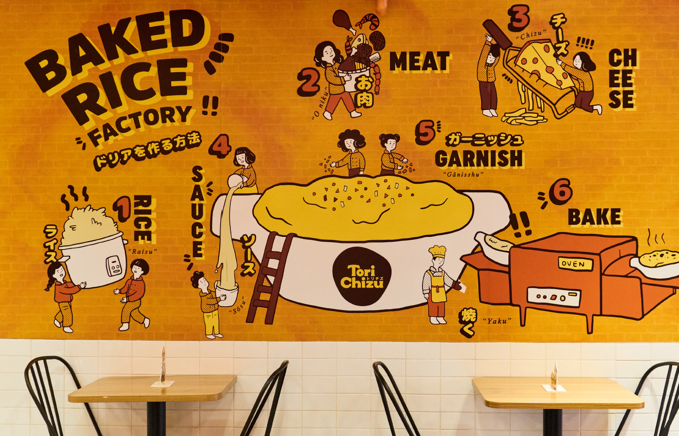
Wall graphics and illustrations guide dining customers on how Doria is made and what it is made of. They are also used for the brand’s social media and other miscellaneous collateral.
Tori Chizu currently has 5 stores in Metro Manila and is looking to expand with more branches in the coming months.
— PREV
Beach Hut
NEXT —
Xception